Armstrong County is a Republican stronghold. About 24% of voters here vote Democratic and 76% Republican.
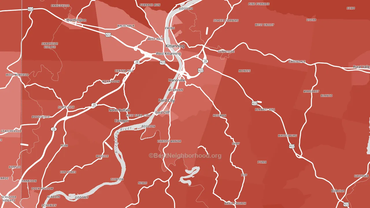
About 76% of adults in Armstrong County typically vote, above the U.S. average of about 62%. Among adults in Armstrong County, ~18% vote Democratic, ~58% Republican, and ~24% don't vote. The map below shows estimated turnout by block group.
How Armstrong County compares
Among counties within 50 miles, Armstrong County leans more Republican than 9 of 10 neighbors.
Armstrong County runs about 50 points more Republican than Pennsylvania as a whole.
Politics vary noticeably by city within Armstrong County. The northeast side is the most Republican-leaning (R+69) and the southwest side is the least Republican-leaning (R+41), a spread of about 28 points.
Why Armstrong County leans the way it does
This analysis examined 14,881 data points per county to find what predicts political lean and turnout. The items below are a few correlations that stood out for Armstrong County, not a ranked or complete list of what matters most.
Areas with a high white share and below-average college attainment vote Republican. In Armstrong County, about 95% of residents are non-Hispanic white, about 23 points above the U.S. average of 72%; about 19% of adults hold a bachelor's degree, about 7 points below the Pennsylvania average of 26%.
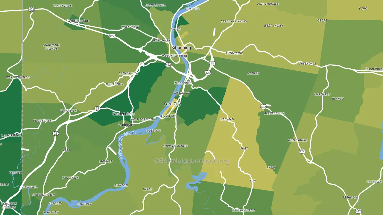
Homeownership and voter turnout
Places with homeowner-heavy households tend to turn out at a higher rate; Armstrong County, PA sits in the top quarter nationally on this measure.
Why turnout in Armstrong County looks the way it does
Areas with strong routine healthcare access turn out at higher rates. Armstrong County is in the top quarter nationally for routine-care measures such as insurance coverage, preventive screenings, and dental visits. The dental-visit rate here is about 64%, above 70% of counties. Learn more about the findings and methodology on the political spectrum map.
Nearby Counties
- Indiana County, PA R+34
- Butler County, PA R+28
- Clarion County, PA R+50
- Westmoreland County, PA R+26
- Allegheny County, PA D+22
- Jefferson County, PA R+55
- Beaver County, PA R+19
- Cambria County, PA R+35
- Lawrence County, PA R+28
- Venango County, PA R+42
Counties with Similar Populations
- Kershaw County, SC R+32
- Mason County, WA R+5
- Adams County, IL R+40
- Warren County, NY R+2
- Marion County, OH R+35
- Sauk County, WI R+20
- Walker County, AL R+72
- Clay County, MN R+3
- Tehama County, CA R+35
- Liberty County, GA D+16
Sources and methodology
Precinct-level voting records used to fit the model come from Pennsylvania Department of State, Bureau of Elections, distributed by the Voting and Election Science Team. Demographic inputs come from the U.S. Census Bureau (ACS 5-year estimates and the 2020 Decennial Census). Health and environmental inputs come from the CDC (PLACES and the Environmental Justice Index). Land cover comes from the USGS and EPA. Election-day and lead-up weather come from PRISM 4km daily grids and the NOAA Global Historical Climatology Network. Mail-voting and election-administration patterns come from the MIT Election Lab's Survey of the Performance of American Elections. Block-group crime detail comes from CrimeGrade. Internet data and modeling support provided by ISPreports.org.
Modeling and analysis by the BestNeighborhood data science team. Full methodology and findings: political spectrum map.
Methodology reviewed by the BestNeighborhood data team. Last updated May 2026.