Audubon leans heavily Democratic by roughly 40 points: about 70% of voters vote Democratic and 30% Republican.
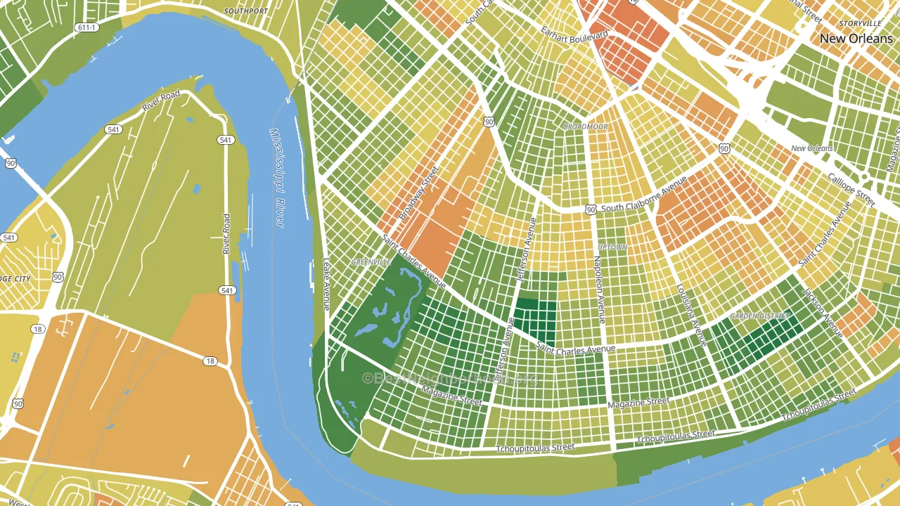
About 57% of adults in Audubon typically vote, near the U.S. average of about 62%. Among adults in Audubon, ~40% vote Democratic, ~17% Republican, and ~43% don't vote. The map below shows estimated turnout by block group.
How Audubon compares
Among neighborhoods within 5 miles, Audubon leans more Democratic than 2 of 23 neighbors.
Audubon runs about 61 points more Democratic than Louisiana as a whole. Louisiana leans Republican overall, while Audubon is one of the few Democratic-leaning pockets.
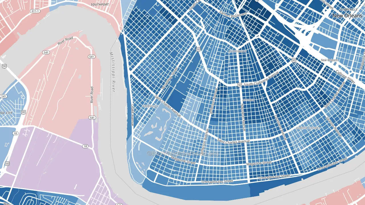
Politics vary noticeably by block within Audubon. The northwest side is the most Democratic-leaning (D+53) and the east side is the least Democratic-leaning (D+24), a spread of about 28 points.
Why Audubon leans the way it does
This analysis examined 14,881 data points per neighborhood to find what predicts political lean and turnout. The items below are a few correlations that stood out for Audubon, not a ranked or complete list of what matters most.
Areas with high college attainment vote Democratic. About 87% of adults in Audubon hold a bachelor's degree, about 59 points above the U.S. average of 28%. A high never-married share predicts Democratic voting, and about 61% of adults in Audubon have never been married, above 94% of neighborhoods. Audubon runs against the grain of Louisiana, a Democratic-leaning pocket in a Republican-leaning state.
Walkability and Democratic lean
Places with a highly walkable street grid tend to lean Democratic; Audubon, New Orleans, LA sits in the top quarter nationally on this measure. A walkable street grid does not change how people vote; it mostly reflects how urban a place is.
Why turnout in Audubon looks the way it does
Strong routine healthcare access lines up with higher turnout, and Audubon sits in the top quarter on routine-care measures. Learn more about the findings and methodology on the political spectrum map.
Nearby Neighborhoods
- East Carollton, New Orleans, LA D+56
- Uptown, New Orleans, LA D+46
- Broadmoor, New Orleans, LA D+68
- West Riverside, New Orleans, LA D+46
- Marlyville, New Orleans, LA D+50
- Milan, New Orleans, LA D+62
- Leonidas, New Orleans, LA D+70
- Gert Town, New Orleans, LA D+79
- Central City, New Orleans, LA D+72
- Holly Grove, New Orleans, LA D+81
Neighborhoods with Similar Populations
- Great Northwest, San Antonio, TX D+10
- Adams Morgan, Washington, DC D+83
- Sabre Springs, San Diego, CA D+20
- Upper Northwood, Baltimore, MD D+87
- Live Oak, Santa Cruz, CA D+50
- Southwest Carrollton, Carrollton, TX D+13
- Crocker Amazon, San Francisco, CA D+34
- College Hill, Cincinnati, OH D+61
- McCullough Hills, Henderson, NV D+4
- Group 14621, Rochester, NY D+57
Sources and methodology
Precinct-level voting records used to fit the model come from Louisiana Secretary of State, Elections, distributed by the Voting and Election Science Team. Demographic inputs come from the U.S. Census Bureau (ACS 5-year estimates and the 2020 Decennial Census). Health and environmental inputs come from the CDC (PLACES and the Environmental Justice Index). Land cover comes from the USGS and EPA. Election-day and lead-up weather come from PRISM 4km daily grids and the NOAA Global Historical Climatology Network. Mail-voting and election-administration patterns come from the MIT Election Lab's Survey of the Performance of American Elections. Block-group crime detail comes from CrimeGrade. Internet data and modeling support provided by ISPreports.org.
Modeling and analysis by the BestNeighborhood data science team. Full methodology and findings: political spectrum map.
Methodology reviewed by the BestNeighborhood data team. Last updated May 2026.