Austin is a Democratic stronghold. About 87% of voters here vote Democratic and 13% Republican.
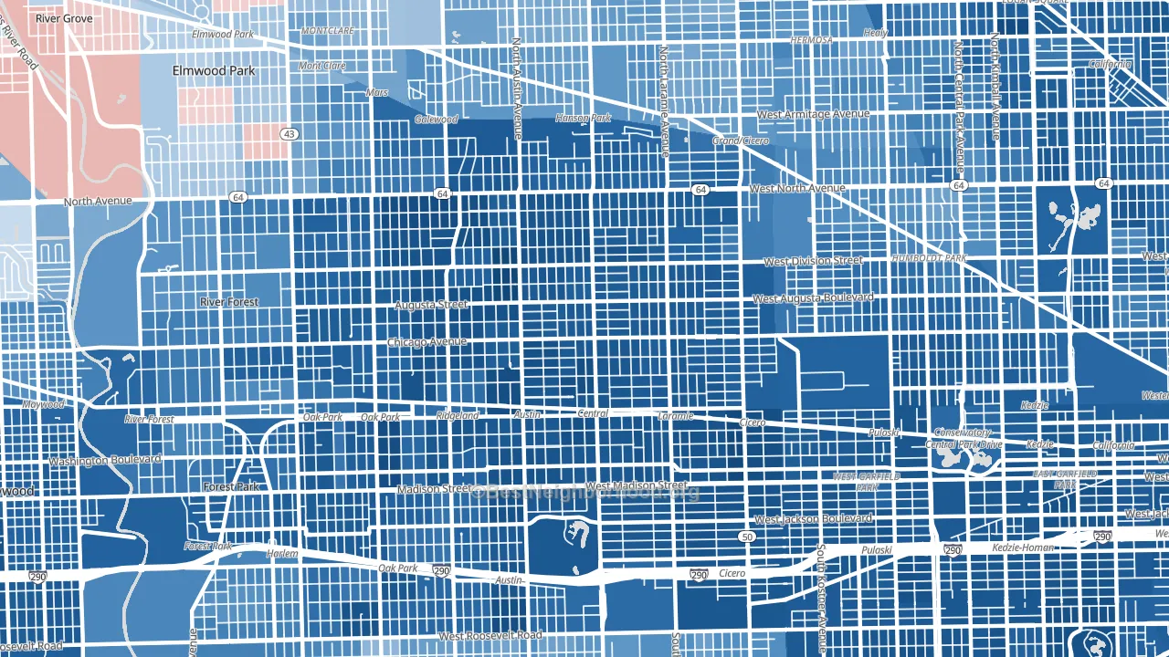
About 47% of adults in Austin typically vote, below the U.S. average of about 62%. Among adults in Austin, ~41% vote Democratic, ~6% Republican, and ~53% don't vote. The map below shows estimated turnout by block group.
How Austin compares
Among neighborhoods within 5 miles, Austin leans more Democratic than 26 of 34 neighbors.
Austin runs about 63 points more Democratic than Illinois as a whole.
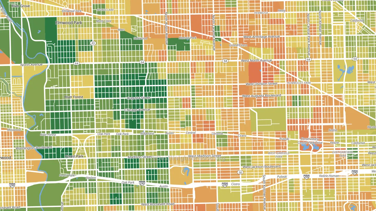
Politics vary noticeably by block within Austin. The west side is the most Democratic-leaning (D+81) and the northwest side is the least Democratic-leaning (D+59), a spread of about 22 points.
Why Austin leans the way it does
This analysis examined 14,881 data points per neighborhood to find what predicts political lean and turnout. The items below are a few correlations that stood out for Austin, not a ranked or complete list of what matters most.
Density combined with diversity predicts Democratic voting. Non-Hispanic white share in Austin is about 7%, about 66 points below the U.S. average of 72%. A high never-married share predicts Democratic voting, and about 53% of adults in Austin have never been married, above 86% of neighborhoods.
Paved land cover and Democratic lean
Places with extensive paved surfaces tend to lean Democratic; Austin, Chicago, IL sits in the top tenth nationally on this measure. Paved ground does not change how people vote; it mostly reflects how urban and built-up a place is.
Why turnout in Austin looks the way it does
Areas with limited routine healthcare access turn out at lower rates. Austin is in the bottom quarter nationally for routine-care measures such as insurance coverage, preventive screenings, and dental visits. The dental-visit rate here is about 47%, about 16 points below the Illinois average of 63%. High food insecurity lines up with lower turnout, and about 41% of adults in Austin report food insecurity, above 94% of neighborhoods. High-crime urban areas turn out at lower rates, and Austin sits in the top 15% on a violent-crime measure. Learn more about the findings and methodology on the political spectrum map.
Nearby Neighborhoods
- Moreland, Chicago, IL D+77
- Ridgeland, Oak Park, IL D+82
- Mandell, Chicago, IL D+79
- Edmund F Burton, Oak Park, IL D+75
- Hanson Park, Chicago, IL D+43
- Samuel A Rothermel, Oak Park, IL D+73
- Central Park, Chicago, IL D+80
- Belmont Cragin, Chicago, IL D+33
- Kelvyn Grove, Chicago, IL D+35
- Humboldt Park, Chicago, IL D+61
Neighborhoods with Similar Populations
- Mira Mesa, San Diego, CA D+21
- Blossom Valley, San Jose, CA D+25
- Highbridge, Bronx, NY D+41
- Millcreek, Salt Lake City, UT D+34
- Forest Hills, Queens, NY D+20
- Downtown Miami, Miami, FL D+6
- Allston-Brighton, Brighton, MA D+63
- Chelsea, Manhattan, NY D+65
- Far North Dallas-Keller, Keller, TX R+16
- Central Mesa, Mesa, AZ R+6
Sources and methodology
Precinct-level voting records used to fit the model come from Illinois State Board of Elections, distributed by the Voting and Election Science Team. Demographic inputs come from the U.S. Census Bureau (ACS 5-year estimates and the 2020 Decennial Census). Health and environmental inputs come from the CDC (PLACES and the Environmental Justice Index). Land cover comes from the USGS and EPA. Election-day and lead-up weather come from PRISM 4km daily grids and the NOAA Global Historical Climatology Network. Mail-voting and election-administration patterns come from the MIT Election Lab's Survey of the Performance of American Elections. Block-group crime detail comes from CrimeGrade. Internet data and modeling support provided by ISPreports.org.
Modeling and analysis by the BestNeighborhood data science team. Full methodology and findings: political spectrum map.
Methodology reviewed by the BestNeighborhood data team. Last updated May 2026.