Highbridge leans heavily Democratic by roughly 42 points: about 71% of voters vote Democratic and 29% Republican.
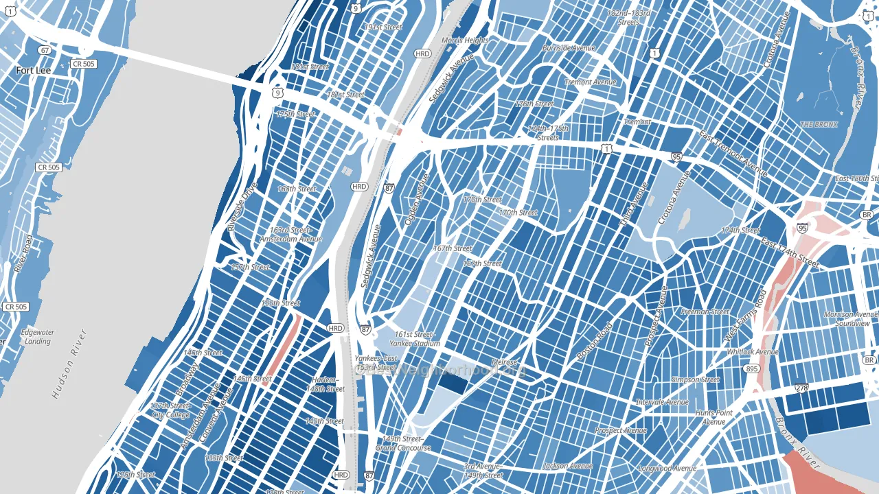
About 35% of adults in Highbridge typically vote, below the U.S. average of about 62%. Among adults in Highbridge, ~25% vote Democratic, ~10% Republican, and ~65% don't vote. The map below shows estimated turnout by block group.
How Highbridge compares
Among neighborhoods within 5 miles, Highbridge leans more Democratic than 18 of 40 neighbors.
Highbridge runs about 29 points more Democratic than New York as a whole.
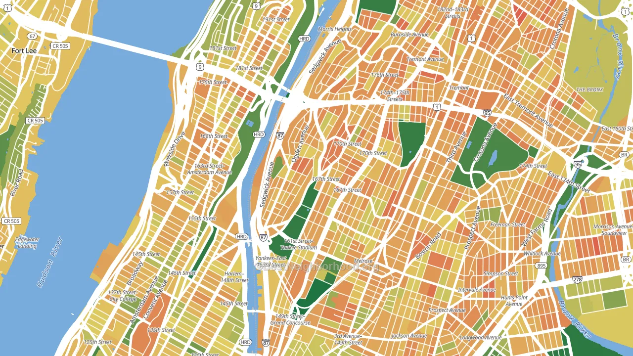
Politics vary noticeably by block within Highbridge. The northwest side is the most Democratic-leaning (D+48) and the east side is the least Democratic-leaning (D+36), a spread of about 12 points.
Why Highbridge leans the way it does
This analysis examined 14,881 data points per neighborhood to find what predicts political lean and turnout. The items below are a few correlations that stood out for Highbridge, not a ranked or complete list of what matters most.
Dense areas vote Democratic. More than 99% of residents in Highbridge live in densely developed areas, about 64 points above the U.S. average of 36%. A high never-married share predicts Democratic voting, and about 55% of adults in Highbridge have never been married, above 89% of neighborhoods.
Population density and Democratic lean
Places with high population density tend to lean Democratic; Highbridge, Bronx, NY sits in the top tenth nationally on this measure.
Why turnout in Highbridge looks the way it does
Areas with limited routine healthcare access turn out at lower rates. Highbridge is in the bottom quarter nationally for routine-care measures such as insurance coverage, preventive screenings, and dental visits. The dental-visit rate here is about 46%, about 18 points below the New York average of 64%. Renters vote less often than owners, and about 96% of households in Highbridge rent, about 71 points above the U.S. average of 25%. High food insecurity lines up with lower turnout, and about 46% of adults in Highbridge report food insecurity, above 97% of neighborhoods. Learn more about the findings and methodology on the political spectrum map.
Nearby Neighborhoods
- South Bronx, Bronx, NY D+50
- Morris Heights, Bronx, NY D+43
- Washington Heights, Manhattan, NY D+49
- Tremont, Bronx, NY D+43
- Charlotte Gardens, Bronx, NY D+50
- Hamilton Heights, Manhattan, NY D+63
- Mott Haven, Bronx, NY D+47
- Harlem, Manhattan, NY D+78
- University Heights, Bronx, NY D+31
- Hunts Point, Bronx, NY D+44
Neighborhoods with Similar Populations
- Millcreek, Salt Lake City, UT D+34
- Mira Mesa, San Diego, CA D+21
- Austin, Chicago, IL D+74
- Forest Hills, Queens, NY D+20
- Blossom Valley, San Jose, CA D+25
- Chelsea, Manhattan, NY D+65
- Far North Dallas-Keller, Keller, TX R+16
- Greater Heights, Houston, TX D+24
- Downtown Miami, Miami, FL D+6
- Allston-Brighton, Brighton, MA D+63
Sources and methodology
Precinct-level voting records used to fit the model come from New York State Board of Elections, distributed by the Voting and Election Science Team. Demographic inputs come from the U.S. Census Bureau (ACS 5-year estimates and the 2020 Decennial Census). Health and environmental inputs come from the CDC (PLACES and the Environmental Justice Index). Land cover comes from the USGS and EPA. Election-day and lead-up weather come from PRISM 4km daily grids and the NOAA Global Historical Climatology Network. Mail-voting and election-administration patterns come from the MIT Election Lab's Survey of the Performance of American Elections. Block-group crime detail comes from CrimeGrade. Internet data and modeling support provided by ISPreports.org.
Modeling and analysis by the BestNeighborhood data science team. Full methodology and findings: political spectrum map.
Methodology reviewed by the BestNeighborhood data team. Last updated May 2026.