Bedford County is a Republican stronghold. About 17% of voters here vote Democratic and 83% Republican.
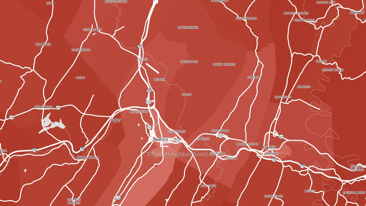
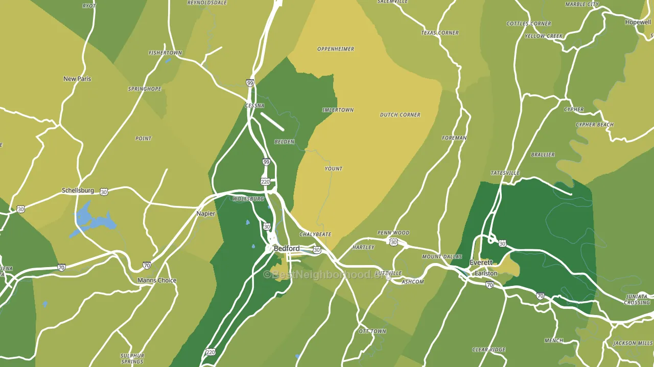
About 70% of adults in Bedford County typically vote, above the U.S. average of about 62%. Among adults in Bedford County, ~12% vote Democratic, ~58% Republican, and ~30% don't vote. The map below shows estimated turnout by block group.
How Bedford County compares
Among counties within 50 miles, Bedford County leans more Republican than 10 of 11 neighbors.
Bedford County runs about 65 points more Republican than Pennsylvania as a whole.
Why Bedford County leans the way it does
This analysis examined 14,881 data points per county to find what predicts political lean and turnout. The items below are a few correlations that stood out for Bedford County, not a ranked or complete list of what matters most.
Areas with a high white share and below-average college attainment vote Republican. In Bedford County, about 95% of residents are non-Hispanic white, about 23 points above the U.S. average of 72%; about 16% of adults hold a bachelor's degree, about 10 points below the Pennsylvania average of 26%.
Preventive-care access and voter turnout
Places with strong routine preventive-care access tend to turn out at a higher rate; Bedford County, PA sits above the national average on this measure. Dental visits do not drive turnout; the rate reflects income, insurance, and healthcare access, which line up with who votes.
Why turnout in Bedford County looks the way it does
Turnout in Bedford County sits close to the national pattern. Routine healthcare access, homeownership, education, and food security all land near their national averages here. Learn more about the findings and methodology on the political spectrum map.
Nearby Counties
- Fulton County, PA R+70
- Somerset County, PA R+54
- Cambria County, PA R+35
- Blair County, PA R+37
- Allegany County, MD R+33
- Morgan County, WV R+56
- Huntingdon County, PA R+46
- Franklin County, PA R+41
- Mineral County, WV R+58
- Berkeley County, WV R+33
Counties with Similar Populations
- Goodhue County, MN R+22
- Val Verde County, TX R+12
- Franklin County, NY R+11
- Santa Cruz County, AZ D+17
- Noble County, IN R+49
- Jackson County, FL R+41
- Greene County, NY R+13
- Chenango County, NY R+36
- Whitman County, WA D+16
- Bingham County, ID R+54
Sources and methodology
Precinct-level voting records used to fit the model come from Pennsylvania Department of State, Bureau of Elections, distributed by the Voting and Election Science Team. Demographic inputs come from the U.S. Census Bureau (ACS 5-year estimates and the 2020 Decennial Census). Health and environmental inputs come from the CDC (PLACES and the Environmental Justice Index). Land cover comes from the USGS and EPA. Election-day and lead-up weather come from PRISM 4km daily grids and the NOAA Global Historical Climatology Network. Mail-voting and election-administration patterns come from the MIT Election Lab's Survey of the Performance of American Elections. Block-group crime detail comes from CrimeGrade. Internet data and modeling support provided by ISPreports.org.
Modeling and analysis by the BestNeighborhood data science team. Full methodology and findings: political spectrum map.
Methodology reviewed by the BestNeighborhood data team. Last updated May 2026.