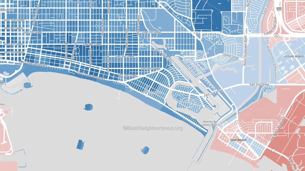
Belmont Shore leans heavily Democratic by roughly 48 points: about 74% of voters vote Democratic and 26% Republican.
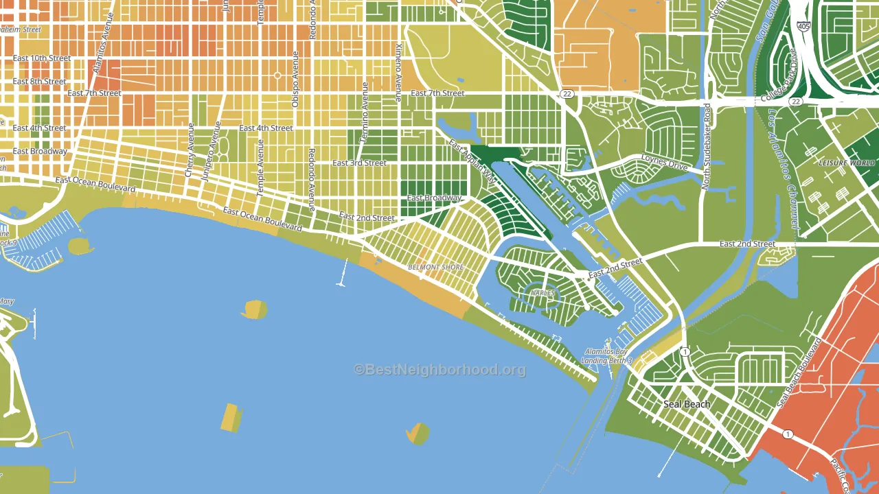
About 63% of adults in Belmont Shore typically vote, near the U.S. average of about 62%. Among adults in Belmont Shore, ~46% vote Democratic, ~16% Republican, and ~38% don't vote. The map below shows estimated turnout by block group.
How Belmont Shore compares
Among neighborhoods within 5 miles, Belmont Shore leans more Democratic than 10 of 13 neighbors.
Belmont Shore runs about 28 points more Democratic than California as a whole.
Politics vary noticeably by block within Belmont Shore. The west side is the most Democratic-leaning (D+56) and the north side is the least Democratic-leaning (D+33), a spread of about 23 points.
Why Belmont Shore leans the way it does
This analysis examined 14,881 data points per neighborhood to find what predicts political lean and turnout. The items below are a few correlations that stood out for Belmont Shore, not a ranked or complete list of what matters most.
Areas with high college attainment vote Democratic. About 62% of adults in Belmont Shore hold a bachelor's degree, about 33 points above the U.S. average of 28%. A high never-married share predicts Democratic voting, and about 55% of adults in Belmont Shore have never been married, above 89% of neighborhoods.
Population density and Democratic lean
Places with high population density tend to lean Democratic; Belmont Shore, Long Beach, CA sits in the top tenth nationally on this measure.
Why turnout in Belmont Shore looks the way it does
Areas with strong routine healthcare access turn out at higher rates. Belmont Shore is in the top quarter nationally for routine-care measures such as insurance coverage, preventive screenings, and dental visits. The dental-visit rate here is about 74%, about 14 points above the U.S. average of 60%. Learn more about the findings and methodology on the political spectrum map.
Nearby Neighborhoods
- Naples-Marina Area, Long Beach, CA D+27
- Belmont Heights, Long Beach, CA D+56
- East Side, Long Beach, CA D+52
- Park Estates, Long Beach, CA D+32
- State College Area, Long Beach, CA D+32
- Circle Area, Long Beach, CA D+40
- Los Altos, Long Beach, CA D+24
- Downtown Long Beach, Long Beach, CA D+52
- Poly High District, Long Beach, CA D+38
- The Plaza, Long Beach, CA D+18
Neighborhoods with Similar Populations
- University Park, Worcester, MA D+36
- SouthWest Anaheim, Anaheim, CA D+11
- Lawrence Park, Bronxville, NY D+22
- Kenton, Portland, OR D+74
- Adams Crossroads, Duluth, GA D+28
- Hartford, Providence, RI D+29
- Brighton Heights, Pittsburgh, PA D+43
- Expo Park, Aurora, CO D+33
- Central Santa Cruz, Santa Cruz, CA D+65
- Deep Creek West, Chesapeake, VA D+5
Sources and methodology
Precinct-level voting records used to fit the model come from California Secretary of State, Elections, distributed by the Voting and Election Science Team. Demographic inputs come from the U.S. Census Bureau (ACS 5-year estimates and the 2020 Decennial Census). Health and environmental inputs come from the CDC (PLACES and the Environmental Justice Index). Land cover comes from the USGS and EPA. Election-day and lead-up weather come from PRISM 4km daily grids and the NOAA Global Historical Climatology Network. Mail-voting and election-administration patterns come from the MIT Election Lab's Survey of the Performance of American Elections. Block-group crime detail comes from CrimeGrade. Internet data and modeling support provided by ISPreports.org.
Modeling and analysis by the BestNeighborhood data science team. Full methodology and findings: political spectrum map.
Methodology reviewed by the BestNeighborhood data team. Last updated May 2026.