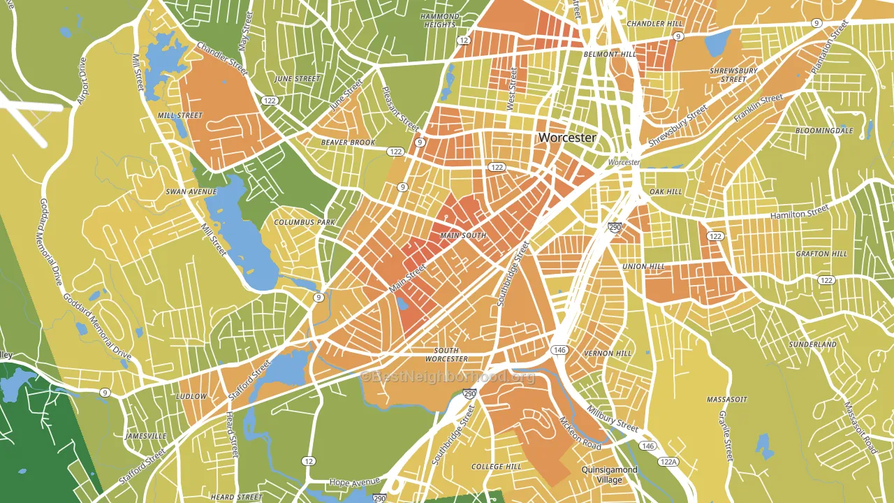
University Park leans heavily Democratic by roughly 36 points: about 68% of voters vote Democratic and 32% Republican.
[sc name="abovemapcta"]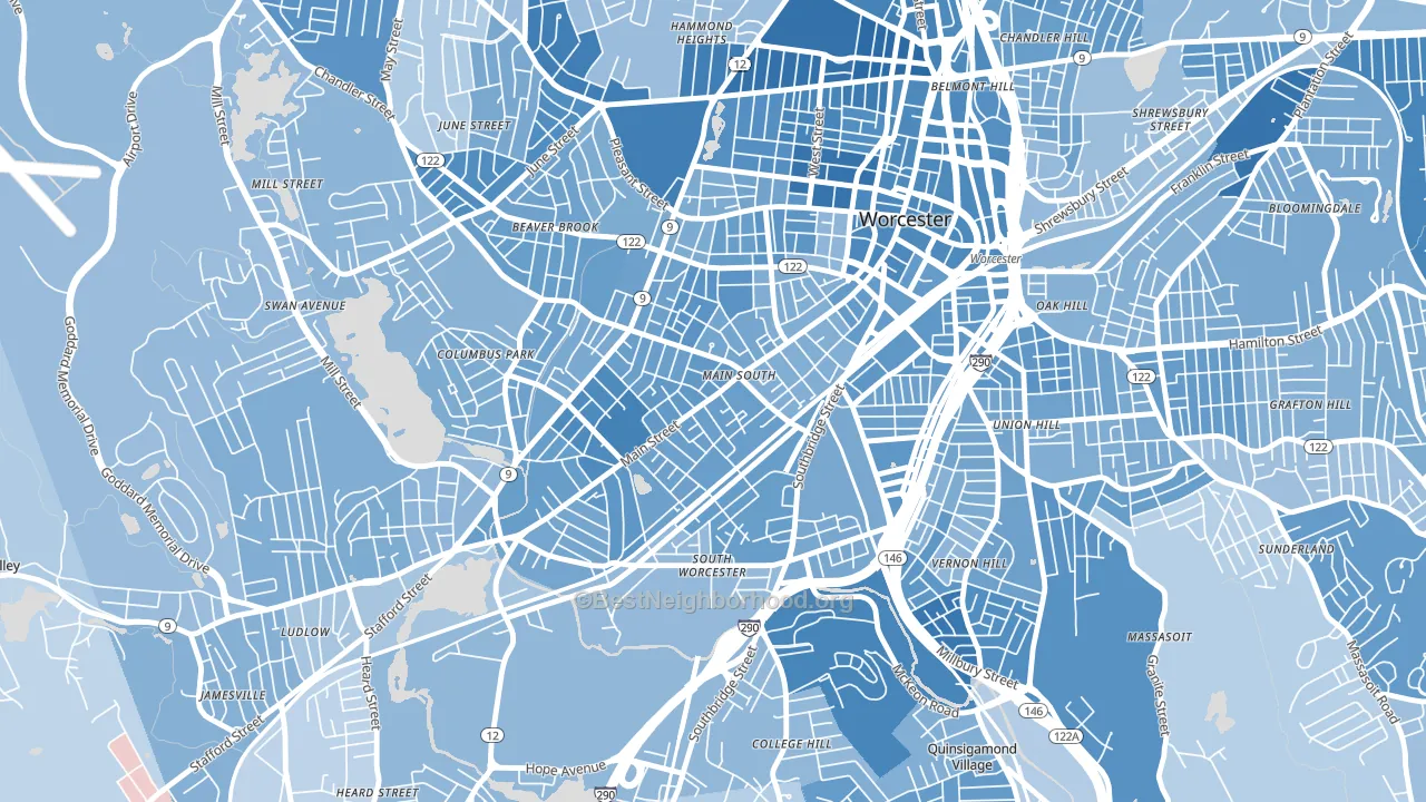 [bestneighborhood_map_controls]
About 27% of adults in University Park typically vote, below the U.S. average of about 62%. Among adults in University Park, ~18% vote Democratic, ~9% Republican, and ~73% don't vote. The map below shows estimated turnout by block group.
 [bestneighborhood_map_controls]
How University Park compares
Among neighborhoods within 5 miles, University Park leans more Democratic than 20 of 25 neighbors.
University Park runs about 11 points more Democratic than Massachusetts as a whole.
Politics vary noticeably by block within University Park. The west side is the most Democratic-leaning (D+45) and the north side is the least Democratic-leaning (D+26), a spread of about 19 points.
Why University Park leans the way it does
This analysis examined 14,881 data points per neighborhood to find what predicts political lean and turnout. The items below are a few correlations that stood out for University Park, not a ranked or complete list of what matters most.
Dense areas vote Democratic. More than 99% of residents in University Park live in densely developed areas, about 64 points above the U.S. average of 36%. A high never-married share predicts Democratic voting, and about 67% of adults in University Park have never been married, above 97% of neighborhoods.
Walkability and Democratic lean
Places with a highly walkable street grid tend to lean Democratic; University Park, Worcester, MA sits in the top quarter nationally on this measure. A walkable street grid does not change how people vote; it mostly reflects how urban a place is.
Why turnout in University Park looks the way it does
Renters vote less often than owners. About 89% of households in University Park rent, about 64 points above the U.S. average of 25%. High food insecurity lines up with lower turnout, and about 37% of adults in University Park report food insecurity, above 91% of neighborhoods. High-crime urban areas turn out at lower rates, and University Park sits in the top 15% on a violent-crime measure. Learn more about the findings and methodology on the political spectrum map.
[one_half]Nearby Neighborhoods
- Main Middle, Worcester, MA D+31
- South Worcester, Worcester, MA D+26
- Columbus Park, Worcester, MA D+29
- Green Island, Worcester, MA D+33
- Vernon Hill, Worcester, MA D+30
- Institute Park, Worcester, MA D+50
- Central Business District, Worcester, MA D+42
- North Quinsigamond Village, Worcester, MA D+37
- Newton Square, Worcester, MA D+31
- Hadwen Park, Worcester, MA D+20
Neighborhoods with Similar Populations
- Lawrence Park, Bronxville, NY D+22
- Belmont Shore, Long Beach, CA D+48
- Kenton, Portland, OR D+74
- Expo Park, Aurora, CO D+33
- Brighton Heights, Pittsburgh, PA D+43
- Central Santa Cruz, Santa Cruz, CA D+65
- SouthWest Anaheim, Anaheim, CA D+11
- Adams Crossroads, Duluth, GA D+28
- Hartford, Providence, RI D+29
- Arlington Hills, Jacksonville, FL D+14
Sources and methodology
Precinct-level voting records used to fit the model come from Massachusetts Secretary of the Commonwealth, Elections, distributed by the Voting and Election Science Team. Demographic inputs come from the U.S. Census Bureau (ACS 5-year estimates and the 2020 Decennial Census). Health and environmental inputs come from the CDC (PLACES and the Environmental Justice Index). Land cover comes from the USGS and EPA. Election-day and lead-up weather come from PRISM 4km daily grids and the NOAA Global Historical Climatology Network. Mail-voting and election-administration patterns come from the MIT Election Lab's Survey of the Performance of American Elections. Block-group crime detail comes from CrimeGrade. Internet data and modeling support provided by ISPreports.org.
Modeling and analysis by the BestNeighborhood data science team. Full methodology and findings: political spectrum map.
Methodology reviewed by the BestNeighborhood data team. Last updated May 2026.