Brooklyn leans heavily Republican by roughly 46 points: about 27% of voters vote Democratic and 73% Republican.
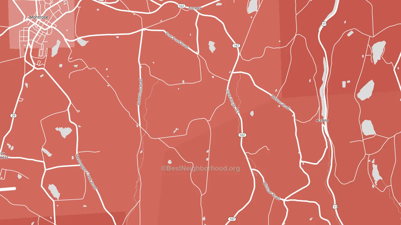
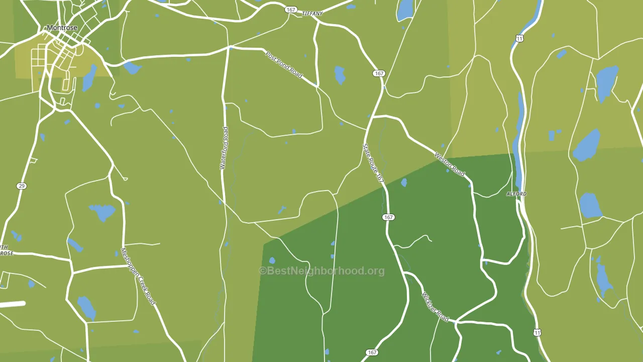
About 74% of adults in Brooklyn typically vote, above the U.S. average of about 62%. Among adults in Brooklyn, ~20% vote Democratic, ~54% Republican, and ~26% don't vote. The map below shows estimated turnout by block group.
How Brooklyn compares
Among cities within 25 miles, Brooklyn leans more Republican than 70 of 121 neighbors.
Brooklyn runs about 44 points more Republican than Pennsylvania as a whole.
Why Brooklyn leans the way it does
Density, race composition, education, and family structure all sit close to their national averages in Brooklyn. The lean here lands roughly where demographic data alone would predict.
Income per capita and voter turnout
Places with high per-capita income tend to turn out at a higher rate; Brooklyn, PA sits in the top tenth nationally on this measure.
Why turnout in Brooklyn looks the way it does
Turnout in Brooklyn sits close to the national pattern. Routine healthcare access, homeownership, education, and food security all land near their national averages here. Learn more about the findings and methodology on the political spectrum map.
Nearby Cities
- Tiffany, PA R+45
- South Montrose, PA R+48
- Heart Lake, PA R+50
- Montrose, PA R+40
- Lindaville, PA R+49
- Kingsley, PA R+51
- New Milford, PA R+49
- Dimock, PA R+52
- Franklin Forks, PA R+47
- Harford, PA R+55
Cities with Similar Populations
- Rathbone, NY R+60
- Dever, OR R+38
- Whitcomb, IN R+66
- Sandfordville, NY R+34
- St. Clair, GA R+27
- Heilman, IN R+56
- Scioto Furnace, OH R+63
- Heathsville, NC D+26
- New Market, MN R+32
- Mazama, WA D+51
Sources and methodology
Precinct-level voting records used to fit the model come from Pennsylvania Department of State, Bureau of Elections, distributed by the Voting and Election Science Team. Demographic inputs come from the U.S. Census Bureau (ACS 5-year estimates and the 2020 Decennial Census). Health and environmental inputs come from the CDC (PLACES and the Environmental Justice Index). Land cover comes from the USGS and EPA. Election-day and lead-up weather come from PRISM 4km daily grids and the NOAA Global Historical Climatology Network. Mail-voting and election-administration patterns come from the MIT Election Lab's Survey of the Performance of American Elections. Block-group crime detail comes from CrimeGrade. Internet data and modeling support provided by ISPreports.org.
Modeling and analysis by the BestNeighborhood data science team. Full methodology and findings: political spectrum map.
Methodology reviewed by the BestNeighborhood data team. Last updated May 2026.