Camelot leans Democratic by roughly 20 points: about 60% of voters vote Democratic and 40% Republican.
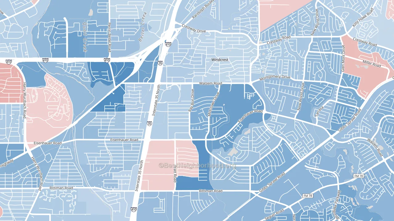
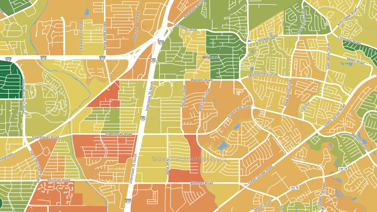
About 44% of adults in Camelot typically vote, below the U.S. average of about 62%. Among adults in Camelot, ~26% vote Democratic, ~18% Republican, and ~56% don't vote. The map below shows estimated turnout by block group.
How Camelot compares
Among neighborhoods within 5 miles, Camelot leans more Democratic than 10 of 19 neighbors.
Camelot runs about 34 points more Democratic than Texas as a whole. Texas leans Republican overall, while Camelot is one of the few Democratic-leaning pockets.
Politics vary noticeably by block within Camelot. The southeast side is the most Democratic-leaning (D+31) and the west side is the least Democratic-leaning (D+6), a spread of about 25 points.
Why Camelot leans the way it does
This analysis examined 14,881 data points per neighborhood to find what predicts political lean and turnout. The items below are a few correlations that stood out for Camelot, not a ranked or complete list of what matters most.
Camelot votes against the grain of Texas. Texas leans Republican overall, while Camelot runs about 34 points more Democratic.
Preventive-care access and voter turnout
Places with limited routine preventive-care access tend to turn out at a lower rate; Camelot, San Antonio, TX sits in the bottom quarter nationally on this measure. Dental visits do not drive turnout; the rate reflects income, insurance, and healthcare access, which line up with who votes.
Why turnout in Camelot looks the way it does
Areas with limited routine healthcare access turn out at lower rates. Camelot is in the bottom quarter nationally for routine-care measures such as insurance coverage, preventive screenings, and dental visits. The uninsured rate here is about 22%, about 11 points above the U.S. average of 10%. Learn more about the findings and methodology on the political spectrum map.
Nearby Neighborhoods
- Park Village, San Antonio, TX D+33
- East Village, San Antonio, TX D+22
- East Terrell Hills, San Antonio, TX D+14
- Sun Gate, San Antonio, TX D+9
- Royal Ridge, San Antonio, TX D+9
- Highland Farms-San Antonio, San Antonio, TX D+36
- Wilshire, San Antonio, TX D+17
- Oakwell Farms, San Antonio, TX D+18
- Sunrise, San Antonio, TX D+30
- Woodlake, San Antonio, TX D+28
Neighborhoods with Similar Populations
- Southwest Quadrant, Alexandria, VA D+62
- Village 12, Sacramento, CA D+31
- Anatolia Village, Rancho Cordova, CA D+10
- Amtrak, San Bernardino, CA D+19
- Prairie Point-Wildberry, Kansas City, MO D+6
- Armory Park, Tucson, AZ D+59
- West Congress, Austin, TX D+57
- South Flagstaff, Flagstaff, AZ D+51
- Granite Hills, El Cajon, CA R+33
- Brookview, Waco, TX D+6
Sources and methodology
Precinct-level voting records used to fit the model come from Texas Secretary of State, Elections Division, distributed by the Voting and Election Science Team. Demographic inputs come from the U.S. Census Bureau (ACS 5-year estimates and the 2020 Decennial Census). Health and environmental inputs come from the CDC (PLACES and the Environmental Justice Index). Land cover comes from the USGS and EPA. Election-day and lead-up weather come from PRISM 4km daily grids and the NOAA Global Historical Climatology Network. Mail-voting and election-administration patterns come from the MIT Election Lab's Survey of the Performance of American Elections. Block-group crime detail comes from CrimeGrade. Internet data and modeling support provided by ISPreports.org.
Modeling and analysis by the BestNeighborhood data science team. Full methodology and findings: political spectrum map.
Methodology reviewed by the BestNeighborhood data team. Last updated May 2026.