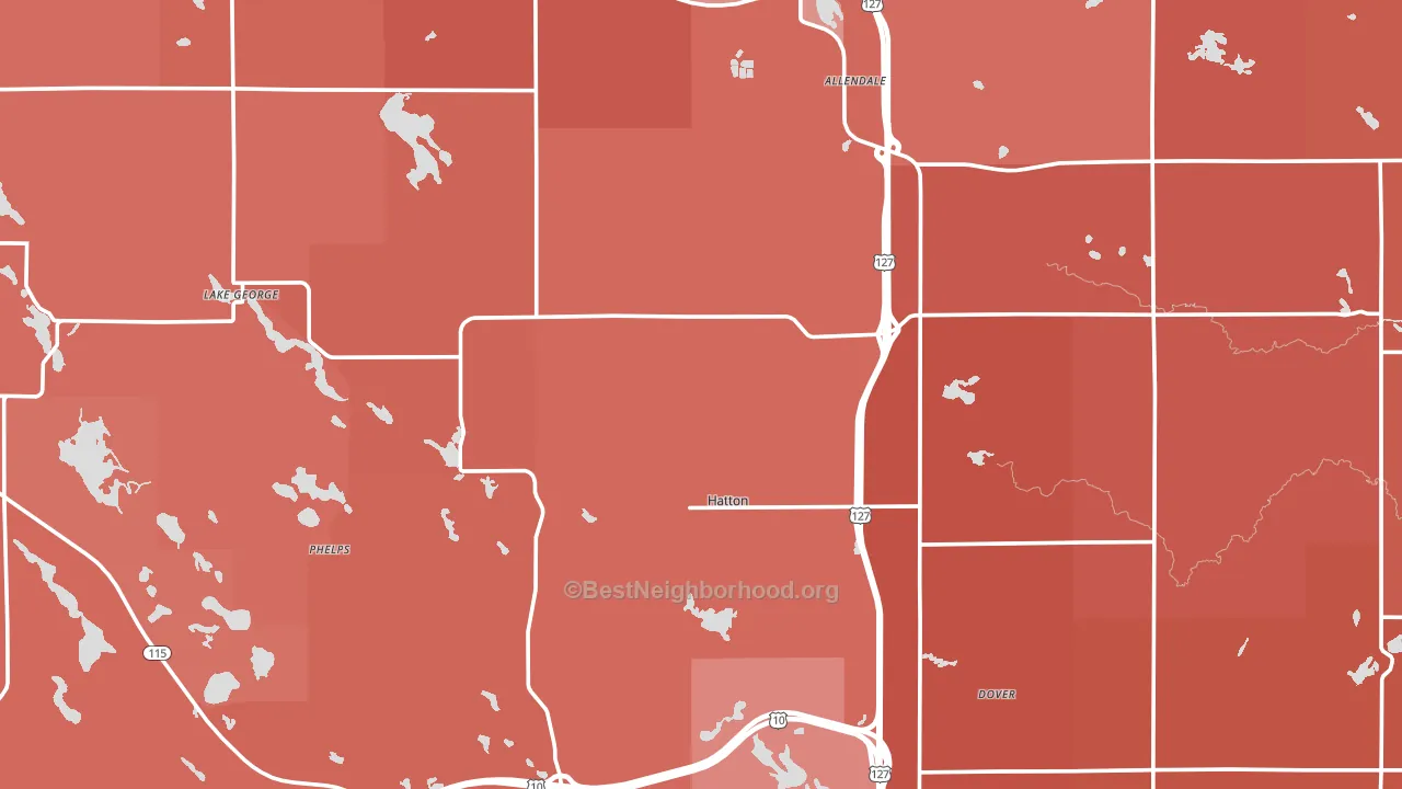
Clare County leans heavily Republican by roughly 40 points: about 30% of voters vote Democratic and 70% Republican.
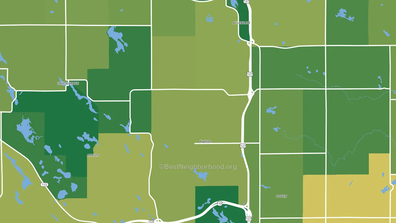
About 82% of adults in Clare County typically vote, above the U.S. average of about 62%. Among adults in Clare County, ~25% vote Democratic, ~57% Republican, and ~18% don't vote. The map below shows estimated turnout by block group.
How Clare County compares
Among counties within 50 miles, Clare County leans more Republican than 9 of 15 neighbors.
Clare County runs about 39 points more Republican than Michigan as a whole.
Politics vary noticeably by city within Clare County. The east side is the most Republican-leaning (R+51) and the southeast side is the least Republican-leaning (R+33), a spread of about 17 points.
Why Clare County leans the way it does
This analysis examined 14,881 data points per county to find what predicts political lean and turnout. The items below are a few correlations that stood out for Clare County, not a ranked or complete list of what matters most.
Areas with a high white share and below-average college attainment vote Republican. In Clare County, about 93% of residents are non-Hispanic white, about 21 points above the U.S. average of 72%; about 14% of adults hold a bachelor's degree, about 13 points below the Michigan average of 26%.
Renting and voter turnout
Places with homeowner-heavy households tend to turn out at a higher rate; Clare County, MI sits in the bottom tenth nationally on this measure.
Why turnout in Clare County looks the way it does
Homeowners vote more often than renters. About 87% of households in Clare County own their home, about 12 points above the U.S. average of 75%. Learn more about the findings and methodology on the political spectrum map.
Nearby Counties
- Gladwin County, MI R+42
- Isabella County, MI R+3
- Osceola County, MI R+46
- Roscommon County, MI R+26
- Missaukee County, MI R+49
- Midland County, MI R+15
- Mecosta County, MI R+26
- Wexford County, MI R+33
- Ogemaw County, MI R+40
- Gratiot County, MI R+28
Counties with Similar Populations
- Caroline County, VA R+15
- Jefferson County, ID R+71
- Freeborn County, MN R+22
- McCurtain County, OK R+55
- Greene County, IN R+55
- Sheridan County, WY R+47
- Obion County, TN R+52
- Muhlenberg County, KY R+55
- Trempealeau County, WI R+26
- Wabash County, IN R+48
Sources and methodology
Precinct-level voting records used to fit the model come from Michigan Department of State, Elections, distributed by the Voting and Election Science Team. Demographic inputs come from the U.S. Census Bureau (ACS 5-year estimates and the 2020 Decennial Census). Health and environmental inputs come from the CDC (PLACES and the Environmental Justice Index). Land cover comes from the USGS and EPA. Election-day and lead-up weather come from PRISM 4km daily grids and the NOAA Global Historical Climatology Network. Mail-voting and election-administration patterns come from the MIT Election Lab's Survey of the Performance of American Elections. Block-group crime detail comes from CrimeGrade. Internet data and modeling support provided by ISPreports.org.
Modeling and analysis by the BestNeighborhood data science team. Full methodology and findings: political spectrum map.
Methodology reviewed by the BestNeighborhood data team. Last updated May 2026.