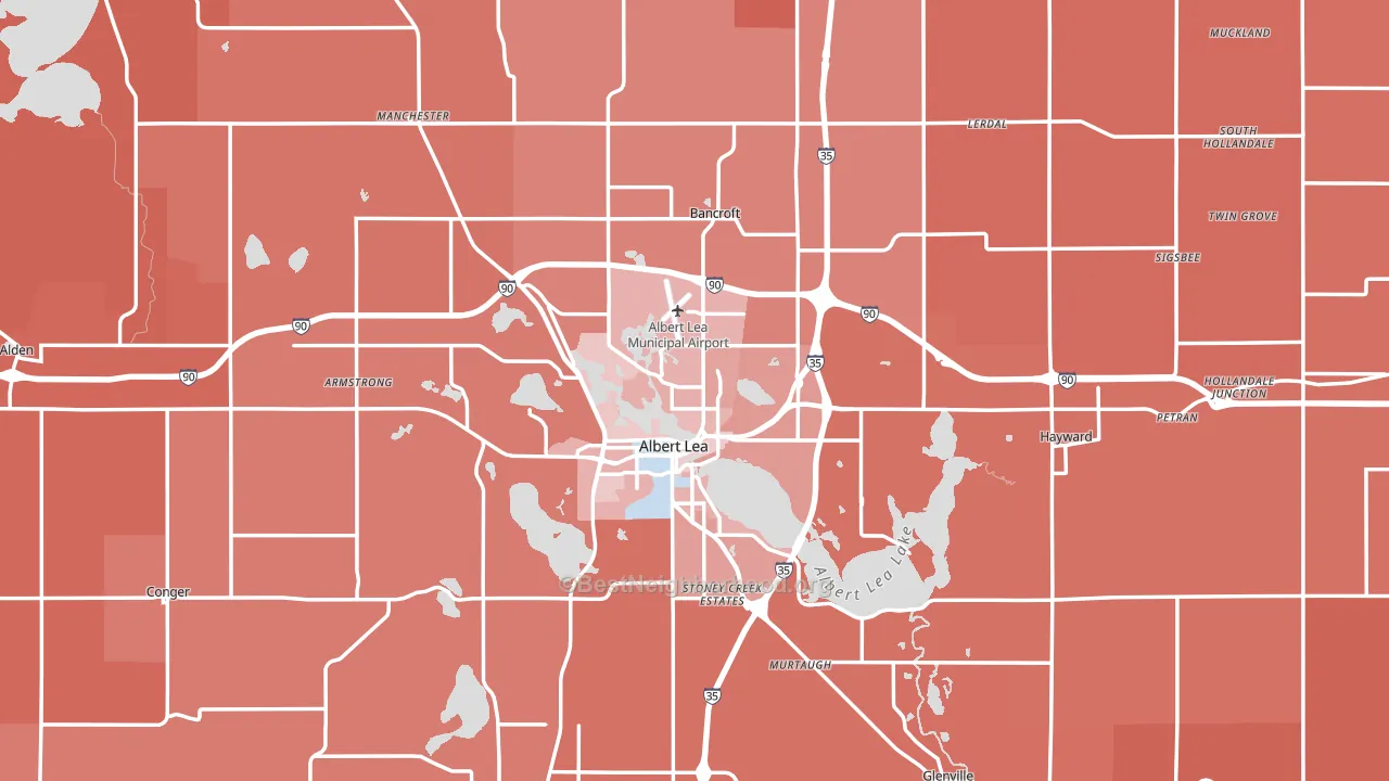
Freeborn County leans Republican by roughly 22 points: about 39% of voters vote Democratic and 61% Republican.
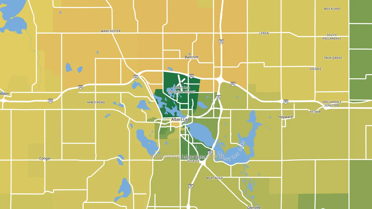
About 69% of adults in Freeborn County typically vote, above the U.S. average of about 62%. Among adults in Freeborn County, ~27% vote Democratic, ~42% Republican, and ~31% don't vote. The map below shows estimated turnout by block group.
How Freeborn County compares
Among counties within 50 miles, Freeborn County leans more Republican than 4 of 12 neighbors.
Freeborn County runs about 26 points more Republican than Minnesota as a whole. Minnesota leans Democratic overall, while Freeborn County is one of the few Republican-leaning pockets.
Politics vary noticeably by city within Freeborn County. The northwest side is the most Republican-leaning (R+45) and the south side is the least Republican-leaning (R+17), a spread of about 28 points.
Why Freeborn County leans the way it does
This analysis examined 14,881 data points per county to find what predicts political lean and turnout. The items below are a few correlations that stood out for Freeborn County, not a ranked or complete list of what matters most.
Freeborn County votes against the grain of Minnesota. Minnesota leans Democratic overall, while Freeborn County runs about 26 points more Republican.
Park access and Republican lean
Places with low park coverage tend to lean Republican; Freeborn County, MN sits below the national average on this measure. Park access does not change how people vote; it tends to track denser, higher-income areas.
Why turnout in Freeborn County looks the way it does
Homeowners vote more often than renters. About 80% of households in Freeborn County own their home, about 5 points above the U.S. average of 75%. Learn more about the findings and methodology on the political spectrum map.
Nearby Counties
- Worth County, IA R+37
- Mower County, MN R+13
- Winnebago County, IA R+28
- Steele County, MN R+22
- Waseca County, MN R+32
- Faribault County, MN R+38
- Mitchell County, IA R+36
- Cerro Gordo County, IA R+18
- Dodge County, MN R+31
- Hancock County, IA R+42
Counties with Similar Populations
- Jefferson County, ID R+71
- Caroline County, VA R+15
- Sheridan County, WY R+47
- Muhlenberg County, KY R+55
- Clare County, MI R+40
- Wabash County, IN R+48
- McCurtain County, OK R+55
- Bolivar County, MS D+34
- Greene County, IN R+55
- Elk County, PA R+42
Sources and methodology
Precinct-level voting records used to fit the model come from Minnesota Secretary of State, Elections, distributed by the Voting and Election Science Team. Demographic inputs come from the U.S. Census Bureau (ACS 5-year estimates and the 2020 Decennial Census). Health and environmental inputs come from the CDC (PLACES and the Environmental Justice Index). Land cover comes from the USGS and EPA. Election-day and lead-up weather come from PRISM 4km daily grids and the NOAA Global Historical Climatology Network. Mail-voting and election-administration patterns come from the MIT Election Lab's Survey of the Performance of American Elections. Block-group crime detail comes from CrimeGrade. Internet data and modeling support provided by ISPreports.org.
Modeling and analysis by the BestNeighborhood data science team. Full methodology and findings: political spectrum map.
Methodology reviewed by the BestNeighborhood data team. Last updated May 2026.