Cleburne County is a Republican stronghold. About 8% of voters here vote Democratic and 92% Republican.
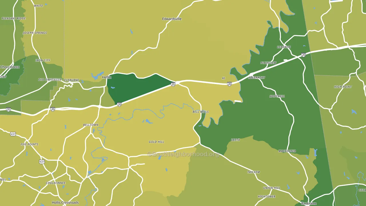
About 67% of adults in Cleburne County typically vote, near the U.S. average of about 62%. Among adults in Cleburne County, ~5% vote Democratic, ~61% Republican, and ~34% don't vote. The map below shows estimated turnout by block group.
How Cleburne County compares
Among counties within 50 miles, Cleburne County is the most Republican-leaning.
Cleburne County runs about 54 points more Republican than Alabama as a whole.
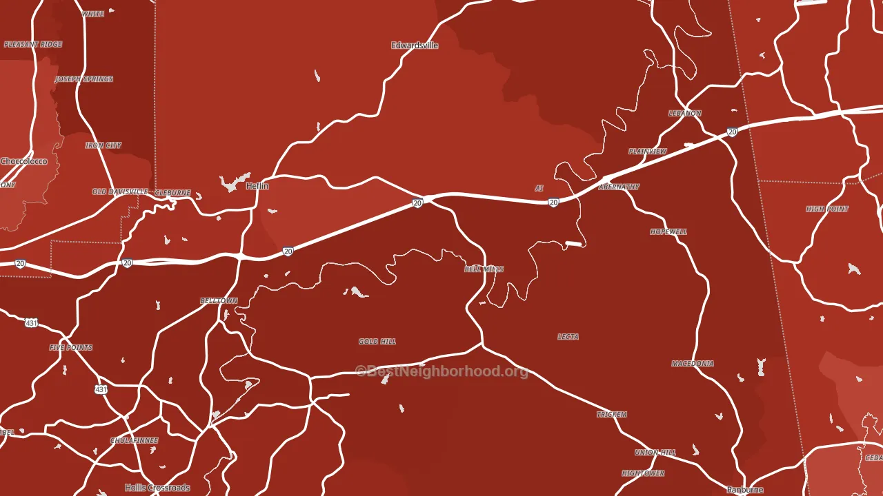
Politics vary noticeably by city within Cleburne County. The southeast side is the most Republican-leaning (R+89) and the west side is the least Republican-leaning (R+76), a spread of about 13 points.
Why Cleburne County leans the way it does
This analysis examined 14,881 data points per county to find what predicts political lean and turnout. The items below are a few correlations that stood out for Cleburne County, not a ranked or complete list of what matters most.
Rural areas vote Republican. About 9% of residents in Cleburne County live in densely developed areas, about 10 points below the Alabama average of 19%. A high white share with below-average college attainment predicts Republican voting, and Cleburne County fits that profile on both counts.
Walkability and Republican lean
Places with a low walkability score tend to lean Republican; Cleburne County, AL sits in the bottom quarter nationally on this measure. A walkable street grid does not change how people vote; it mostly reflects how urban a place is.
Why turnout in Cleburne County looks the way it does
Turnout in Cleburne County sits close to the national pattern. Learn more about the findings and methodology on the political spectrum map.
Nearby Counties
- Calhoun County, AL R+35
- Haralson County, GA R+73
- Randolph County, AL R+59
- Carroll County, GA R+35
- Clay County, AL R+65
- Heard County, GA R+71
- Polk County, GA R+53
- Cherokee County, AL R+76
- Etowah County, AL R+49
- Talladega County, AL R+27
Counties with Similar Populations
- Missaukee County, MI R+49
- Torrance County, NM R+36
- Hamilton County, IA R+34
- Jackson Parish, LA R+43
- Fleming County, KY R+61
- Arenac County, MI R+40
- Jackson County, TX R+62
- Clay County, SD D+2
- Kingfisher County, OK R+64
- Pecos County, TX R+28
Sources and methodology
Precinct-level voting records used to fit the model come from Alabama Secretary of State, Elections, distributed by the Voting and Election Science Team. Demographic inputs come from the U.S. Census Bureau (ACS 5-year estimates and the 2020 Decennial Census). Health and environmental inputs come from the CDC (PLACES and the Environmental Justice Index). Land cover comes from the USGS and EPA. Election-day and lead-up weather come from PRISM 4km daily grids and the NOAA Global Historical Climatology Network. Mail-voting and election-administration patterns come from the MIT Election Lab's Survey of the Performance of American Elections. Block-group crime detail comes from CrimeGrade. Internet data and modeling support provided by ISPreports.org.
Modeling and analysis by the BestNeighborhood data science team. Full methodology and findings: political spectrum map.
Methodology reviewed by the BestNeighborhood data team. Last updated May 2026.