Clinton County leans heavily Republican by roughly 46 points: about 27% of voters vote Democratic and 73% Republican.
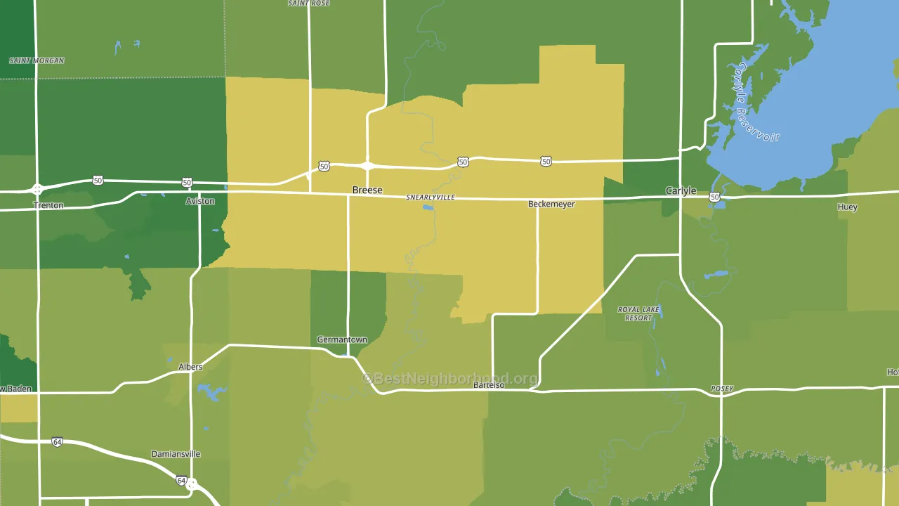
About 72% of adults in Clinton County typically vote, above the U.S. average of about 62%. Among adults in Clinton County, ~19% vote Democratic, ~53% Republican, and ~28% don't vote. The map below shows estimated turnout by block group.
How Clinton County compares
Among counties within 50 miles, Clinton County leans more Republican than 10 of 14 neighbors.
Clinton County runs about 58 points more Republican than Illinois as a whole. Illinois leans Democratic overall, while Clinton County is one of the few Republican-leaning pockets.
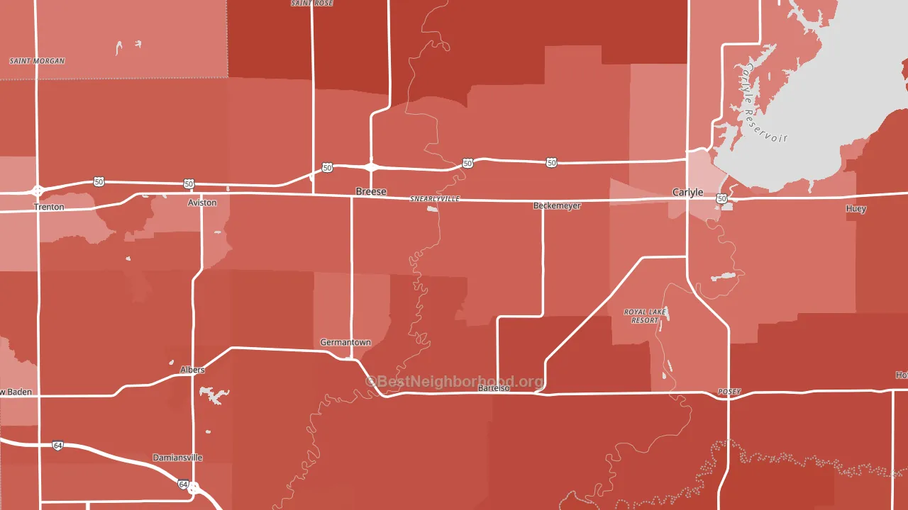
Politics vary noticeably by city within Clinton County. The south side is the most Republican-leaning (R+58) and the west side is the least Republican-leaning (R+39), a spread of about 20 points.
Why Clinton County leans the way it does
This analysis examined 14,881 data points per county to find what predicts political lean and turnout. The items below are a few correlations that stood out for Clinton County, not a ranked or complete list of what matters most.
Clinton County votes against the grain of Illinois. Illinois leans Democratic overall, while Clinton County runs about 58 points more Republican.
High-school completion, uninsured rate, and voter turnout
Places that combine high-school-completion-heavy adults and a low uninsured rate tend to turn out at a higher rate, as Clinton County, IL does.
Why turnout in Clinton County looks the way it does
Homeowners vote more often than renters. About 81% of households in Clinton County own their home, about 6 points above the U.S. average of 75%. Learn more about the findings and methodology on the political spectrum map.
Nearby Counties
- Washington County, IL R+53
- Bond County, IL R+39
- Marion County, IL R+47
- St. Clair County, IL D+13
- Madison County, IL R+11
- Jefferson County, IL R+44
- Fayette County, IL R+59
- Perry County, IL R+49
- Monroe County, IL R+39
- Randolph County, IL R+45
Counties with Similar Populations
- Delta County, MI R+22
- Dare County, NC R+25
- Webster Parish, LA R+27
- Clark County, KY R+39
- Dyer County, TN R+47
- Webster County, IA R+22
- Hopkins County, TX R+61
- Chippewa County, MI R+11
- Macon County, NC R+42
- McLeod County, MN R+40
Sources and methodology
Precinct-level voting records used to fit the model come from Illinois State Board of Elections, distributed by the Voting and Election Science Team. Demographic inputs come from the U.S. Census Bureau (ACS 5-year estimates and the 2020 Decennial Census). Health and environmental inputs come from the CDC (PLACES and the Environmental Justice Index). Land cover comes from the USGS and EPA. Election-day and lead-up weather come from PRISM 4km daily grids and the NOAA Global Historical Climatology Network. Mail-voting and election-administration patterns come from the MIT Election Lab's Survey of the Performance of American Elections. Block-group crime detail comes from CrimeGrade. Internet data and modeling support provided by ISPreports.org.
Modeling and analysis by the BestNeighborhood data science team. Full methodology and findings: political spectrum map.
Methodology reviewed by the BestNeighborhood data team. Last updated May 2026.