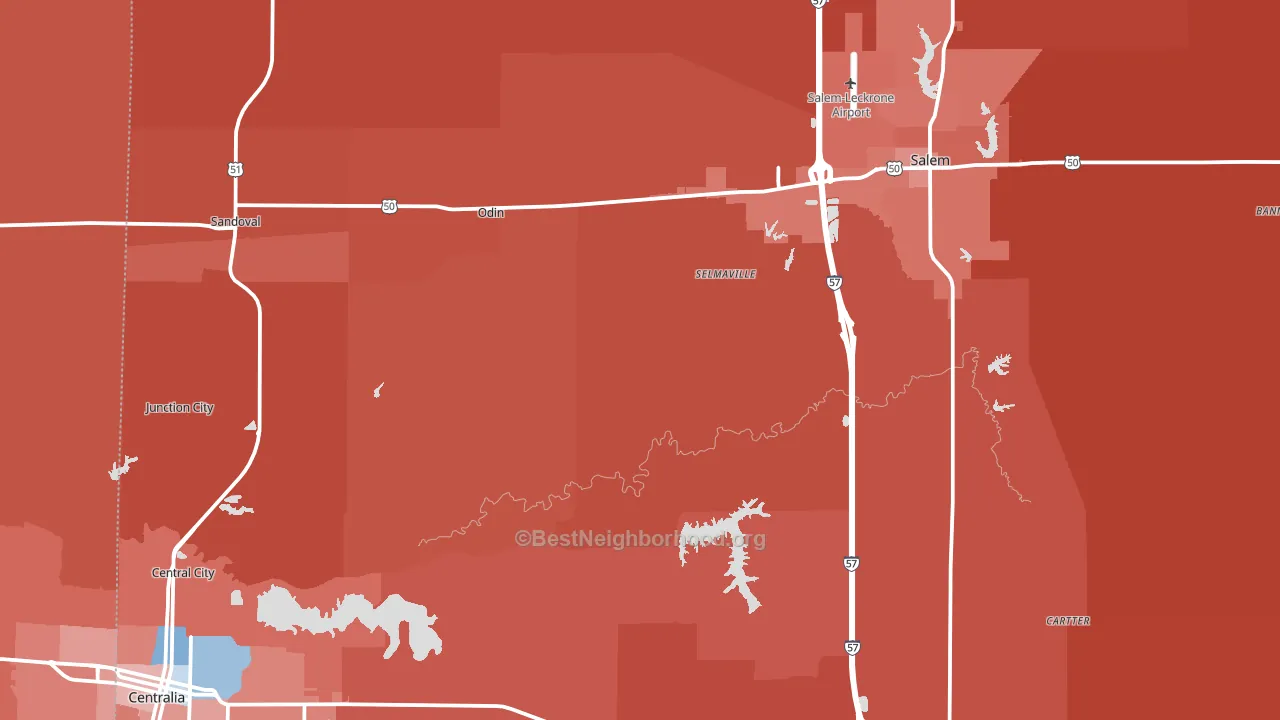
Marion County leans heavily Republican by roughly 48 points: about 26% of voters vote Democratic and 74% Republican.
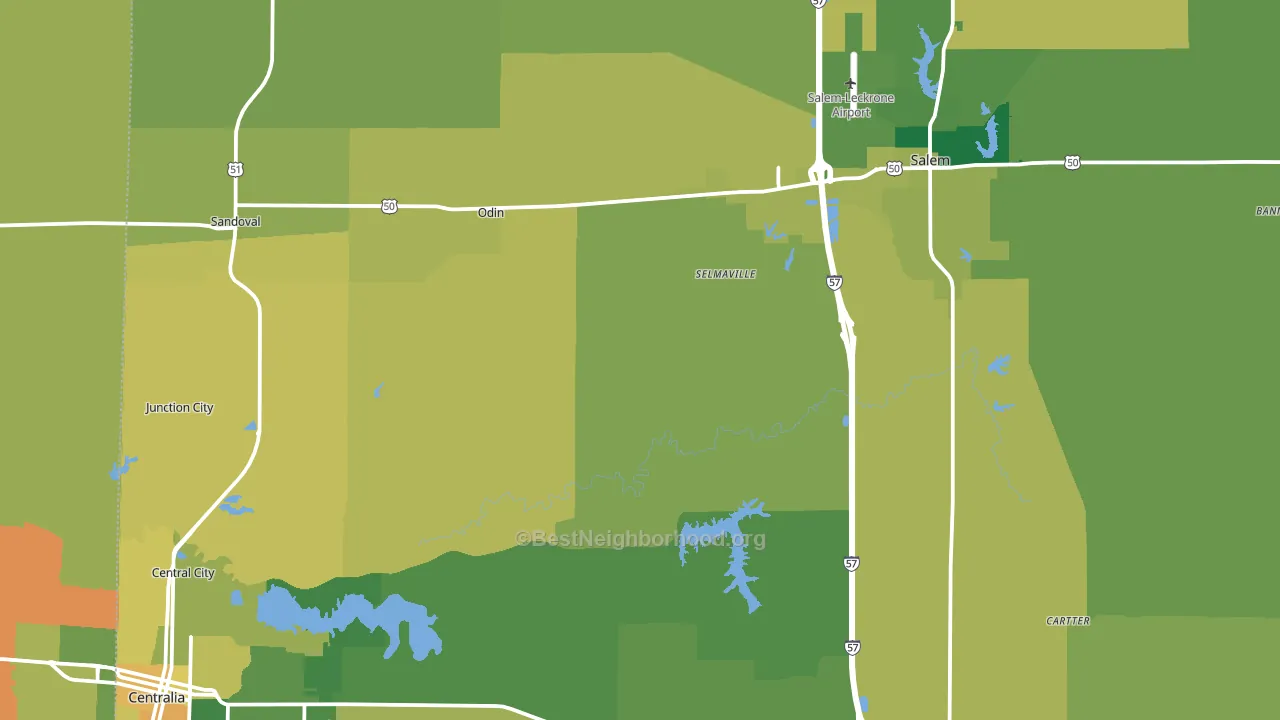
About 71% of adults in Marion County typically vote, above the U.S. average of about 62%. Among adults in Marion County, ~18% vote Democratic, ~53% Republican, and ~29% don't vote. The map below shows estimated turnout by block group.
How Marion County compares
Among counties within 50 miles, Marion County leans more Republican than 4 of 12 neighbors.
Marion County runs about 58 points more Republican than Illinois as a whole. Illinois leans Democratic overall, while Marion County is one of the few Republican-leaning pockets.
Politics vary noticeably by city within Marion County. The southeast side is the most Republican-leaning (R+68) and the southwest side is the least Republican-leaning (R+19), a spread of about 48 points.
Why Marion County leans the way it does
This analysis examined 14,881 data points per county to find what predicts political lean and turnout. The items below are a few correlations that stood out for Marion County, not a ranked or complete list of what matters most.
Marion County votes against the grain of Illinois. Illinois leans Democratic overall, while Marion County runs about 58 points more Republican. Car-dependent areas vote Republican, and about 82% of residents in Marion County drive to work alone, above 81% of counties. Low college attainment predicts Republican voting, and Marion County sits in the bottom quarter (about 16%, below 80% of counties).
Local retail density and voter turnout
Places with dense local retail within a mile tend to turn out at a higher rate; Marion County, IL sits above the national average on this measure. Nearby retail does not change how people vote; it reflects how urban and built-up a place is.
Why turnout in Marion County looks the way it does
Turnout in Marion County sits close to the national pattern. Routine healthcare access, homeownership, education, and food security all land near their national averages here. Learn more about the findings and methodology on the political spectrum map.
Nearby Counties
- Jefferson County, IL R+44
- Clinton County, IL R+47
- Washington County, IL R+53
- Fayette County, IL R+59
- Clay County, IL R+63
- Bond County, IL R+39
- Wayne County, IL R+65
- Perry County, IL R+49
- Effingham County, IL R+56
- Hamilton County, IL R+62
Counties with Similar Populations
- Newberry County, SC R+22
- Franklin County, IL R+52
- Jasper County, IA R+28
- Oneida County, WI R+18
- Louisa County, VA R+32
- Cass County, IN R+38
- Covington County, AL R+66
- Talbot County, MD Even
- Montgomery County, IN R+44
- Independence County, AR R+57
Sources and methodology
Precinct-level voting records used to fit the model come from Illinois State Board of Elections, distributed by the Voting and Election Science Team. Demographic inputs come from the U.S. Census Bureau (ACS 5-year estimates and the 2020 Decennial Census). Health and environmental inputs come from the CDC (PLACES and the Environmental Justice Index). Land cover comes from the USGS and EPA. Election-day and lead-up weather come from PRISM 4km daily grids and the NOAA Global Historical Climatology Network. Mail-voting and election-administration patterns come from the MIT Election Lab's Survey of the Performance of American Elections. Block-group crime detail comes from CrimeGrade. Internet data and modeling support provided by ISPreports.org.
Modeling and analysis by the BestNeighborhood data science team. Full methodology and findings: political spectrum map.
Methodology reviewed by the BestNeighborhood data team. Last updated May 2026.