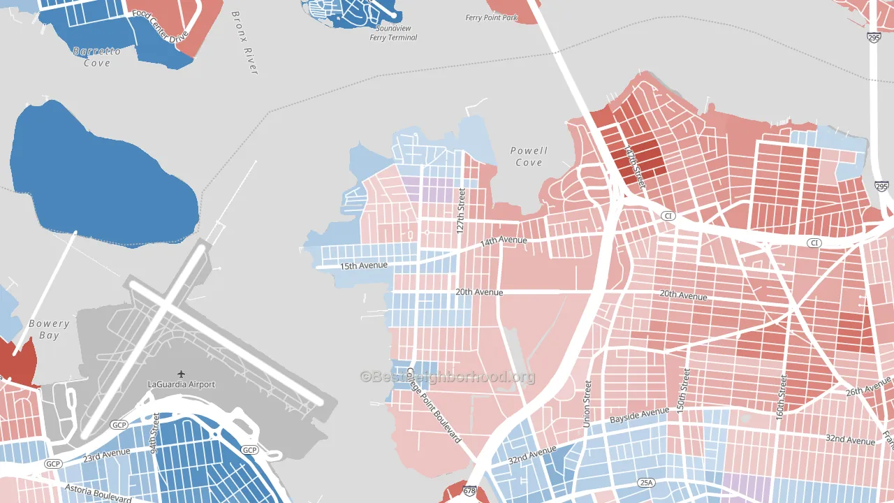
College Point leans slightly Republican by roughly 6 points: about 47% of voters vote Democratic and 53% Republican.
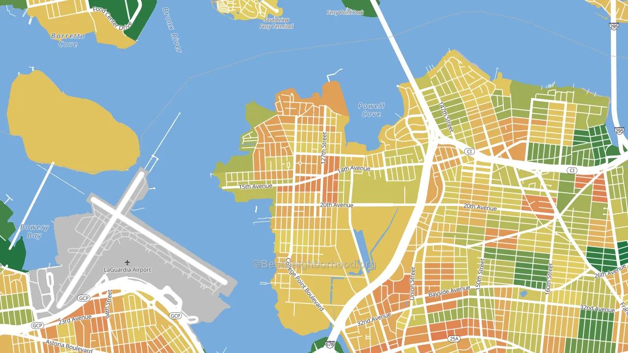
About 39% of adults in College Point typically vote, below the U.S. average of about 62%. Among adults in College Point, ~19% vote Democratic, ~21% Republican, and ~60% don't vote. The map below shows estimated turnout by block group.
How College Point compares
Among neighborhoods within 5 miles, College Point leans more Republican than 28 of 34 neighbors.
College Point runs about 18 points more Republican than New York as a whole. New York leans Democratic overall, while College Point is one of the few Republican-leaning pockets.
Politics vary noticeably by block within College Point. The west side runs the most Democratic (Even) and the east side runs the most Republican (R+13), a spread of about 15 points.
Why College Point leans the way it does
This analysis examined 14,881 data points per neighborhood to find what predicts political lean and turnout. The items below are a few correlations that stood out for College Point, not a ranked or complete list of what matters most.
Areas with many family households vote Republican. About 78% of households in College Point are family households, about 11 points above the U.S. average of 67%. College Point runs against the grain of New York, a Republican-leaning pocket in a Democratic-leaning state.
Cancer-screening access and voter turnout
Places with low colon-cancer-screening access tend to turn out at a lower rate; College Point, Queens, NY sits in the bottom quarter nationally on this measure. Cancer screening does not drive turnout; it reflects income, insurance, and healthcare access.
Why turnout in College Point looks the way it does
Crowded housing lines up with lower turnout. About 8% of homes in College Point have more than one occupant per room, above 87% of neighborhoods. Learn more about the findings and methodology on the political spectrum map.
Nearby Neighborhoods
- Malba, Queens, NY R+20
- Whitestone, Queens, NY R+22
- Flushing, Queens, NY Even
- Beechhurst, Queens, NY R+20
- Unionport, Bronx, NY D+39
- Corona, Queens, NY D+14
- Jackson Heights-ny, Queens, NY D+18
- East Elmhurst, Queens, NY R+11
- Soundview, Bronx, NY D+47
- Throgs Neck-Edgewater Park, Bronx, NY D+4
Neighborhoods with Similar Populations
- Northern Arizona University, Flagstaff, AZ D+63
- Avenues West, Milwaukee, WI D+52
- South East, Pasadena, CA D+56
- West University Austin, Austin, TX D+57
- Taku-Campbell, Anchorage, AK D+21
- Lower Northwood, Baltimore, MD D+84
- Drake, Des Moines, IA D+50
- Logan, Spokane, WA D+30
- West Bench, Boise, ID D+4
- Riverside, Cambridge, MA D+78
Sources and methodology
Precinct-level voting records used to fit the model come from New York State Board of Elections, distributed by the Voting and Election Science Team. Demographic inputs come from the U.S. Census Bureau (ACS 5-year estimates and the 2020 Decennial Census). Health and environmental inputs come from the CDC (PLACES and the Environmental Justice Index). Land cover comes from the USGS and EPA. Election-day and lead-up weather come from PRISM 4km daily grids and the NOAA Global Historical Climatology Network. Mail-voting and election-administration patterns come from the MIT Election Lab's Survey of the Performance of American Elections. Block-group crime detail comes from CrimeGrade. Internet data and modeling support provided by ISPreports.org.
Modeling and analysis by the BestNeighborhood data science team. Full methodology and findings: political spectrum map.
Methodology reviewed by the BestNeighborhood data team. Last updated May 2026.