Cuf is a Democratic stronghold. About 77% of voters here vote Democratic and 23% Republican.
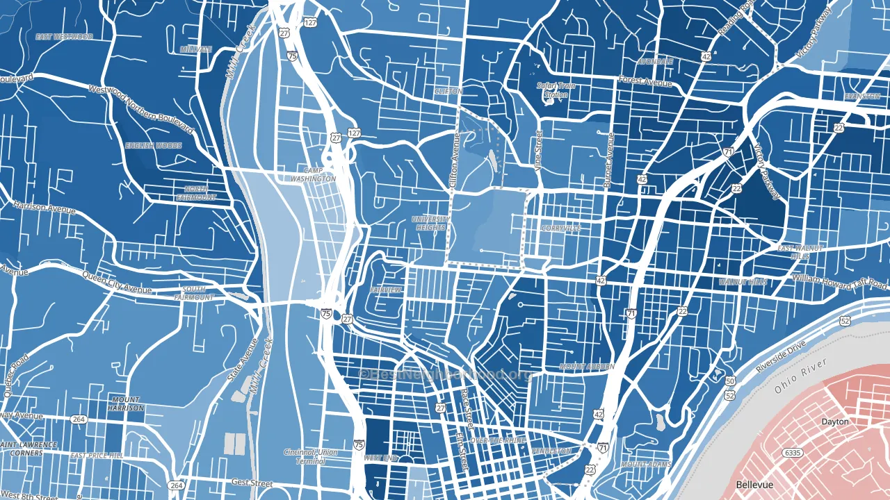
About 36% of adults in Cuf typically vote, below the U.S. average of about 62%. Among adults in Cuf, ~28% vote Democratic, ~8% Republican, and ~64% don't vote. The map below shows estimated turnout by block group.
How Cuf compares
Among neighborhoods within 5 miles, Cuf leans more Democratic than 8 of 22 neighbors.
Cuf runs about 65 points more Democratic than Ohio as a whole. Ohio leans Republican overall, while Cuf is one of the few Democratic-leaning pockets.
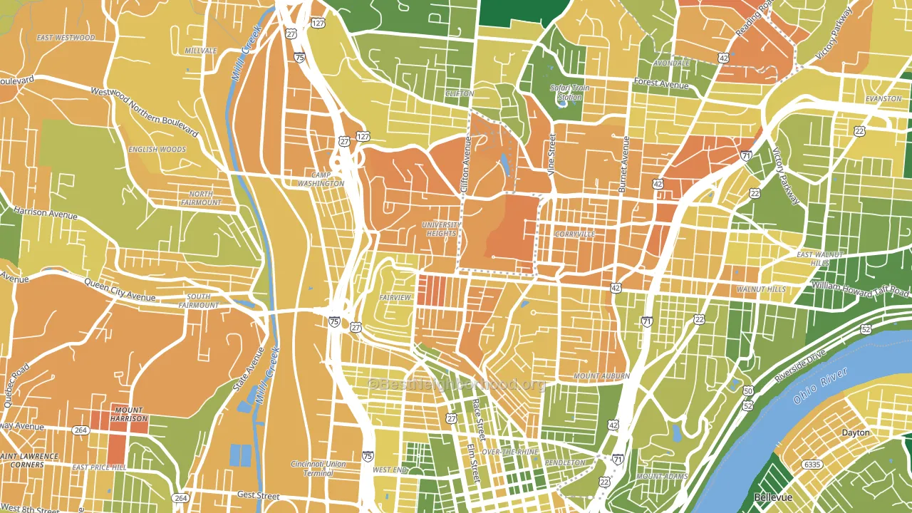
Politics vary noticeably by block within Cuf. The northwest side is the most Democratic-leaning (D+59) and the northeast side is the least Democratic-leaning (D+48), a spread of about 10 points.
Why Cuf leans the way it does
This analysis examined 14,881 data points per neighborhood to find what predicts political lean and turnout. The items below are a few correlations that stood out for Cuf, not a ranked or complete list of what matters most.
Cuf votes against the grain of Ohio. Ohio leans Republican overall, while Cuf runs about 65 points more Democratic. A high never-married share predicts Democratic voting, and about 89% of adults in Cuf have never been married, in the top fraction of neighborhoods.
Walkability and Democratic lean
Places with a highly walkable street grid tend to lean Democratic; Cuf, Cincinnati, OH sits in the top quarter nationally on this measure. A walkable street grid does not change how people vote; it mostly reflects how urban a place is.
Why turnout in Cuf looks the way it does
Renters vote less often than owners. About 84% of households in Cuf rent, about 59 points above the U.S. average of 25%. High-crime urban areas turn out at lower rates, and Cuf sits in the top 15% on a violent-crime measure. Learn more about the findings and methodology on the political spectrum map.
Nearby Neighborhoods
- Corryville, Cincinnati, OH D+54
- Mount Auburn, Cincinnati, OH D+67
- Over-the-Rhine, Cincinnati, OH D+68
- Clifton, Cincinnati, OH D+68
- West End, Cincinnati, OH D+75
- Avondale, Cincinnati, OH D+83
- Walnut Hills, Cincinnati, OH D+74
- Central Business District, Cincinnati, OH D+52
- South Fairmount, Cincinnati, OH D+54
- North Avondale, Cincinnati, OH D+81
Neighborhoods with Similar Populations
- Green Valley Ranch, Henderson, NV D+4
- Heights, Billings, MT R+29
- Rainier Beach, Seattle, WA D+59
- Gibson Springs, Henderson, NV D+8
- Rice, Houston, TX D+39
- Vance Jackson, San Antonio, TX D+20
- Far Southwest, Portland, OR D+61
- Lakeview, Stockton, CA D+20
- Wallingford, Seattle, WA D+83
- Dayton's Bluff, St. Paul, MN D+46
Sources and methodology
Precinct-level voting records used to fit the model come from Ohio Secretary of State, Elections, distributed by the Voting and Election Science Team. Demographic inputs come from the U.S. Census Bureau (ACS 5-year estimates and the 2020 Decennial Census). Health and environmental inputs come from the CDC (PLACES and the Environmental Justice Index). Land cover comes from the USGS and EPA. Election-day and lead-up weather come from PRISM 4km daily grids and the NOAA Global Historical Climatology Network. Mail-voting and election-administration patterns come from the MIT Election Lab's Survey of the Performance of American Elections. Block-group crime detail comes from CrimeGrade. Internet data and modeling support provided by ISPreports.org.
Modeling and analysis by the BestNeighborhood data science team. Full methodology and findings: political spectrum map.
Methodology reviewed by the BestNeighborhood data team. Last updated May 2026.