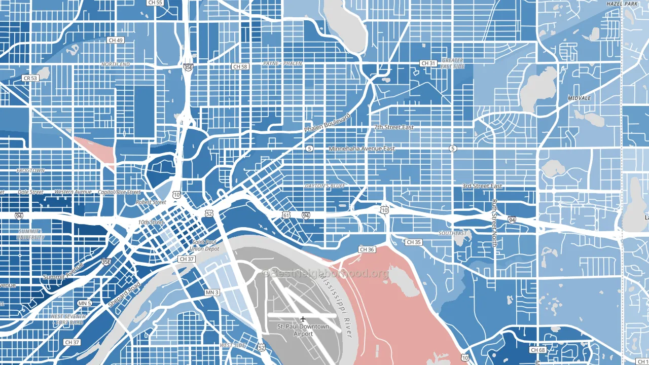
Dayton's Bluff leans heavily Democratic by roughly 46 points: about 73% of voters vote Democratic and 27% Republican.
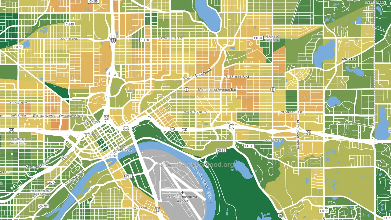
About 55% of adults in Dayton's Bluff typically vote, below the U.S. average of about 62%. Among adults in Dayton's Bluff, ~40% vote Democratic, ~15% Republican, and ~45% don't vote. The map below shows estimated turnout by block group.
How Dayton's Bluff compares
Among neighborhoods within 5 miles, Dayton's Bluff leans more Democratic than 5 of 11 neighbors.
Dayton's Bluff runs about 42 points more Democratic than Minnesota as a whole.
Politics vary noticeably by block within Dayton's Bluff. The west side is the most Democratic-leaning (D+56) and the east side is the least Democratic-leaning (D+38), a spread of about 18 points.
Why Dayton's Bluff leans the way it does
This analysis examined 14,881 data points per neighborhood to find what predicts political lean and turnout. The items below are a few correlations that stood out for Dayton's Bluff, not a ranked or complete list of what matters most.
Areas with many never-married adults vote Democratic. About 49% of adults in Dayton's Bluff have never been married, modestly above similar-sized neighborhoods (around 41%).
Walkability and Democratic lean
Places with a highly walkable street grid tend to lean Democratic; Dayton's Bluff, St. Paul, MN sits above the national average on this measure. A walkable street grid does not change how people vote; it mostly reflects how urban a place is.
Why turnout in Dayton's Bluff looks the way it does
Crowded housing lines up with lower turnout. About 10% of homes in Dayton's Bluff have more than one occupant per room, above 90% of neighborhoods. High-crime urban areas turn out at lower rates, and Dayton's Bluff sits in the top 15% on a violent-crime measure. Learn more about the findings and methodology on the political spectrum map.
Nearby Neighborhoods
- Payne Phallen, St. Paul, MN D+40
- Downtown Minneapolis, St. Paul, MN D+64
- Greater Eastside, St. Paul, MN D+32
- Battle Creek, St. Paul, MN D+39
- West Side, St. Paul, MN D+46
- North End, St. Paul, MN D+45
- Thomas-Dale, St. Paul, MN D+53
- Summit-University, St. Paul, MN D+72
- West 7th, St. Paul, MN D+59
- Summit Hill, St. Paul, MN D+71
Neighborhoods with Similar Populations
- Vance Jackson, San Antonio, TX D+20
- Flat Rock Area, Flat Rock, MI R+11
- Bernal Heights, San Francisco, CA D+78
- Cuf, Cincinnati, OH D+54
- Green Valley Ranch, Henderson, NV D+4
- Heights, Billings, MT R+29
- Rainier Beach, Seattle, WA D+59
- Gibson Springs, Henderson, NV D+8
- Rice, Houston, TX D+39
- Sandalwood, Jacksonville, FL R+6
Sources and methodology
Precinct-level voting records used to fit the model come from Minnesota Secretary of State, Elections, distributed by the Voting and Election Science Team. Demographic inputs come from the U.S. Census Bureau (ACS 5-year estimates and the 2020 Decennial Census). Health and environmental inputs come from the CDC (PLACES and the Environmental Justice Index). Land cover comes from the USGS and EPA. Election-day and lead-up weather come from PRISM 4km daily grids and the NOAA Global Historical Climatology Network. Mail-voting and election-administration patterns come from the MIT Election Lab's Survey of the Performance of American Elections. Block-group crime detail comes from CrimeGrade. Internet data and modeling support provided by ISPreports.org.
Modeling and analysis by the BestNeighborhood data science team. Full methodology and findings: political spectrum map.
Methodology reviewed by the BestNeighborhood data team. Last updated May 2026.