Davis Tract leans heavily Democratic by roughly 36 points: about 68% of voters vote Democratic and 32% Republican.
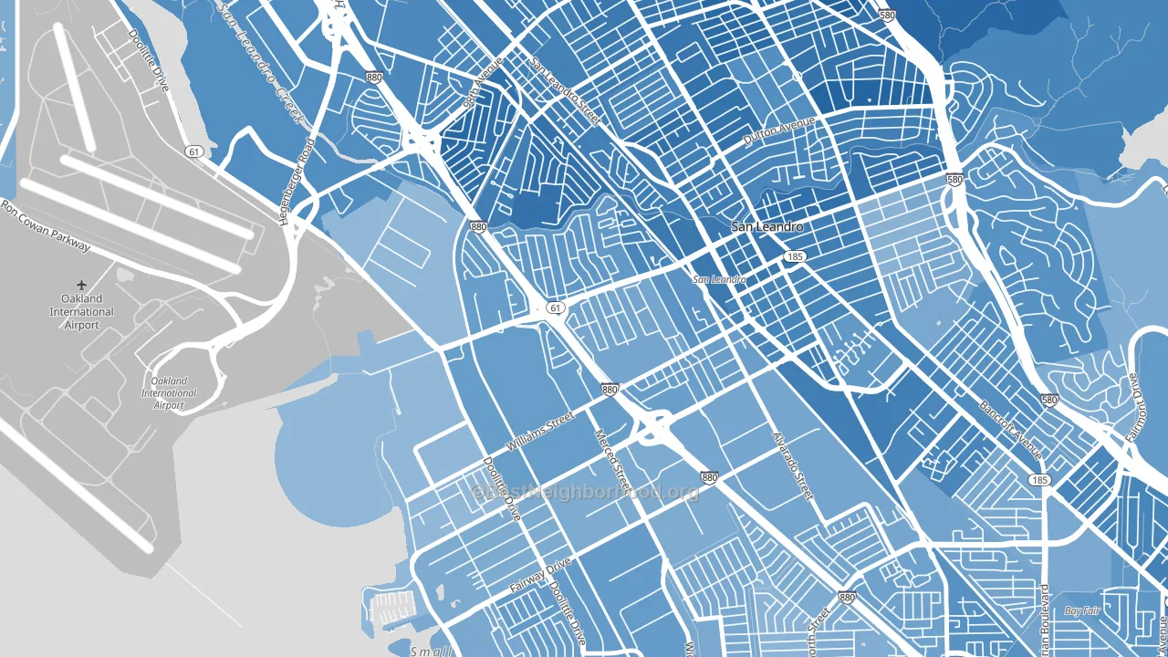
About 42% of adults in Davis Tract typically vote, below the U.S. average of about 62%. Among adults in Davis Tract, ~29% vote Democratic, ~13% Republican, and ~58% don't vote. The map below shows estimated turnout by block group.
How Davis Tract compares
Among neighborhoods within 5 miles, Davis Tract leans more Democratic than 3 of 33 neighbors.
Davis Tract runs about 16 points more Democratic than California as a whole.
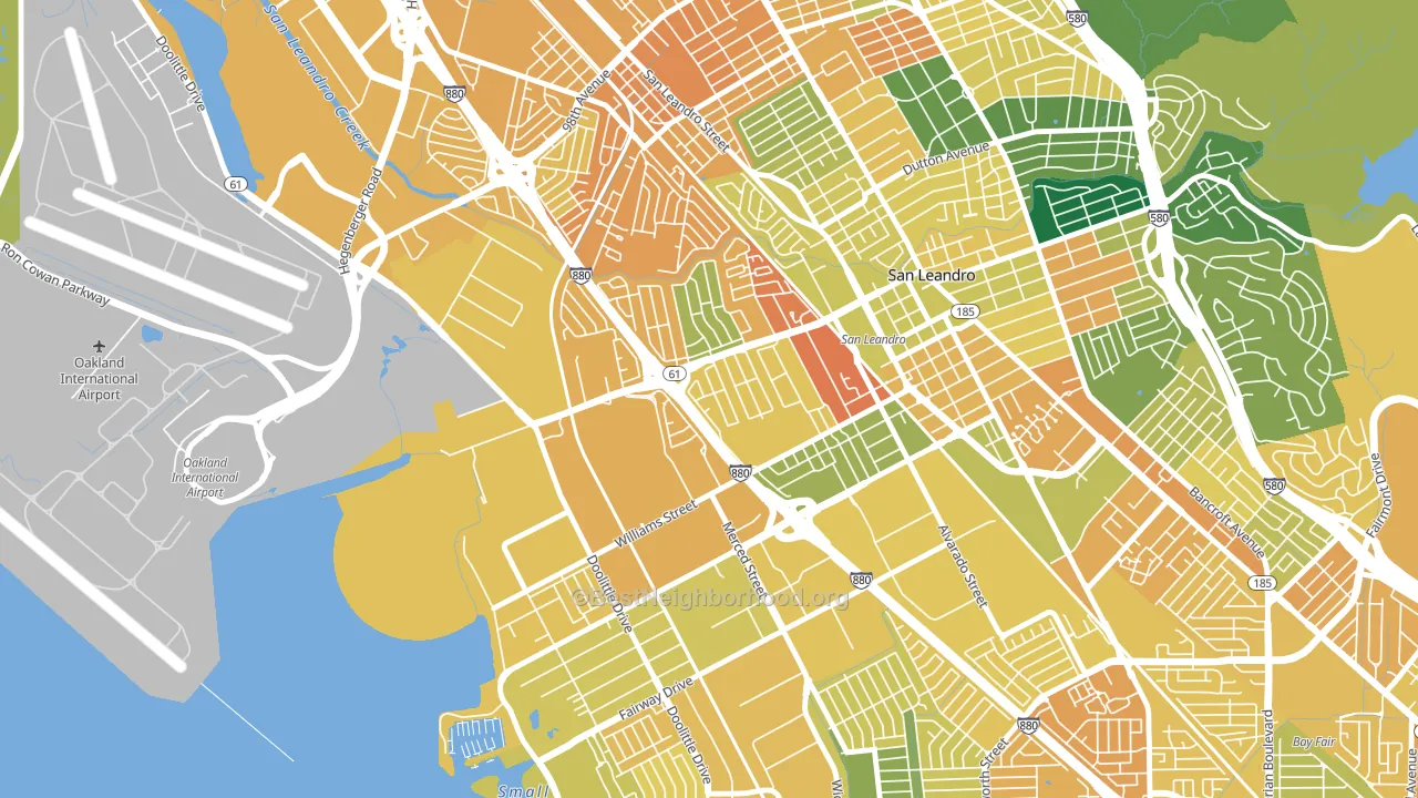
Politics vary noticeably by block within Davis Tract. The northeast side is the most Democratic-leaning (D+50) and the north side is the least Democratic-leaning (D+32), a spread of about 19 points.
Why Davis Tract leans the way it does
Density, race composition, education, and family structure all sit close to their national averages in Davis Tract. The lean here lands roughly where demographic data alone would predict.
Paved land cover and Democratic lean
Places with extensive paved surfaces tend to lean Democratic; Davis Tract, San Leandro, CA sits in the top tenth nationally on this measure. Paved ground does not change how people vote; it mostly reflects how urban and built-up a place is.
Why turnout in Davis Tract looks the way it does
Crowded housing lines up with lower turnout. About 20% of homes in Davis Tract have more than one occupant per room, above 98% of neighborhoods. Learn more about the findings and methodology on the political spectrum map.
Nearby Neighborhoods
- Sobrante Park, Oakland, CA D+52
- Mullford Gardens, San Leandro, CA D+32
- Old San Leandro, San Leandro, CA D+50
- Brookfield Village, Oakland, CA D+58
- North Stonehurst, Oakland, CA D+59
- Durant Manor, Oakland, CA D+60
- Estudillo Estates-Glen, San Leandro, CA D+54
- Assumption Parish, San Leandro, CA D+45
- Elmhurst Park, Oakland, CA D+56
- Iveywood, Oakland, CA D+61
Neighborhoods with Similar Populations
- Westowne, Catonsville, MD D+50
- Italian Bowery, Chicago, IL D+82
- Meadow Hills, Aurora, CO D+33
- Hiawatha, Minneapolis, MN D+68
- Side Creek, Aurora, CO D+23
- Diamond Lake, Minneapolis, MN D+62
- South Los Altos, Los Altos, CA D+38
- Southeast Como, Minneapolis, MN D+66
- Tippecanoe, Milwaukee, WI D+32
- Felicita, Escondido, CA D+8
Sources and methodology
Precinct-level voting records used to fit the model come from California Secretary of State, Elections, distributed by the Voting and Election Science Team. Demographic inputs come from the U.S. Census Bureau (ACS 5-year estimates and the 2020 Decennial Census). Health and environmental inputs come from the CDC (PLACES and the Environmental Justice Index). Land cover comes from the USGS and EPA. Election-day and lead-up weather come from PRISM 4km daily grids and the NOAA Global Historical Climatology Network. Mail-voting and election-administration patterns come from the MIT Election Lab's Survey of the Performance of American Elections. Block-group crime detail comes from CrimeGrade. Internet data and modeling support provided by ISPreports.org.
Modeling and analysis by the BestNeighborhood data science team. Full methodology and findings: political spectrum map.
Methodology reviewed by the BestNeighborhood data team. Last updated May 2026.