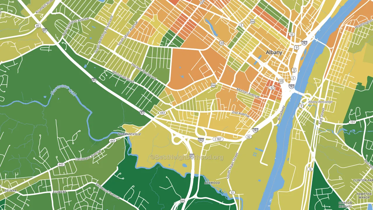
Delaware Avenue is a Democratic stronghold. About 79% of voters here vote Democratic and 21% Republican.
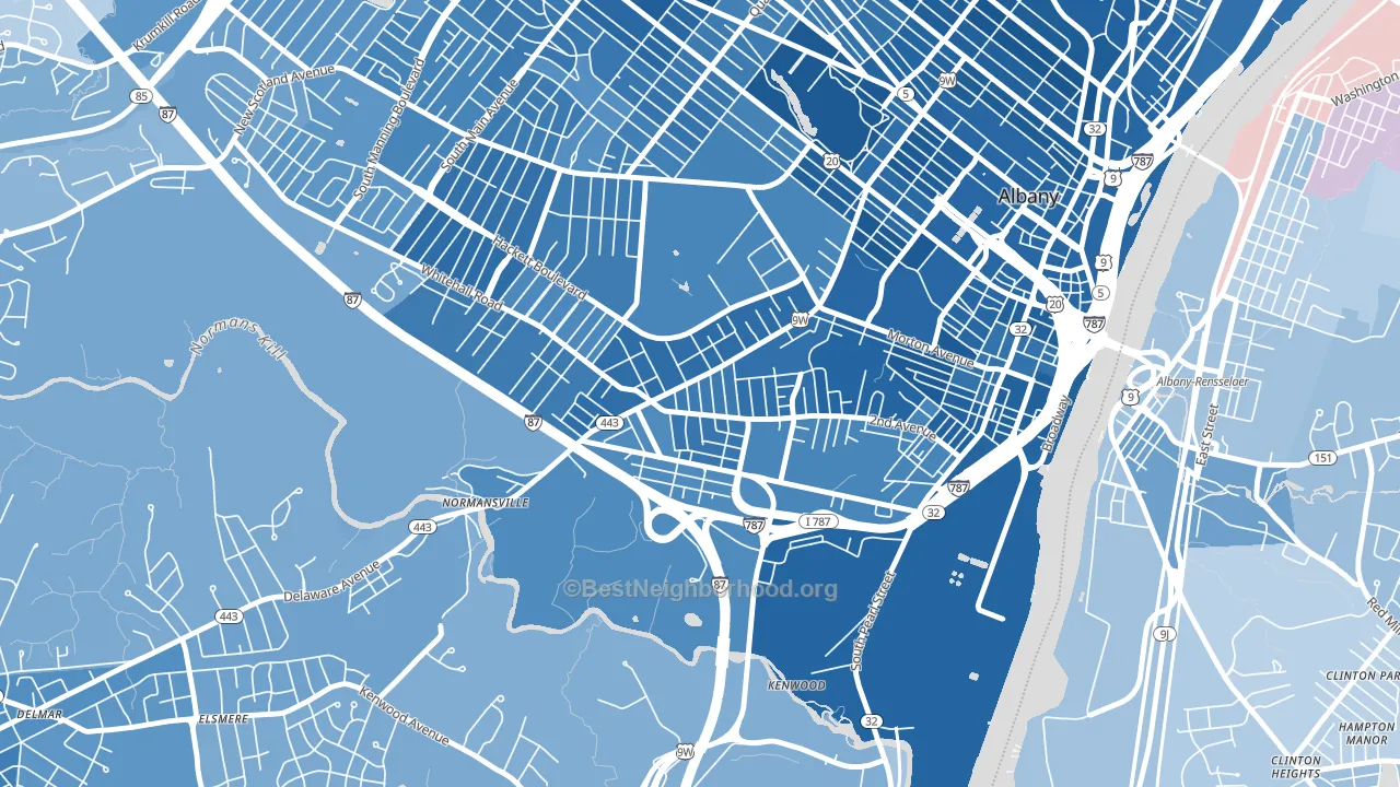
About 55% of adults in Delaware Avenue typically vote, below the U.S. average of about 62%. Among adults in Delaware Avenue, ~43% vote Democratic, ~12% Republican, and ~45% don't vote. The map below shows estimated turnout by block group.
How Delaware Avenue compares
Among neighborhoods within 5 miles, Delaware Avenue leans more Democratic than 3 of 12 neighbors.
Delaware Avenue runs about 46 points more Democratic than New York as a whole.
Politics vary noticeably by block within Delaware Avenue. The north side is the most Democratic-leaning (D+64) and the northwest side is the least Democratic-leaning (D+53), a spread of about 11 points.
Why Delaware Avenue leans the way it does
Density, race composition, education, and family structure all sit close to their national averages in Delaware Avenue. The lean here lands roughly where demographic data alone would predict.
Population density and Democratic lean
Places with high population density tend to lean Democratic; Delaware Avenue, Albany, NY sits in the top tenth nationally on this measure.
Why turnout in Delaware Avenue looks the way it does
Turnout in Delaware Avenue sits close to the national pattern. Routine healthcare access, homeownership, education, and food security all land near their national averages here. Learn more about the findings and methodology on the political spectrum map.
Nearby Neighborhoods
- Helderberg, Albany, NY D+57
- South End, Albany, NY D+69
- Center Square, Albany, NY D+75
- New Scotland-Woodlawn, Albany, NY D+60
- Central Ave, Albany, NY D+66
- Pine Hills, Albany, NY D+62
- Sheridan Hollow, Albany, NY D+71
- West Hill, Albany, NY D+66
- Arbor Hill, Albany, NY D+77
- Buckingham Lake-Crestwood, Albany, NY D+47
Neighborhoods with Similar Populations
- Vose, Beaverton, OR D+39
- Franklin Park, Detroit, MI D+87
- Highlands, Lincoln, NE Even
- Lauderdale Manors, Fort Lauderdale, FL D+77
- Midtown Harrisburg, Harrisburg, PA D+64
- North Sharon Amity, Charlotte, NC D+49
- Read Blvd East, New Orleans, LA D+80
- Prescott, Oakland, CA D+79
- Edgewater, Cleveland, OH D+54
- Darnall, San Diego, CA D+31
Sources and methodology
Precinct-level voting records used to fit the model come from New York State Board of Elections, distributed by the Voting and Election Science Team. Demographic inputs come from the U.S. Census Bureau (ACS 5-year estimates and the 2020 Decennial Census). Health and environmental inputs come from the CDC (PLACES and the Environmental Justice Index). Land cover comes from the USGS and EPA. Election-day and lead-up weather come from PRISM 4km daily grids and the NOAA Global Historical Climatology Network. Mail-voting and election-administration patterns come from the MIT Election Lab's Survey of the Performance of American Elections. Block-group crime detail comes from CrimeGrade. Internet data and modeling support provided by ISPreports.org.
Modeling and analysis by the BestNeighborhood data science team. Full methodology and findings: political spectrum map.
Methodology reviewed by the BestNeighborhood data team. Last updated May 2026.