DePeyster leans heavily Republican by roughly 46 points: about 27% of voters vote Democratic and 73% Republican.
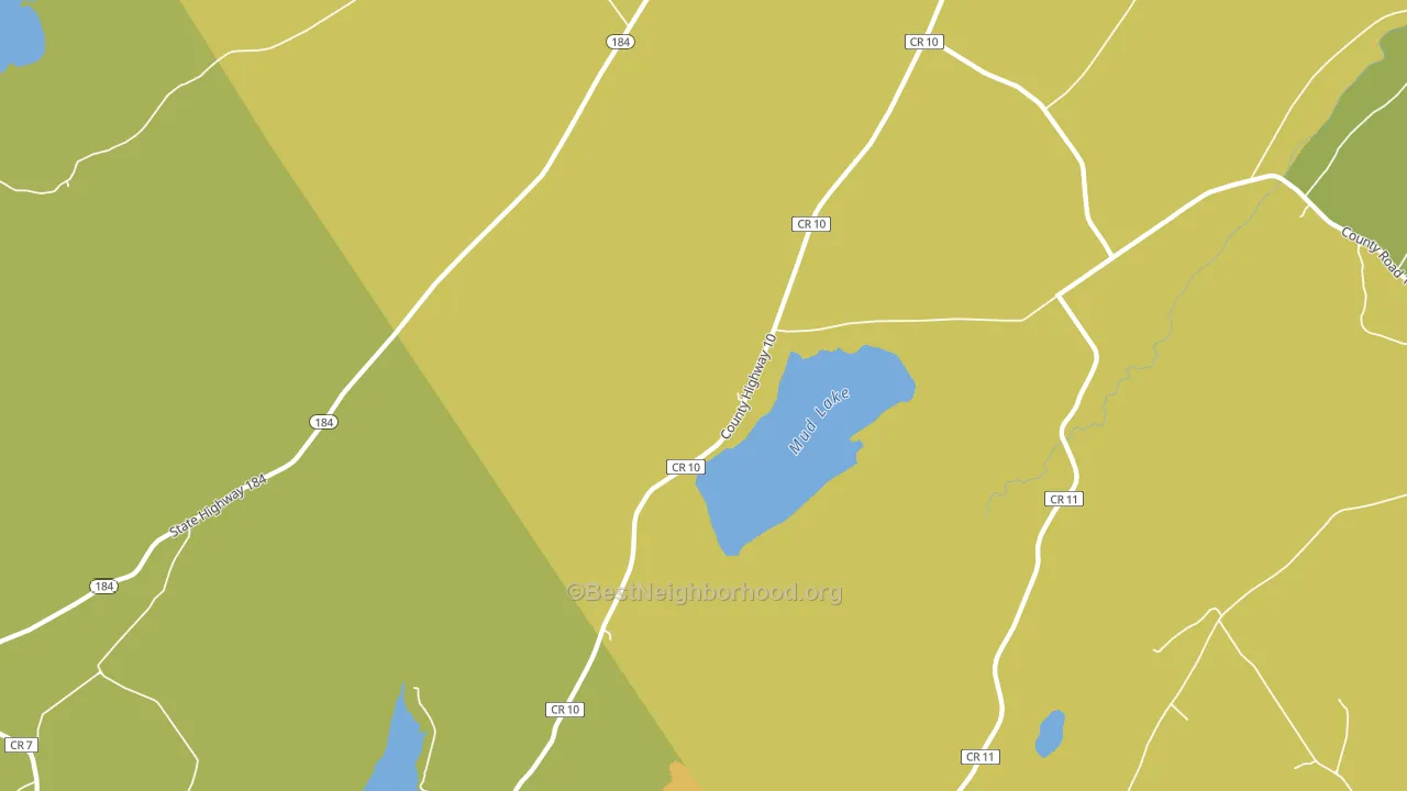
About 55% of adults in DePeyster typically vote, below the U.S. average of about 62%. Among adults in DePeyster, ~15% vote Democratic, ~40% Republican, and ~45% don't vote. The map below shows estimated turnout by block group.
How DePeyster compares
Among cities within 25 miles, DePeyster leans more Republican than 54 of 55 neighbors.
DePeyster runs about 58 points more Republican than New York as a whole. New York leans Democratic overall, while DePeyster is one of the few Republican-leaning pockets.
Why DePeyster leans the way it does
This analysis examined 14,881 data points per city to find what predicts political lean and turnout. The items below are a few correlations that stood out for DePeyster, not a ranked or complete list of what matters most.
DePeyster votes against the grain of New York. New York leans Democratic overall, while DePeyster runs about 58 points more Republican. Rural areas with a high white share vote Republican. Non-Hispanic white share in DePeyster is about 97%, about 25 points above the U.S. average of 72%.
Walkability and Republican lean
Places with a low walkability score tend to lean Republican; DePeyster, NY sits in the bottom quarter nationally on this measure. A walkable street grid does not change how people vote; it mostly reflects how urban a place is.
Why turnout in DePeyster looks the way it does
Crowded housing lines up with lower turnout. About 6% of homes in DePeyster have more than one occupant per room, above 91% of cities. Low high-school completion lines up with lower turnout, and about 78% of adults in DePeyster have completed high school, below 93% of cities. Learn more about the findings and methodology on the political spectrum map.
Nearby Cities
- Pope Mills, NY R+45
- Ruby Corner, NY R+41
- Richville, NY R+44
- DeKalb Junction, NY R+40
- Heuvelton, NY R+37
- Little Bow, NY R+39
- Rensselaer Falls, NY R+25
- Hammond, NY R+39
- Morristown, NY R+36
Cities with Similar Populations
- Melrose, MD R+38
- Menifee, AR R+25
- Uniontown, AR R+68
- Towns, GA R+52
- Springville, VA R+57
- Revloc, PA R+53
- Flat Rock, OH R+55
- Osceola, WA R+21
- Perry, LA R+72
- Laurel, IA R+48
Sources and methodology
Precinct-level voting records used to fit the model come from New York State Board of Elections, distributed by the Voting and Election Science Team. Demographic inputs come from the U.S. Census Bureau (ACS 5-year estimates and the 2020 Decennial Census). Health and environmental inputs come from the CDC (PLACES and the Environmental Justice Index). Land cover comes from the USGS and EPA. Election-day and lead-up weather come from PRISM 4km daily grids and the NOAA Global Historical Climatology Network. Mail-voting and election-administration patterns come from the MIT Election Lab's Survey of the Performance of American Elections. Block-group crime detail comes from CrimeGrade. Internet data and modeling support provided by ISPreports.org.
Modeling and analysis by the BestNeighborhood data science team. Full methodology and findings: political spectrum map.
Methodology reviewed by the BestNeighborhood data team. Last updated May 2026.