Elgin Historic District leans heavily Democratic by roughly 38 points: about 69% of voters vote Democratic and 31% Republican.
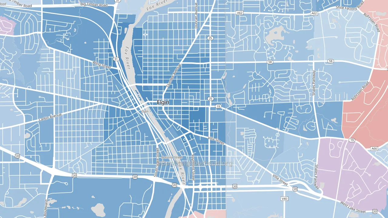
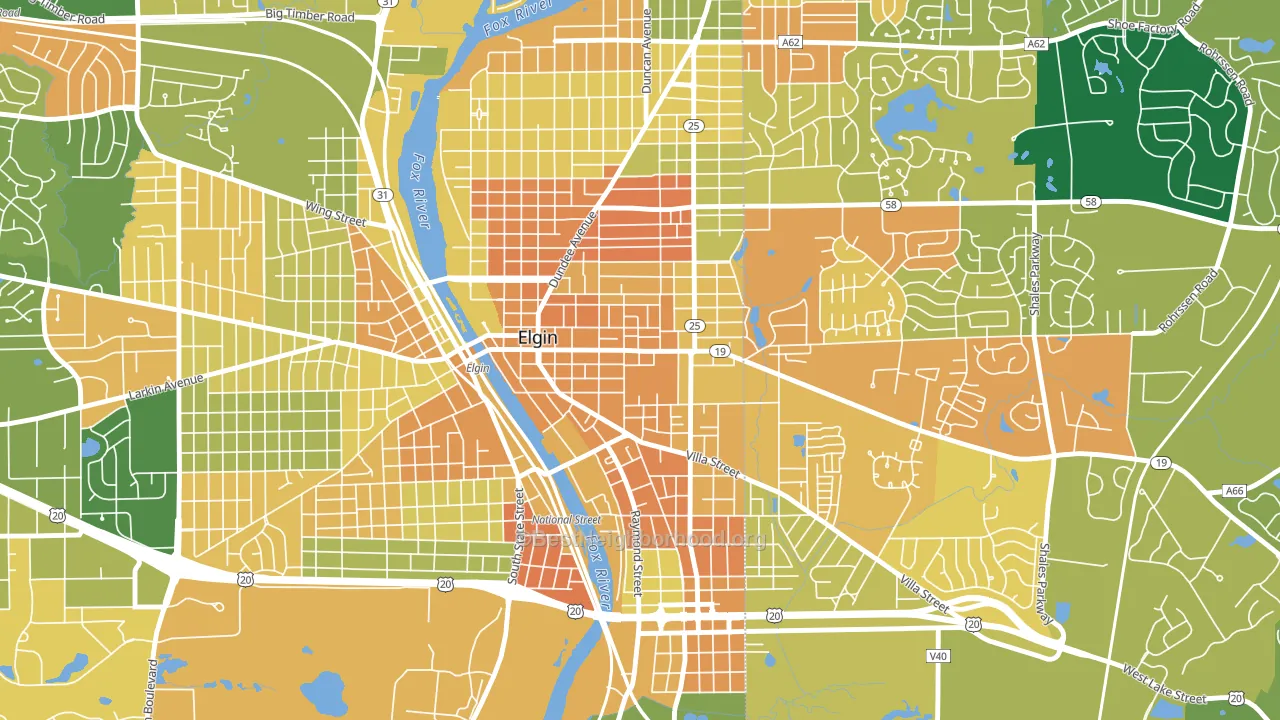
About 33% of adults in Elgin Historic District typically vote, below the U.S. average of about 62%. Among adults in Elgin Historic District, ~23% vote Democratic, ~10% Republican, and ~67% don't vote. The map below shows estimated turnout by block group.
How Elgin Historic District compares
Elgin Historic District runs about 28 points more Democratic than Illinois as a whole.
Why Elgin Historic District leans the way it does
Density, race composition, education, and family structure all sit close to their national averages in Elgin Historic District. The lean here lands roughly where demographic data alone would predict.
Population density and Democratic lean
Places with high population density tend to lean Democratic; Elgin Historic District, Elgin, IL sits in the top tenth nationally on this measure.
Why turnout in Elgin Historic District looks the way it does
Areas with limited routine healthcare access turn out at lower rates. Elgin Historic District is in the bottom quarter nationally for routine-care measures such as insurance coverage, preventive screenings, and dental visits. The dental-visit rate here is about 48%, about 15 points below the Illinois average of 63%. High food insecurity lines up with lower turnout, and about 34% of adults in Elgin Historic District report food insecurity, above 88% of neighborhoods. Low high-school completion lines up with lower turnout, and about 68% of adults in Elgin Historic District have completed high school, below 96% of neighborhoods. Learn more about the findings and methodology on the political spectrum map.
Nearby Neighborhoods
- Maple Manor, Elgin, IL D+24
- Thornwood, South Elgin, IL R+4
- Valley View, Glen Ellyn, IL D+5
- Coventry, Crystal Lake, IL D+5
- Winston Park, Palatine, IL D+18
- Scarsdale, Arlington Heights, IL D+25
- Randall Hills, North Aurora, IL D+13
- Woodlands at Fiore, Buffalo Grove, IL D+26
- Yorkfield, Elmhurst, IL D+16
- Frontenac, Aurora, IL D+26
Neighborhoods with Similar Populations
- Beechview, Pittsburgh, PA D+34
- West Modesto, Modesto, CA D+8
- Pukalani, Makawao, HI D+20
- Coronado, El Paso, TX D+18
- Downtown Tempe, Tempe, AZ D+38
- Coolidge Corner, Brookline, MA D+70
- Cane Ridge, Antioch, TN D+5
- The Paseos, Las Vegas, NV R+4
- Cortez Hill, San Diego, CA D+50
- Bloomfield, Pittsburgh, PA D+64
Sources and methodology
Precinct-level voting records used to fit the model come from Illinois State Board of Elections, distributed by the Voting and Election Science Team. Demographic inputs come from the U.S. Census Bureau (ACS 5-year estimates and the 2020 Decennial Census). Health and environmental inputs come from the CDC (PLACES and the Environmental Justice Index). Land cover comes from the USGS and EPA. Election-day and lead-up weather come from PRISM 4km daily grids and the NOAA Global Historical Climatology Network. Mail-voting and election-administration patterns come from the MIT Election Lab's Survey of the Performance of American Elections. Block-group crime detail comes from CrimeGrade. Internet data and modeling support provided by ISPreports.org.
Modeling and analysis by the BestNeighborhood data science team. Full methodology and findings: political spectrum map.
Methodology reviewed by the BestNeighborhood data team. Last updated May 2026.