Maple Manor leans Democratic by roughly 24 points: about 62% of voters vote Democratic and 38% Republican.
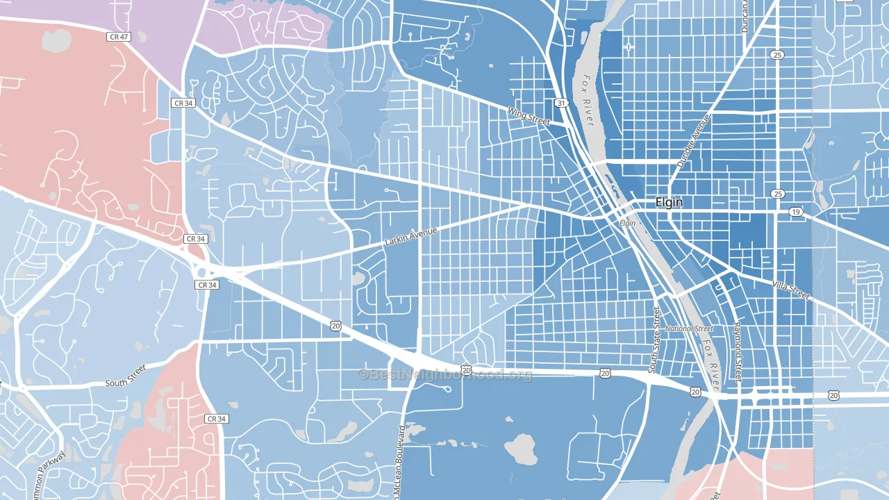
About 57% of adults in Maple Manor typically vote, near the U.S. average of about 62%. Among adults in Maple Manor, ~35% vote Democratic, ~22% Republican, and ~43% don't vote. The map below shows estimated turnout by block group.
How Maple Manor compares
Maple Manor sits in a sparsely populated area with few comparable neighborhoods nearby.
Maple Manor runs about 14 points more Democratic than Illinois as a whole.
Politics vary noticeably by block within Maple Manor. The east side is the most Democratic-leaning (D+30) and the south side is the least Democratic-leaning (D+19), a spread of about 11 points.
Why Maple Manor leans the way it does
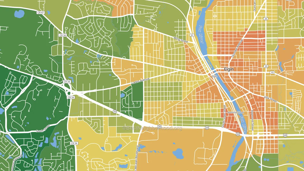
This analysis examined 14,881 data points per neighborhood to find what predicts political lean and turnout. The items below are a few correlations that stood out for Maple Manor, not a ranked or complete list of what matters most.
Dense areas vote Democratic. More than 99% of residents in Maple Manor live in densely developed areas, about 64 points above the U.S. average of 36%.
Cancer-screening access and voter turnout
Places with low colon-cancer-screening access tend to turn out at a lower rate; Maple Manor, Elgin, IL sits in the bottom quarter nationally on this measure. Cancer screening does not drive turnout; it reflects income, insurance, and healthcare access.
Why turnout in Maple Manor looks the way it does
Areas with limited routine healthcare access turn out at lower rates. Maple Manor is in the bottom quarter nationally for routine-care measures such as insurance coverage, preventive screenings, and dental visits. Learn more about the findings and methodology on the political spectrum map.
Nearby Neighborhoods
- Elgin Historic District, Elgin, IL D+38
- Thornwood, South Elgin, IL R+4
- Coventry, Crystal Lake, IL D+5
- Valley View, Glen Ellyn, IL D+5
- Randall Hills, North Aurora, IL D+13
- Winston Park, Palatine, IL D+18
- Scarsdale, Arlington Heights, IL D+25
- Sycamore Manor, Sycamore, IL D+14
- Frontenac, Aurora, IL D+26
- Woodlands at Fiore, Buffalo Grove, IL D+26
Neighborhoods with Similar Populations
- Downtown Syracuse, Syracuse, NY D+63
- Central Business District, Louisville, KY D+58
- Churchill Estates, San Antonio, TX Even
- Lawrence Park, Sacramento, CA D+37
- Foothill Green, Dakota Ridge, CO D+8
- Downtown Neptune City, Neptune City, NJ D+8
- Regency, Pueblo, CO Even
- Ventana Lakes, Peoria, AZ R+24
- Cool Springs, Wilmington, DE D+69
- Keene Valley, Richland, WA R+9
Sources and methodology
Precinct-level voting records used to fit the model come from Illinois State Board of Elections, distributed by the Voting and Election Science Team. Demographic inputs come from the U.S. Census Bureau (ACS 5-year estimates and the 2020 Decennial Census). Health and environmental inputs come from the CDC (PLACES and the Environmental Justice Index). Land cover comes from the USGS and EPA. Election-day and lead-up weather come from PRISM 4km daily grids and the NOAA Global Historical Climatology Network. Mail-voting and election-administration patterns come from the MIT Election Lab's Survey of the Performance of American Elections. Block-group crime detail comes from CrimeGrade. Internet data and modeling support provided by ISPreports.org.
Modeling and analysis by the BestNeighborhood data science team. Full methodology and findings: political spectrum map.
Methodology reviewed by the BestNeighborhood data team. Last updated May 2026.