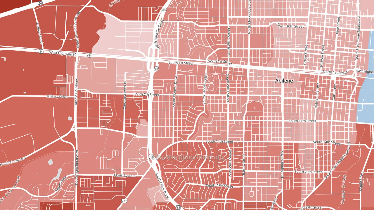
Elmwood Area leans Republican by roughly 24 points: about 38% of voters vote Democratic and 62% Republican.
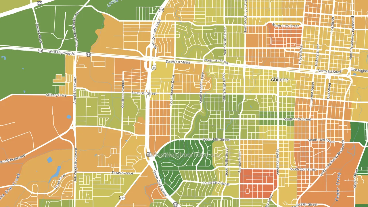
About 53% of adults in Elmwood Area typically vote, below the U.S. average of about 62%. Among adults in Elmwood Area, ~20% vote Democratic, ~33% Republican, and ~47% don't vote. The map below shows estimated turnout by block group.
How Elmwood Area compares
Among neighborhoods within 5 miles, Elmwood Area leans more Republican than 7 of 10 neighbors.
Elmwood Area runs about 11 points more Republican than Texas as a whole.
Politics vary noticeably by block within Elmwood Area. The south side is the most Republican-leaning (R+30) and the northwest side is the least Republican-leaning (R+13), a spread of about 17 points.
Why Elmwood Area leans the way it does
This analysis examined 14,881 data points per neighborhood to find what predicts political lean and turnout. The items below are a few correlations that stood out for Elmwood Area, not a ranked or complete list of what matters most.
Areas with low college attainment vote Republican. About 19% of adults in Elmwood Area hold a bachelor's degree, about 7 points below the Texas average of 26%.
Cancer-screening access and voter turnout
Places with low colon-cancer-screening access tend to turn out at a lower rate; Elmwood Area, Abilene, TX sits in the bottom quarter nationally on this measure. Cancer screening does not drive turnout; it reflects income, insurance, and healthcare access.
Why turnout in Elmwood Area looks the way it does
Areas with limited routine healthcare access turn out at lower rates. Elmwood Area is in the bottom quarter nationally for routine-care measures such as insurance coverage, preventive screenings, and dental visits. Learn more about the findings and methodology on the political spectrum map.
Nearby Neighborhoods
- Westwood Richland, Abilene, TX R+18
- Sayles Boulevard Area, Abilene, TX R+17
- River Oaks-Brookhollow, Abilene, TX R+39
- Over Place Area, Abilene, TX R+30
- Cobb Park Area, Abilene, TX R+12
- Park Central Area, Abilene, TX R+16
- Sears Park Area, Abilene, TX R+7
- North College, Abilene, TX R+14
- Chimney Rock Area, Abilene, TX R+46
- Abilene Heights Area, Abilene, TX R+24
Neighborhoods with Similar Populations
- Central Business District, Orlando, FL D+30
- Bryant, Buffalo, NY D+68
- Summit Hill, St. Paul, MN D+71
- Greenville, Scarsdale, NY D+27
- Disston Heights, St. Petersburg, FL Even
- South Side, West Palm Beach, FL Even
- Wellington-Harrington, Cambridge, MA D+72
- Hyde Park, Austin, TX D+71
- The Bush, Chicago, IL D+68
- Bala Cynwyd, Bala-Cynwyd, PA D+48
Sources and methodology
Precinct-level voting records used to fit the model come from Texas Secretary of State, Elections Division, distributed by the Voting and Election Science Team. Demographic inputs come from the U.S. Census Bureau (ACS 5-year estimates and the 2020 Decennial Census). Health and environmental inputs come from the CDC (PLACES and the Environmental Justice Index). Land cover comes from the USGS and EPA. Election-day and lead-up weather come from PRISM 4km daily grids and the NOAA Global Historical Climatology Network. Mail-voting and election-administration patterns come from the MIT Election Lab's Survey of the Performance of American Elections. Block-group crime detail comes from CrimeGrade. Internet data and modeling support provided by ISPreports.org.
Modeling and analysis by the BestNeighborhood data science team. Full methodology and findings: political spectrum map.
Methodology reviewed by the BestNeighborhood data team. Last updated May 2026.