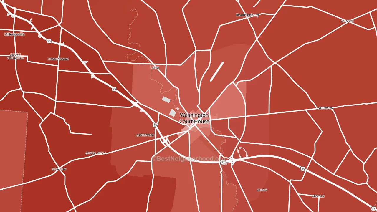
Fayette County is a Republican stronghold. About 23% of voters here vote Democratic and 77% Republican.
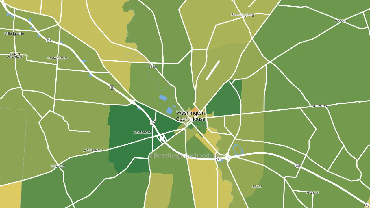
About 75% of adults in Fayette County typically vote, above the U.S. average of about 62%. Among adults in Fayette County, ~17% vote Democratic, ~58% Republican, and ~25% don't vote. The map below shows estimated turnout by block group.
How Fayette County compares
Among counties within 50 miles, Fayette County leans more Republican than 12 of 16 neighbors.
Fayette County runs about 44 points more Republican than Ohio as a whole.
Politics vary noticeably by city within Fayette County. The southwest side is the most Republican-leaning (R+69) and the east side is the least Republican-leaning (R+53), a spread of about 17 points.
Why Fayette County leans the way it does
This analysis examined 14,881 data points per county to find what predicts political lean and turnout. The items below are a few correlations that stood out for Fayette County, not a ranked or complete list of what matters most.
Car-dependent areas vote Republican. About 83% of residents in Fayette County drive to work alone, about 9 points above the U.S. average of 74%. Low college attainment predicts Republican voting, and Fayette County sits in the bottom quarter (about 14%, below 90% of counties).
Homeownership and voter turnout
Places with renter-heavy households tend to turn out at a lower rate; Fayette County, OH sits in the bottom quarter nationally on this measure.
Why turnout in Fayette County looks the way it does
Turnout in Fayette County sits close to the national pattern. Routine healthcare access, homeownership, education, and food security all land near their national averages here. Learn more about the findings and methodology on the political spectrum map.
Nearby Counties
- Clinton County, OH R+53
- Highland County, OH R+61
- Pickaway County, OH R+41
- Madison County, OH R+39
- Ross County, OH R+44
- Greene County, OH R+17
- Clark County, OH R+21
- Pike County, OH R+58
- Franklin County, OH D+30
- Montgomery County, OH D+6
Counties with Similar Populations
- Ellis County, KS R+38
- Van Wert County, OH R+56
- Glenn County, CA R+32
- Alpena County, MI R+25
- Ripley County, IN R+59
- Pine County, MN R+37
- Mason County, MI R+20
- Marion County, TN R+62
- Neshoba County, MS R+31
- Hancock County, WV R+42
Sources and methodology
Precinct-level voting records used to fit the model come from Ohio Secretary of State, Elections, distributed by the Voting and Election Science Team. Demographic inputs come from the U.S. Census Bureau (ACS 5-year estimates and the 2020 Decennial Census). Health and environmental inputs come from the CDC (PLACES and the Environmental Justice Index). Land cover comes from the USGS and EPA. Election-day and lead-up weather come from PRISM 4km daily grids and the NOAA Global Historical Climatology Network. Mail-voting and election-administration patterns come from the MIT Election Lab's Survey of the Performance of American Elections. Block-group crime detail comes from CrimeGrade. Internet data and modeling support provided by ISPreports.org.
Modeling and analysis by the BestNeighborhood data science team. Full methodology and findings: political spectrum map.
Methodology reviewed by the BestNeighborhood data team. Last updated May 2026.