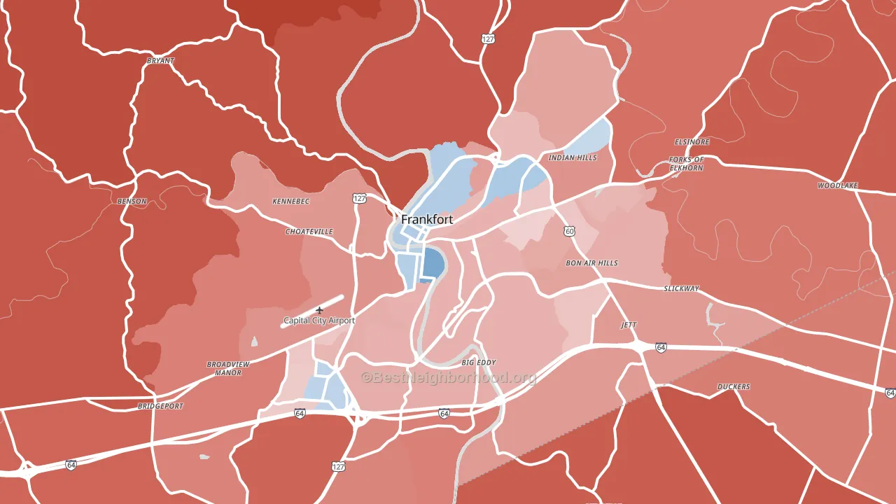
Franklin County leans Republican by roughly 20 points: about 40% of voters vote Democratic and 60% Republican.
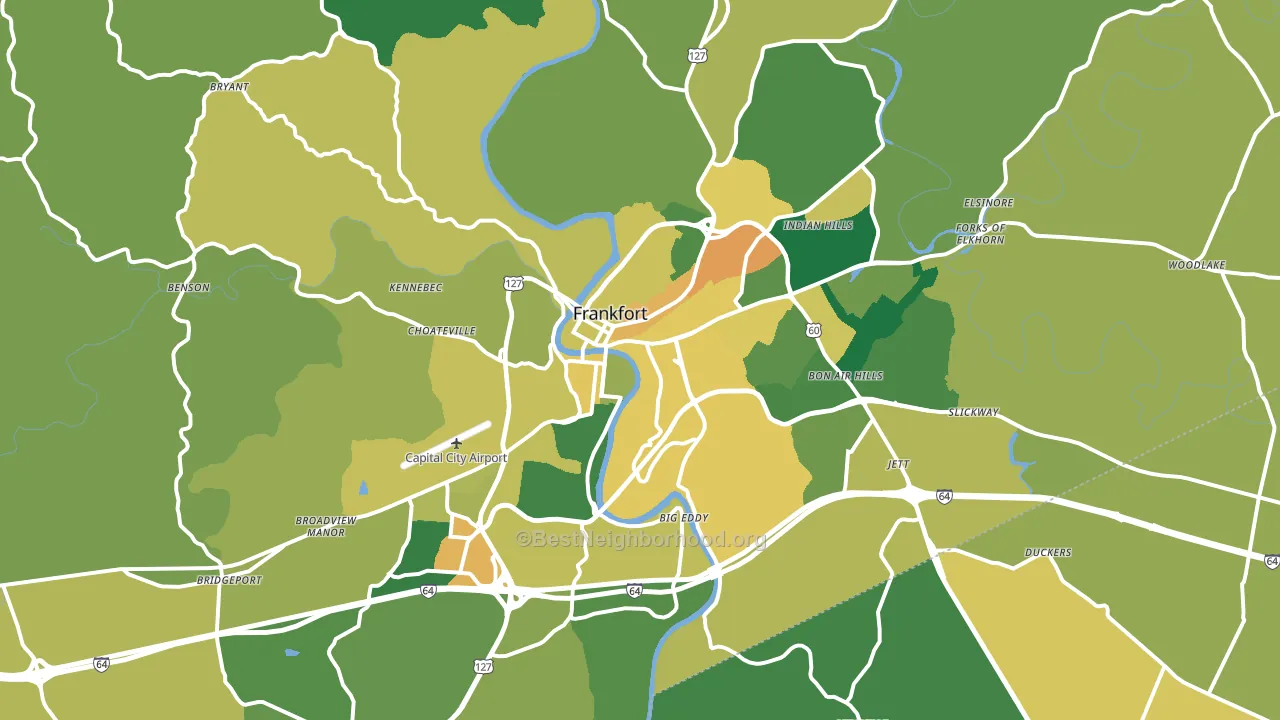
About 69% of adults in Franklin County typically vote, above the U.S. average of about 62%. Among adults in Franklin County, ~28% vote Democratic, ~41% Republican, and ~31% don't vote. The map below shows estimated turnout by block group.
How Franklin County compares
Among counties within 50 miles, Franklin County leans more Republican than 2 of 32 neighbors.
Franklin County runs about 11 points more Democratic than Kentucky as a whole.
Politics vary noticeably by city within Franklin County. The northwest side is the most Republican-leaning (R+58) and the south side is the least Republican-leaning (R+12), a spread of about 46 points.
Why Franklin County leans the way it does
This analysis examined 14,881 data points per county to find what predicts political lean and turnout. The items below are a few correlations that stood out for Franklin County, not a ranked or complete list of what matters most.
Franklin County votes Republican even though it is densely developed (about 55%, far above the Kentucky average of 18%). State and regional patterns outweigh the Democratic lean that density usually predicts here.
Population density and Democratic lean
Places with high population density tend to lean Democratic; Franklin County, KY sits in the top quarter nationally on this measure.
Why turnout in Franklin County looks the way it does
Areas with strong routine healthcare access turn out at higher rates. Franklin County is in the top quarter nationally for routine-care measures such as insurance coverage, preventive screenings, and dental visits. The dental-visit rate here is about 61%, above 55% of counties. Learn more about the findings and methodology on the political spectrum map.
Nearby Counties
- Anderson County, KY R+50
- Woodford County, KY R+29
- Scott County, KY R+29
- Shelby County, KY R+32
- Owen County, KY R+63
- Henry County, KY R+51
- Fayette County, KY D+24
- Jessamine County, KY R+35
- Spencer County, KY R+56
- Mercer County, KY R+52
Counties with Similar Populations
- Cass County, MI R+29
- Nye County, NV R+41
- St. Martin Parish, LA R+35
- Ogle County, IL R+28
- Oktibbeha County, MS D+3
- Waupaca County, WI R+34
- Harrisonburg City, VA D+18
- Darke County, OH R+61
- Wayne County, PA R+36
- Grant County, WI R+23
Sources and methodology
Precinct-level voting records used to fit the model come from Kentucky State Board of Elections, distributed by the Voting and Election Science Team. Demographic inputs come from the U.S. Census Bureau (ACS 5-year estimates and the 2020 Decennial Census). Health and environmental inputs come from the CDC (PLACES and the Environmental Justice Index). Land cover comes from the USGS and EPA. Election-day and lead-up weather come from PRISM 4km daily grids and the NOAA Global Historical Climatology Network. Mail-voting and election-administration patterns come from the MIT Election Lab's Survey of the Performance of American Elections. Block-group crime detail comes from CrimeGrade. Internet data and modeling support provided by ISPreports.org.
Modeling and analysis by the BestNeighborhood data science team. Full methodology and findings: political spectrum map.
Methodology reviewed by the BestNeighborhood data team. Last updated May 2026.