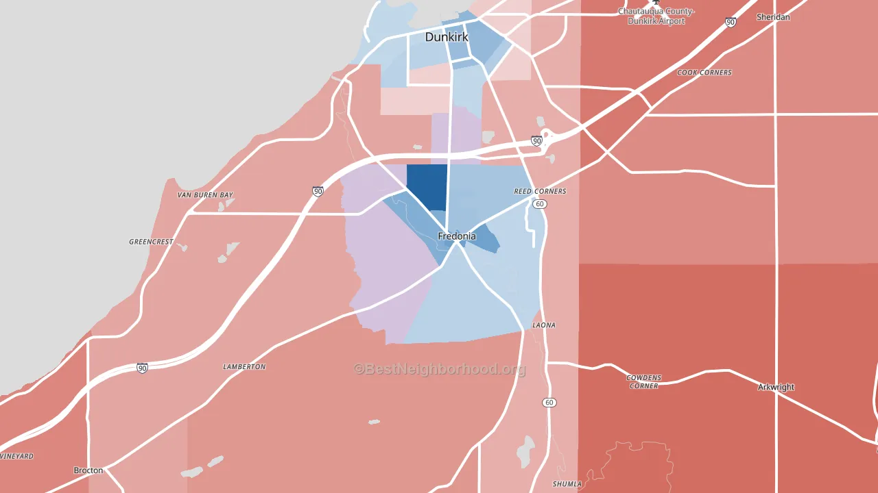
Fredonia leans slightly Democratic by roughly 14 points: about 57% of voters vote Democratic and 43% Republican.
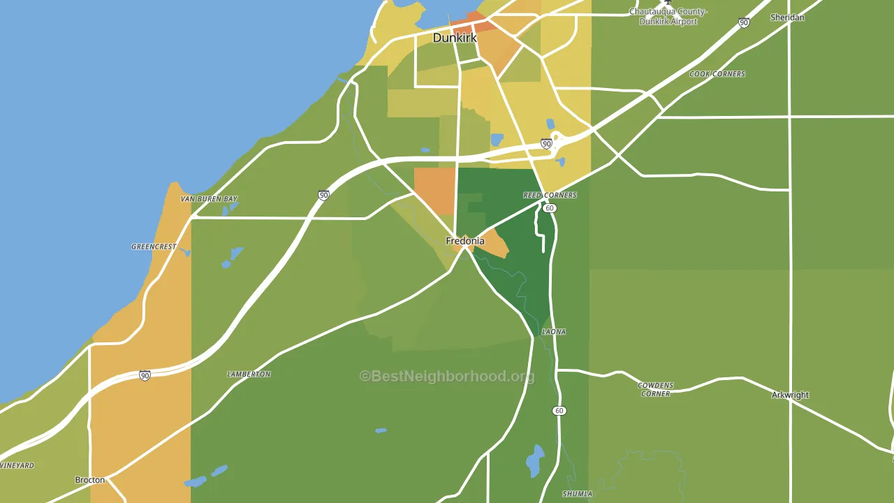
About 66% of adults in Fredonia typically vote, near the U.S. average of about 62%. Among adults in Fredonia, ~38% vote Democratic, ~28% Republican, and ~34% don't vote. The map below shows estimated turnout by block group.
How Fredonia compares
Among cities within 25 miles, Fredonia leans more Democratic than 73 of 74 neighbors.
Politically, Fredonia sits close to the rest of New York.
Politics vary noticeably by neighborhood within Fredonia. The north side runs the most Democratic (D+28) and the southeast side runs the most Republican (R+23), a spread of about 51 points.
Why Fredonia leans the way it does
This analysis examined 14,881 data points per city to find what predicts political lean and turnout. The items below are a few correlations that stood out for Fredonia, not a ranked or complete list of what matters most.
Areas with high college attainment vote Democratic. About 47% of adults in Fredonia hold a bachelor's degree, about 19 points above the U.S. average of 28%. Dense areas vote Democratic, and Fredonia sits in the top fifth on density (about 59%, above 90% of cities). A high never-married share predicts Democratic voting, and about 46% of adults in Fredonia have never been married, above 97% of cities.
Population density and Democratic lean
Places with high population density tend to lean Democratic; Fredonia, NY sits in the top tenth nationally on this measure.
Why turnout in Fredonia looks the way it does
Turnout in Fredonia sits close to the national pattern. Routine healthcare access, homeownership, education, and food security all land near their national averages here. Learn more about the findings and methodology on the political spectrum map.
Nearby Cities
- Laona, NY R+24
- Dunkirk, NY Even
- Lamberton, NY R+15
- Shumla, NY R+31
- Lily Dale, NY R+18
- Sheridan, NY R+34
- Brocton, NY R+19
- Cassadaga, NY R+31
- Portland, NY R+27
Cities with Similar Populations
- Midland, WA D+16
- Canyon Lake, CA R+24
- Wallingford, PA D+30
- South Point, OH R+46
- Wakefield, RI D+12
- Totowa, NJ R+27
- Manteno, IL R+31
- Sandwich, IL R+20
- Central, SC R+31
- Endwell, NY D+7
Sources and methodology
Precinct-level voting records used to fit the model come from New York State Board of Elections, distributed by the Voting and Election Science Team. Demographic inputs come from the U.S. Census Bureau (ACS 5-year estimates and the 2020 Decennial Census). Health and environmental inputs come from the CDC (PLACES and the Environmental Justice Index). Land cover comes from the USGS and EPA. Election-day and lead-up weather come from PRISM 4km daily grids and the NOAA Global Historical Climatology Network. Mail-voting and election-administration patterns come from the MIT Election Lab's Survey of the Performance of American Elections. Block-group crime detail comes from CrimeGrade. Internet data and modeling support provided by ISPreports.org.
Modeling and analysis by the BestNeighborhood data science team. Full methodology and findings: political spectrum map.
Methodology reviewed by the BestNeighborhood data team. Last updated May 2026.