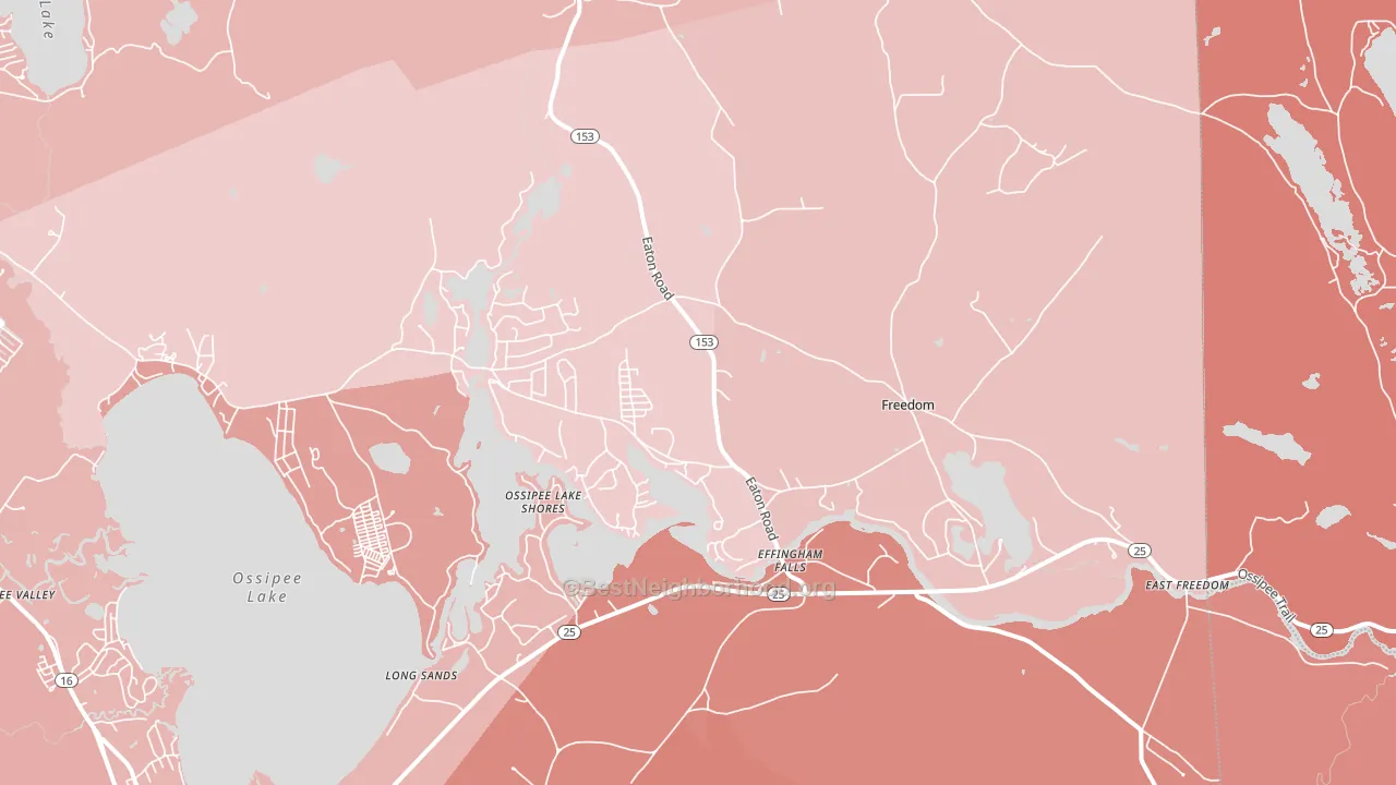
Freedom is a true toss-up. About 48% of voters here vote Democratic and 52% Republican. These figures are model estimates: New Hampshire did not have precinct-level voting records available for training, so the numbers above come from demographic and health features rather than local ground truth.
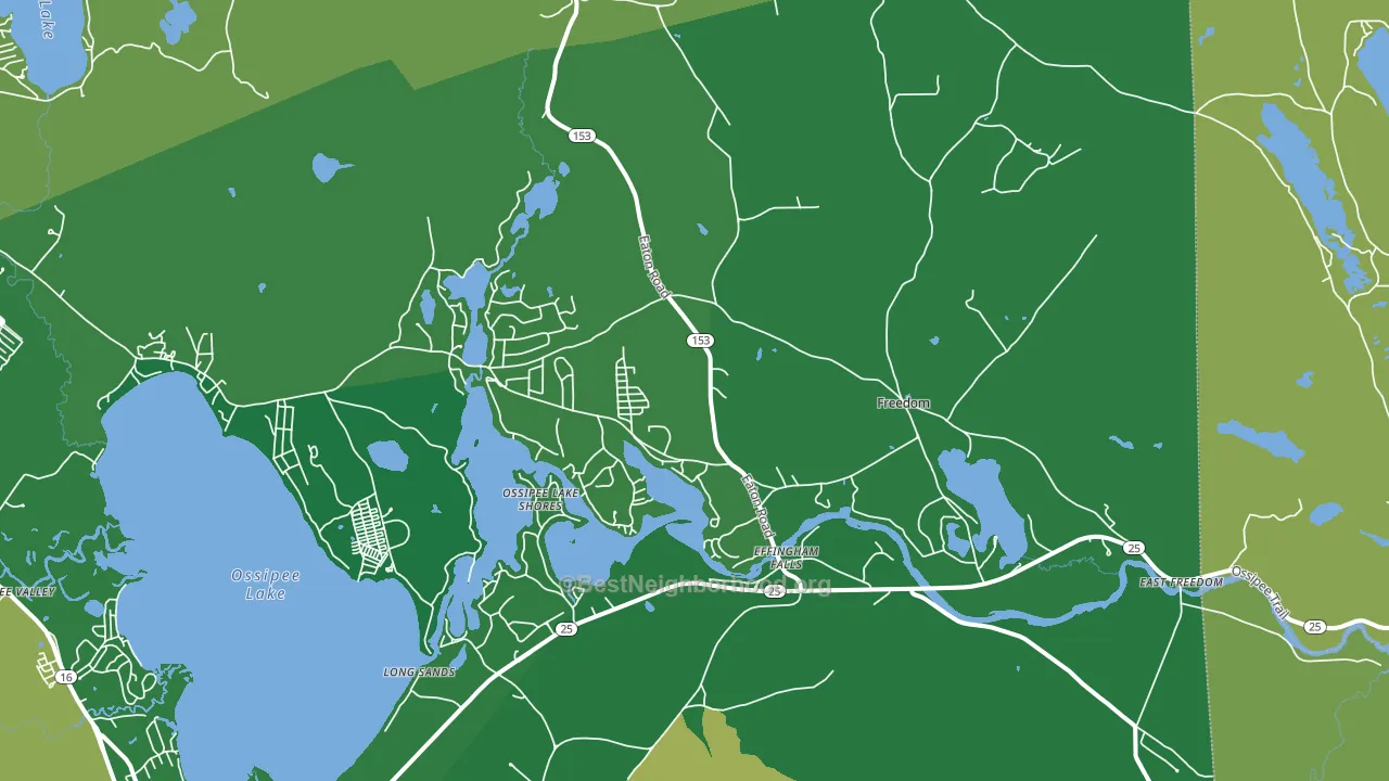
About 93% of adults in Freedom typically vote, above the U.S. average of about 62%. Among adults in Freedom, ~45% vote Democratic, ~48% Republican, and ~7% don't vote. The map below shows estimated turnout by block group.
How Freedom compares
Among cities within 25 miles, Freedom leans more Republican than 35 of 92 neighbors.
Freedom runs about 7 points more Republican than New Hampshire as a whole.
Why Freedom leans the way it does
Density, race composition, education, and family structure all sit close to their national averages in Freedom. None of them point strongly toward either party.
Cancer-screening access and voter turnout
Places with high colon-cancer-screening access tend to turn out at a higher rate; Freedom, NH sits in the top tenth nationally on this measure. Cancer screening does not drive turnout; it reflects income, insurance, and healthcare access.
Why turnout in Freedom looks the way it does
Areas with strong routine healthcare access turn out at higher rates. Freedom is in the top quarter nationally for routine-care measures such as insurance coverage, preventive screenings, and dental visits. The dental-visit rate here is about 68%, about 8 points above the U.S. average of 60%. Homeowners vote more often than renters, and about 91% of households in Freedom own their home, about 16 points above the U.S. average of 75%. Learn more about the findings and methodology on the political spectrum map.
Nearby Cities
- South Effingham, NH R+26
- Center Ossipee, NH R+16
- West Ossipee, NH R+6
- Effingham, NH R+15
- Silver Lake, NH R+6
- Moultonville, NH R+15
- Eaton Center, NH R+5
- Porter, ME R+34
- Tuftonboro, NH R+32
- Madison, NH R+3
Cities with Similar Populations
- Burson, CA R+44
- Ocean Breeze Park, FL R+31
- Deadwood, SD R+49
- Caldwell, WV R+38
- Swanville, MN R+66
- Warwick, GA R+53
- Caney, OK R+75
- Spottsville, KY R+54
- Chebanse, IL R+49
- Scribner, NE R+48
Sources and methodology
Precinct-level voting records used to fit the model come from New Hampshire Secretary of State, Elections Division, distributed by the Voting and Election Science Team. Demographic inputs come from the U.S. Census Bureau (ACS 5-year estimates and the 2020 Decennial Census). Health and environmental inputs come from the CDC (PLACES and the Environmental Justice Index). Land cover comes from the USGS and EPA. Election-day and lead-up weather come from PRISM 4km daily grids and the NOAA Global Historical Climatology Network. Mail-voting and election-administration patterns come from the MIT Election Lab's Survey of the Performance of American Elections. Block-group crime detail comes from CrimeGrade. Internet data and modeling support provided by ISPreports.org.
Modeling and analysis by the BestNeighborhood data science team. NH did not have precinct-level voting records available for training, so the figures here come from extrapolation across demographic, health, and land-use features rather than local ground truth. Full methodology and findings: political spectrum map.
Methodology reviewed by the BestNeighborhood data team. Last updated May 2026.