Gallatin County is a Republican stronghold. About 21% of voters here vote Democratic and 79% Republican.
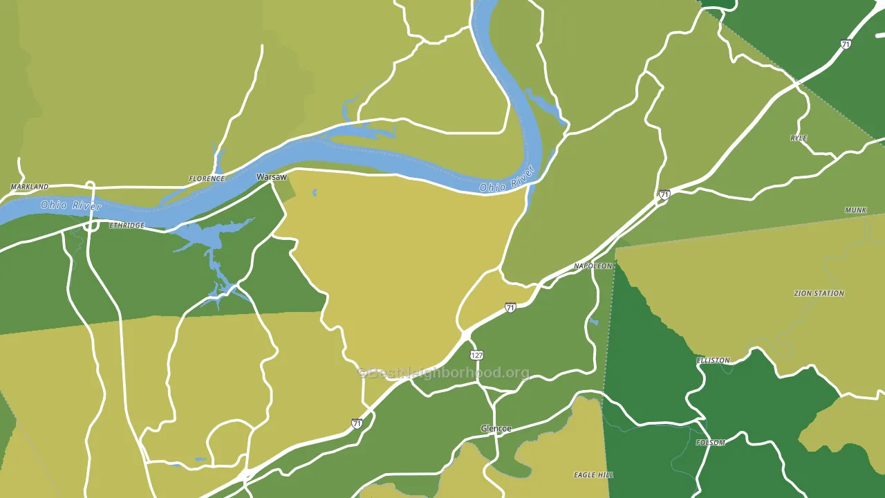
About 71% of adults in Gallatin County typically vote, above the U.S. average of about 62%. Among adults in Gallatin County, ~15% vote Democratic, ~56% Republican, and ~29% don't vote. The map below shows estimated turnout by block group.
How Gallatin County compares
Among counties within 50 miles, Gallatin County leans more Republican than 19 of 28 neighbors.
Gallatin County runs about 27 points more Republican than Kentucky as a whole.
Politics vary noticeably by city within Gallatin County. The northeast side is the most Republican-leaning (R+62) and the north side is the least Republican-leaning (R+51), a spread of about 11 points.
Why Gallatin County leans the way it does
This analysis examined 14,881 data points per county to find what predicts political lean and turnout. The items below are a few correlations that stood out for Gallatin County, not a ranked or complete list of what matters most.
Areas with many family households vote Republican. About 75% of households in Gallatin County are family households, about 8 points above the U.S. average of 67%. Low college attainment predicts Republican voting, and Gallatin County sits in the bottom quarter (about 16%, below 85% of counties).
Paved land cover and Republican lean
Places with little paved surface tend to lean Republican; Gallatin County, KY sits in the bottom quarter nationally on this measure. Paved ground does not change how people vote; it mostly reflects how urban and built-up a place is.
Why turnout in Gallatin County looks the way it does
Turnout in Gallatin County sits close to the national pattern. Routine healthcare access, homeownership, education, and food security all land near their national averages here. Learn more about the findings and methodology on the political spectrum map.
Nearby Counties
- Switzerland County, IN R+63
- Ohio County, IN R+58
- Grant County, KY R+62
- Owen County, KY R+63
- Carroll County, KY R+51
- Boone County, KY R+28
- Kenton County, KY R+14
- Pendleton County, KY R+62
- Dearborn County, IN R+53
- Trimble County, KY R+57
Counties with Similar Populations
- Lyon County, KY R+56
- Modoc County, CA R+44
- Jenkins County, GA R+20
- Turner County, SD R+53
- Monroe County, MO R+57
- Benton County, IN R+49
- Sublette County, WY R+58
- Clearwater County, ID R+64
- Hancock County, GA D+32
- Blaine County, OK R+60
Sources and methodology
Precinct-level voting records used to fit the model come from Kentucky State Board of Elections, distributed by the Voting and Election Science Team. Demographic inputs come from the U.S. Census Bureau (ACS 5-year estimates and the 2020 Decennial Census). Health and environmental inputs come from the CDC (PLACES and the Environmental Justice Index). Land cover comes from the USGS and EPA. Election-day and lead-up weather come from PRISM 4km daily grids and the NOAA Global Historical Climatology Network. Mail-voting and election-administration patterns come from the MIT Election Lab's Survey of the Performance of American Elections. Block-group crime detail comes from CrimeGrade. Internet data and modeling support provided by ISPreports.org.
Modeling and analysis by the BestNeighborhood data science team. Full methodology and findings: political spectrum map.
Methodology reviewed by the BestNeighborhood data team. Last updated May 2026.