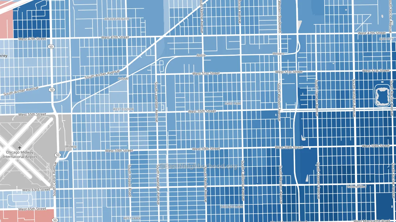
Garfield Manor leans heavily Democratic by roughly 38 points: about 69% of voters vote Democratic and 31% Republican.
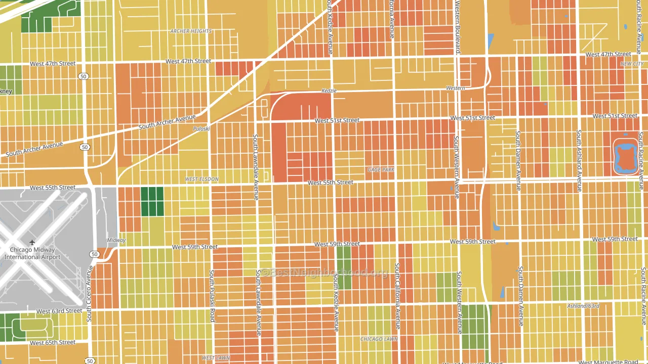
About 35% of adults in Garfield Manor typically vote, below the U.S. average of about 62%. Among adults in Garfield Manor, ~24% vote Democratic, ~11% Republican, and ~65% don't vote. The map below shows estimated turnout by block group.
How Garfield Manor compares
Among neighborhoods within 5 miles, Garfield Manor leans more Democratic than 13 of 37 neighbors.
Garfield Manor runs about 27 points more Democratic than Illinois as a whole.
Why Garfield Manor leans the way it does
This analysis examined 14,881 data points per neighborhood to find what predicts political lean and turnout. The items below are a few correlations that stood out for Garfield Manor, not a ranked or complete list of what matters most.
Dense areas vote Democratic. More than 99% of residents in Garfield Manor live in densely developed areas, about 64 points above the U.S. average of 36%.
Preventive-care access and voter turnout
Places with limited routine preventive-care access tend to turn out at a lower rate; Garfield Manor, Chicago, IL sits in the bottom quarter nationally on this measure. Dental visits do not drive turnout; the rate reflects income, insurance, and healthcare access, which line up with who votes.
Why turnout in Garfield Manor looks the way it does
Areas with limited routine healthcare access turn out at lower rates. Garfield Manor is in the bottom quarter nationally for routine-care measures such as insurance coverage, preventive screenings, and dental visits. The uninsured rate here is about 31%, about 23 points above the Illinois average of 8%. High food insecurity lines up with lower turnout, and about 36% of adults in Garfield Manor report food insecurity, above 90% of neighborhoods. Low high-school completion lines up with lower turnout, and about 66% of adults in Garfield Manor have completed high school, below 96% of neighborhoods. Learn more about the findings and methodology on the political spectrum map.
Nearby Neighborhoods
- Gage Park, Chicago, IL D+39
- West Elsdon, Chicago, IL D+28
- Archer Heights, Chicago, IL D+28
- Chicago Lawn, Chicago, IL D+58
- Brighton Park, Chicago, IL D+32
- West Lawn, Chicago, IL D+32
- Corwith, Chicago, IL D+30
- Back of the Yards, Chicago, IL D+46
- New City, Chicago, IL D+54
- Archer Limits, Chicago, IL D+36
Neighborhoods with Similar Populations
- Poplar Grove, Salt Lake City, UT D+34
- Cambridgeport, Cambridge, MA D+77
- Southwest Topeka, Topeka, KS D+8
- Pleasant Grove West, Chesapeake, VA R+31
- Magruder, Hampton, VA D+47
- Marina-San Francisco, San Francisco, CA D+63
- Eastwood, Syracuse, NY D+37
- Neighbors Southwest, Beaverton, OR D+42
- Churchill, Eugene, OR D+46
- Moran Prairie, Spokane, WA D+18
Sources and methodology
Precinct-level voting records used to fit the model come from Illinois State Board of Elections, distributed by the Voting and Election Science Team. Demographic inputs come from the U.S. Census Bureau (ACS 5-year estimates and the 2020 Decennial Census). Health and environmental inputs come from the CDC (PLACES and the Environmental Justice Index). Land cover comes from the USGS and EPA. Election-day and lead-up weather come from PRISM 4km daily grids and the NOAA Global Historical Climatology Network. Mail-voting and election-administration patterns come from the MIT Election Lab's Survey of the Performance of American Elections. Block-group crime detail comes from CrimeGrade. Internet data and modeling support provided by ISPreports.org.
Modeling and analysis by the BestNeighborhood data science team. Full methodology and findings: political spectrum map.
Methodology reviewed by the BestNeighborhood data team. Last updated May 2026.