Glendale leans Democratic by roughly 24 points: about 62% of voters vote Democratic and 38% Republican.
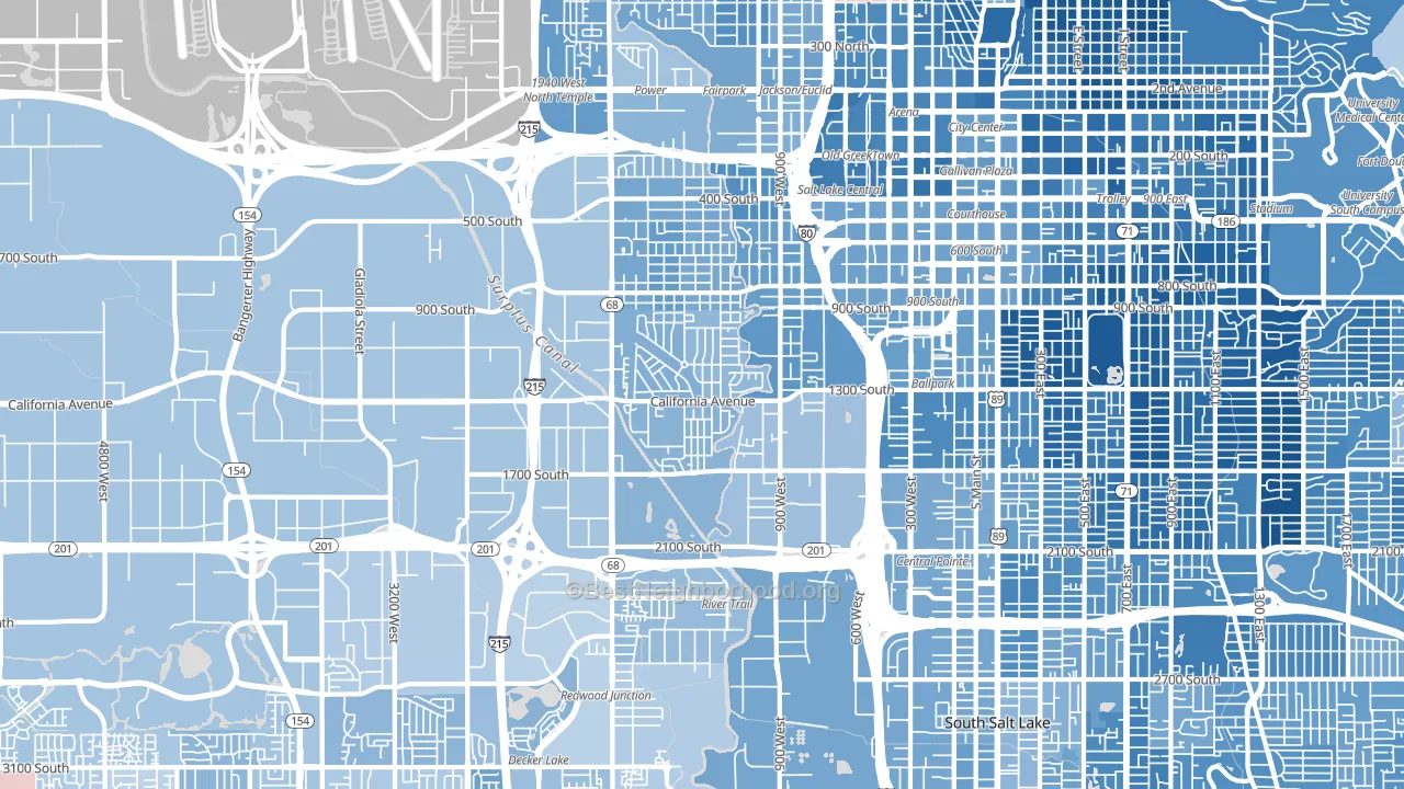
About 38% of adults in Glendale typically vote, below the U.S. average of about 62%. Among adults in Glendale, ~23% vote Democratic, ~14% Republican, and ~63% don't vote. The map below shows estimated turnout by block group.
How Glendale compares
Among neighborhoods within 5 miles, Glendale leans more Democratic than 2 of 18 neighbors.
Glendale runs about 46 points more Democratic than Utah as a whole. Utah leans Republican overall, while Glendale is one of the few Democratic-leaning pockets.
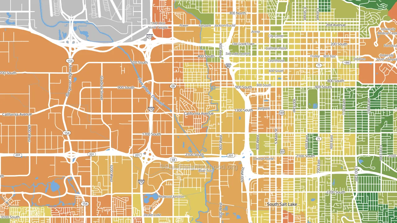
Politics vary noticeably by block within Glendale. The northeast side runs the most Democratic (D+30) and the southwest side runs the most Republican (R+3), a spread of about 33 points.
Why Glendale leans the way it does
This analysis examined 14,881 data points per neighborhood to find what predicts political lean and turnout. The items below are a few correlations that stood out for Glendale, not a ranked or complete list of what matters most.
Glendale votes against the grain of Utah. Utah leans Republican overall, while Glendale runs about 46 points more Democratic.
High-school completion, developed land, and voter turnout
Places that combine low high-school-completion share and a heavily developed built environment tend to turn out at a lower rate, as Glendale, Salt Lake City, UT does.
Why turnout in Glendale looks the way it does
Areas with limited routine healthcare access turn out at lower rates. Glendale is in the bottom quarter nationally for routine-care measures such as insurance coverage, preventive screenings, and dental visits. The uninsured rate here is about 23%, about 13 points above the Utah average of 10%. High food insecurity lines up with lower turnout, and about 29% of adults in Glendale report food insecurity, above 81% of neighborhoods. High-crime urban areas turn out at lower rates, and Glendale sits in the top 15% on a violent-crime measure. Learn more about the findings and methodology on the political spectrum map.
Nearby Neighborhoods
- Poplar Grove, Salt Lake City, UT D+34
- People's Freeway, Salt Lake City, UT D+47
- Downtown, Salt Lake City, UT D+48
- Central City Liberty Wells, Salt Lake City, UT D+66
- Liberty Wells, Salt Lake City, UT D+64
- Fairpark, Salt Lake City, UT D+40
- Jordan Meadows, Salt Lake City, UT D+30
- Central City, Salt Lake City, UT D+60
- Capitol Hill, Salt Lake City, UT D+52
- Rose Park, Salt Lake City, UT D+30
Neighborhoods with Similar Populations
- Outer Mission, San Francisco, CA D+48
- Grayland, Chicago, IL D+39
- Phoebus, Hampton, VA D+52
- Energy Corridor, Houston, TX D+21
- Fenton Area, Fenton, MO R+27
- University District, Portland, OR D+62
- Yorkshire, Charlotte, NC D+29
- Copperfield, Houston, TX R+4
- Oceanway, Jacksonville, FL R+7
- Eastmont, Oakland, CA D+72
Sources and methodology
Precinct-level voting records used to fit the model come from Utah Lieutenant Governor's Office, Elections, distributed by the Voting and Election Science Team. Demographic inputs come from the U.S. Census Bureau (ACS 5-year estimates and the 2020 Decennial Census). Health and environmental inputs come from the CDC (PLACES and the Environmental Justice Index). Land cover comes from the USGS and EPA. Election-day and lead-up weather come from PRISM 4km daily grids and the NOAA Global Historical Climatology Network. Mail-voting and election-administration patterns come from the MIT Election Lab's Survey of the Performance of American Elections. Block-group crime detail comes from CrimeGrade. Internet data and modeling support provided by ISPreports.org.
Modeling and analysis by the BestNeighborhood data science team. Full methodology and findings: political spectrum map.
Methodology reviewed by the BestNeighborhood data team. Last updated May 2026.