Fenton Area leans Republican by roughly 26 points: about 37% of voters vote Democratic and 63% Republican.
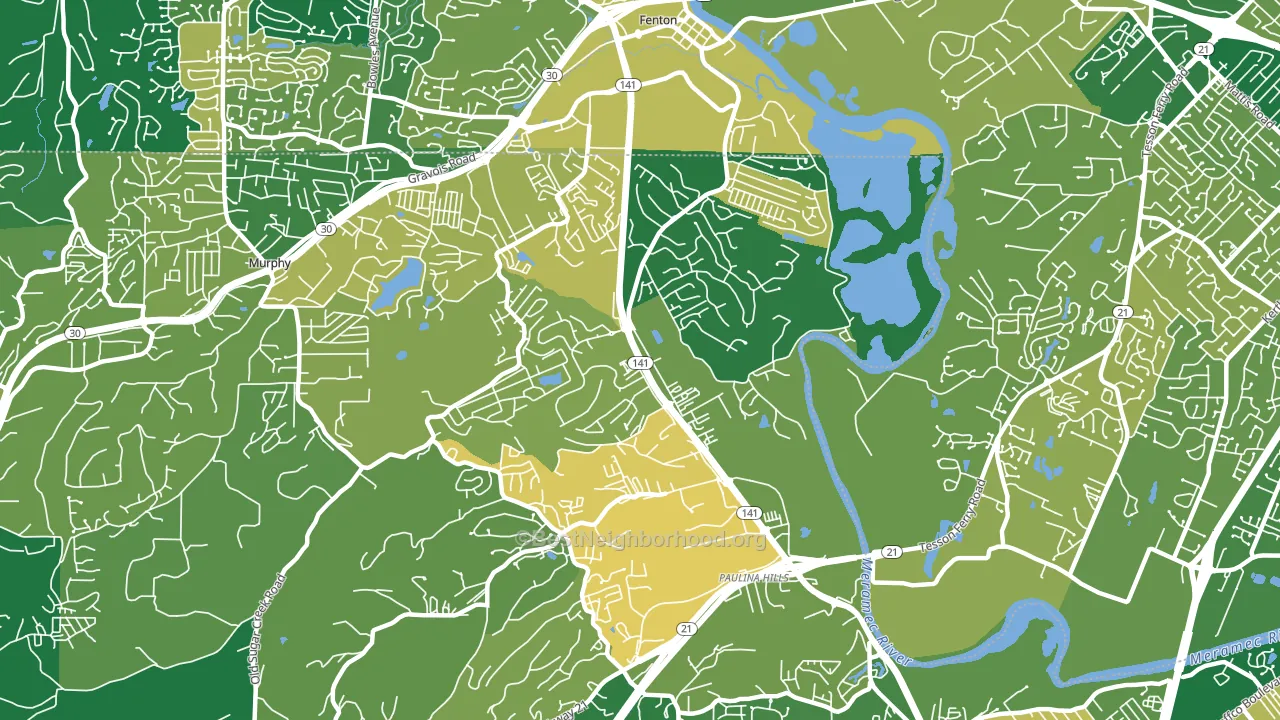
About 76% of adults in Fenton Area typically vote, above the U.S. average of about 62%. Among adults in Fenton Area, ~28% vote Democratic, ~48% Republican, and ~24% don't vote. The map below shows estimated turnout by block group.
How Fenton Area compares
Fenton Area runs about 8 points more Republican than Missouri as a whole.
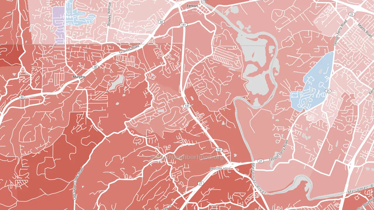
Politics vary noticeably by block within Fenton Area. The southwest side is the most Republican-leaning (R+35) and the northeast side is the least Republican-leaning (R+22), a spread of about 13 points.
Why Fenton Area leans the way it does
This analysis examined 14,881 data points per neighborhood to find what predicts political lean and turnout. The items below are a few correlations that stood out for Fenton Area, not a ranked or complete list of what matters most.
Rural areas with a high white share vote Republican. Fenton Area sits in the bottom quarter on density and about 87% of residents are non-Hispanic white, about 15 points above the U.S. average of 72%.
Paved land cover and Republican lean
Places with little paved surface tend to lean Republican; Fenton Area, Fenton, MO sits in the bottom quarter nationally on this measure. Paved ground does not change how people vote; it mostly reflects how urban and built-up a place is.
Why turnout in Fenton Area looks the way it does
Turnout in Fenton Area sits close to the national pattern. Learn more about the findings and methodology on the political spectrum map.
Nearby Neighborhoods
- Saint Louis Hills, St. Louis, MO D+33
- Boulevard Heights, St. Louis, MO D+25
- Princeton Heights, St. Louis, MO D+42
- Lindenwood Park, St. Louis, MO D+39
- South Hampton, St. Louis, MO D+55
- Holly Hills, St. Louis, MO D+40
- Carondelet, St. Louis, MO D+51
- Bevo Mill, St. Louis, MO D+40
- North Hampton, St. Louis, MO D+54
- Clifton Heights, St. Louis, MO D+36
Neighborhoods with Similar Populations
- Energy Corridor, Houston, TX D+21
- Eastmont, Oakland, CA D+72
- Phoebus, Hampton, VA D+52
- Overtown, Miami, FL D+37
- Glendale, Salt Lake City, UT D+24
- Outer Mission, San Francisco, CA D+48
- Grayland, Chicago, IL D+39
- Hough, Cleveland, OH D+85
- Milwood, Austin, TX D+42
- South Central Westminster, Westminster, CO D+19
Sources and methodology
Precinct-level voting records used to fit the model come from Missouri Secretary of State, Elections, distributed by the Voting and Election Science Team. Demographic inputs come from the U.S. Census Bureau (ACS 5-year estimates and the 2020 Decennial Census). Health and environmental inputs come from the CDC (PLACES and the Environmental Justice Index). Land cover comes from the USGS and EPA. Election-day and lead-up weather come from PRISM 4km daily grids and the NOAA Global Historical Climatology Network. Mail-voting and election-administration patterns come from the MIT Election Lab's Survey of the Performance of American Elections. Block-group crime detail comes from CrimeGrade. Internet data and modeling support provided by ISPreports.org.
Modeling and analysis by the BestNeighborhood data science team. Full methodology and findings: political spectrum map.
Methodology reviewed by the BestNeighborhood data team. Last updated May 2026.