Hanover leans heavily Republican by roughly 40 points: about 30% of voters vote Democratic and 70% Republican.
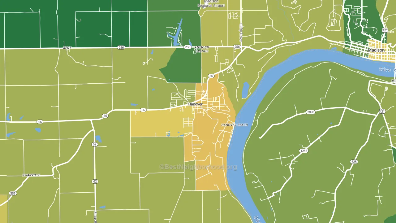
About 59% of adults in Hanover typically vote, near the U.S. average of about 62%. Among adults in Hanover, ~18% vote Democratic, ~42% Republican, and ~40% don't vote. The map below shows estimated turnout by block group.
How Hanover compares
Among cities within 25 miles, Hanover leans more Republican than 6 of 78 neighbors.
Hanover runs about 21 points more Republican than Indiana as a whole.
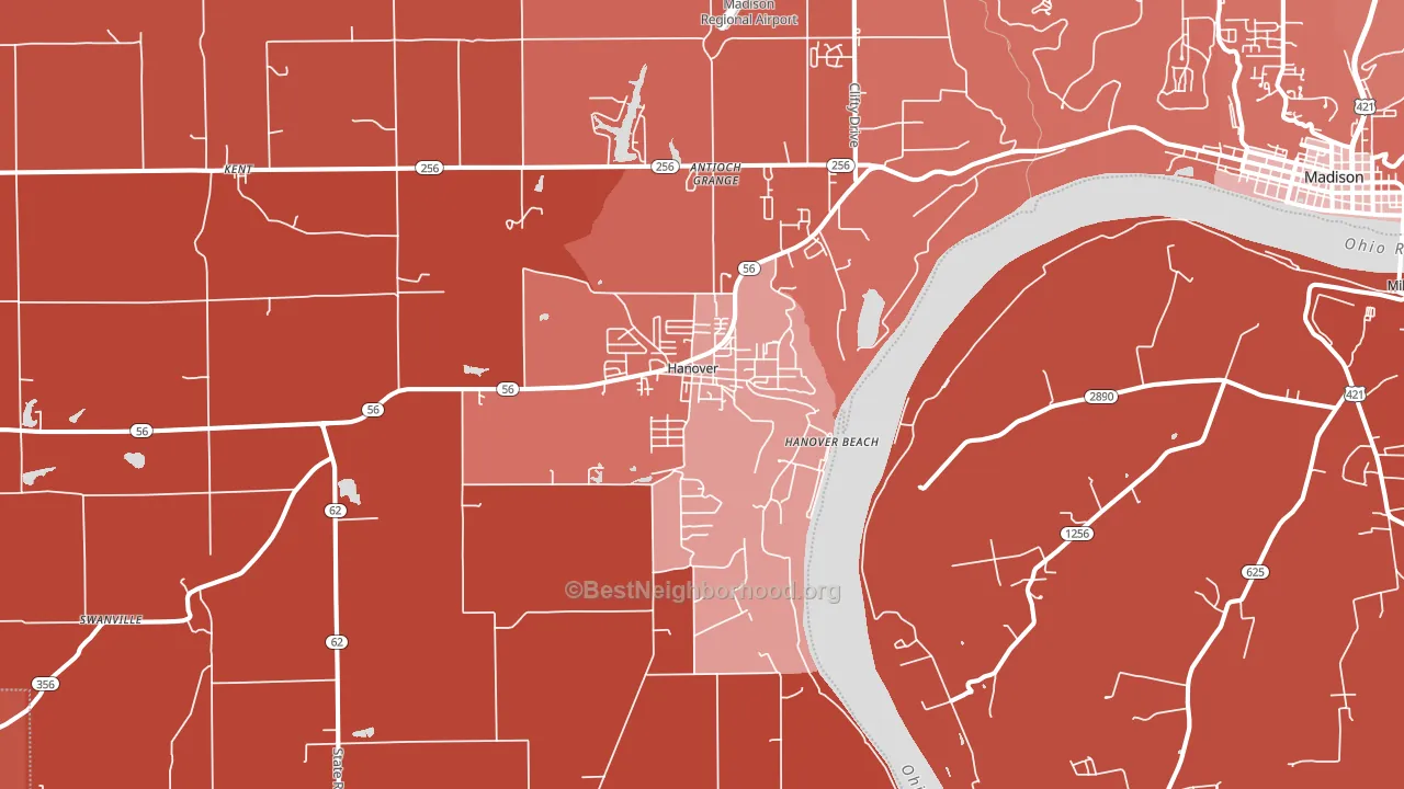
Politics vary noticeably by neighborhood within Hanover. The southwest side is the most Republican-leaning (R+57) and the east side is the least Republican-leaning (R+30), a spread of about 27 points.
Why Hanover leans the way it does
This analysis examined 14,881 data points per city to find what predicts political lean and turnout. The items below are a few correlations that stood out for Hanover, not a ranked or complete list of what matters most.
Hanover votes Republican even though it is densely developed (about 28%, about 9 points below the U.S. average of 36%). State and regional patterns outweigh the Democratic lean that density usually predicts here.
Homeownership and voter turnout
Places with renter-heavy households tend to turn out at a lower rate; Hanover, IN sits in the bottom quarter nationally on this measure.
Why turnout in Hanover looks the way it does
Renters vote less often than owners. About 29% of households in Hanover rent, above 83% of cities. Learn more about the findings and methodology on the political spectrum map.
Nearby Cities
- Saluda, IN R+62
- North Madison, IN R+37
- Kent, IN R+60
- Chelsea, IN R+62
- Smyrna, IN R+50
- Volga, IN R+55
- Milton, KY R+58
- Madison, IN R+39
- Paynesville, IN R+62
- Otto, IN R+60
Cities with Similar Populations
- Coldspring, TX R+57
- Greenback, TN R+69
- Beaver Dam, KY R+56
- North Street, MI R+38
- Dulles Town Center, VA D+26
- Port St. Joe, FL R+41
- Coal Valley, IL R+18
- Pinnacle, NC R+57
- Eldorado at Santa Fe, NM D+68
- Port Labelle, FL R+36
Sources and methodology
Precinct-level voting records used to fit the model come from Indiana Secretary of State, Elections, distributed by the Voting and Election Science Team. Demographic inputs come from the U.S. Census Bureau (ACS 5-year estimates and the 2020 Decennial Census). Health and environmental inputs come from the CDC (PLACES and the Environmental Justice Index). Land cover comes from the USGS and EPA. Election-day and lead-up weather come from PRISM 4km daily grids and the NOAA Global Historical Climatology Network. Mail-voting and election-administration patterns come from the MIT Election Lab's Survey of the Performance of American Elections. Block-group crime detail comes from CrimeGrade. Internet data and modeling support provided by ISPreports.org.
Modeling and analysis by the BestNeighborhood data science team. Full methodology and findings: political spectrum map.
Methodology reviewed by the BestNeighborhood data team. Last updated May 2026.