Harlan County is a Republican stronghold. About 14% of voters here vote Democratic and 86% Republican.
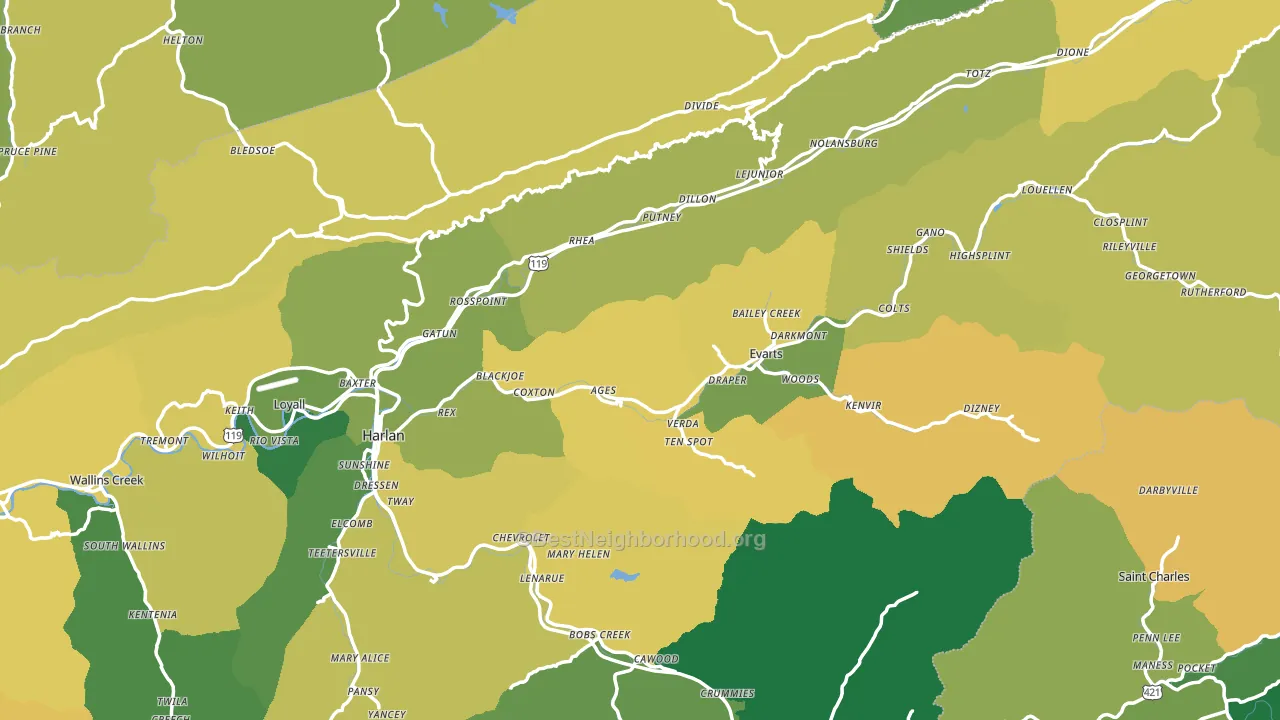
About 64% of adults in Harlan County typically vote, near the U.S. average of about 62%. Among adults in Harlan County, ~9% vote Democratic, ~55% Republican, and ~36% don't vote. The map below shows estimated turnout by block group.
How Harlan County compares
Among counties within 50 miles, Harlan County leans more Republican than 16 of 19 neighbors.
Harlan County runs about 41 points more Republican than Kentucky as a whole.
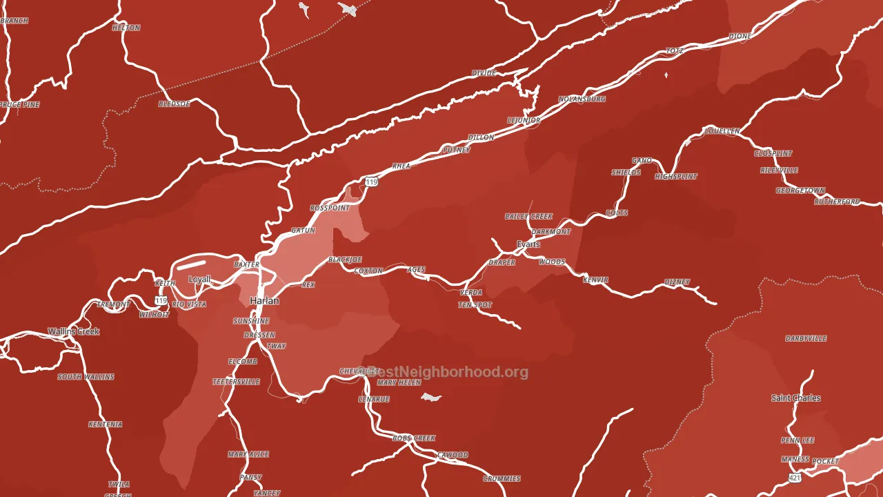
Politics vary noticeably by city within Harlan County. The northwest side is the most Republican-leaning (R+85) and the west side is the least Republican-leaning (R+66), a spread of about 19 points.
Why Harlan County leans the way it does
This analysis examined 14,881 data points per county to find what predicts political lean and turnout. The items below are a few correlations that stood out for Harlan County, not a ranked or complete list of what matters most.
Areas with a high white share and below-average college attainment vote Republican. In Harlan County, about 94% of residents are non-Hispanic white, about 22 points above the U.S. average of 72%; about 13% of adults hold a bachelor's degree, about 6 points below the Kentucky average of 19%. Rural areas vote Republican, and Harlan County sits in the bottom quarter on density (about 12%, below 79% of counties). A high family-household share predicts Republican voting, and about 70% of households in Harlan County are family households, above 80% of counties.
Paved land cover and Republican lean
Places with little paved surface tend to lean Republican; Harlan County, KY sits in the bottom quarter nationally on this measure. Paved ground does not change how people vote; it mostly reflects how urban and built-up a place is.
Why turnout in Harlan County looks the way it does
Turnout in Harlan County sits close to the national pattern. Learn more about the findings and methodology on the political spectrum map.
Nearby Counties
- Lee County, VA R+64
- Leslie County, KY R+76
- Hancock County, TN R+77
- Perry County, KY R+61
- Bell County, KY R+62
- Letcher County, KY R+65
- Norton City, VA R+39
- Hawkins County, TN R+66
- Claiborne County, TN R+70
- Wise County, VA R+55
Counties with Similar Populations
- Hardin County, TN R+69
- De Soto Parish, LA R+22
- Dawson County, GA R+61
- Woodford County, KY R+29
- Stephens County, GA R+53
- Yazoo County, MS D+17
- Gillespie County, TX R+56
- Mineral County, WV R+58
- King George County, VA R+23
- Carroll County, OH R+55
Sources and methodology
Precinct-level voting records used to fit the model come from Kentucky State Board of Elections, distributed by the Voting and Election Science Team. Demographic inputs come from the U.S. Census Bureau (ACS 5-year estimates and the 2020 Decennial Census). Health and environmental inputs come from the CDC (PLACES and the Environmental Justice Index). Land cover comes from the USGS and EPA. Election-day and lead-up weather come from PRISM 4km daily grids and the NOAA Global Historical Climatology Network. Mail-voting and election-administration patterns come from the MIT Election Lab's Survey of the Performance of American Elections. Block-group crime detail comes from CrimeGrade. Internet data and modeling support provided by ISPreports.org.
Modeling and analysis by the BestNeighborhood data science team. Full methodology and findings: political spectrum map.
Methodology reviewed by the BestNeighborhood data team. Last updated May 2026.