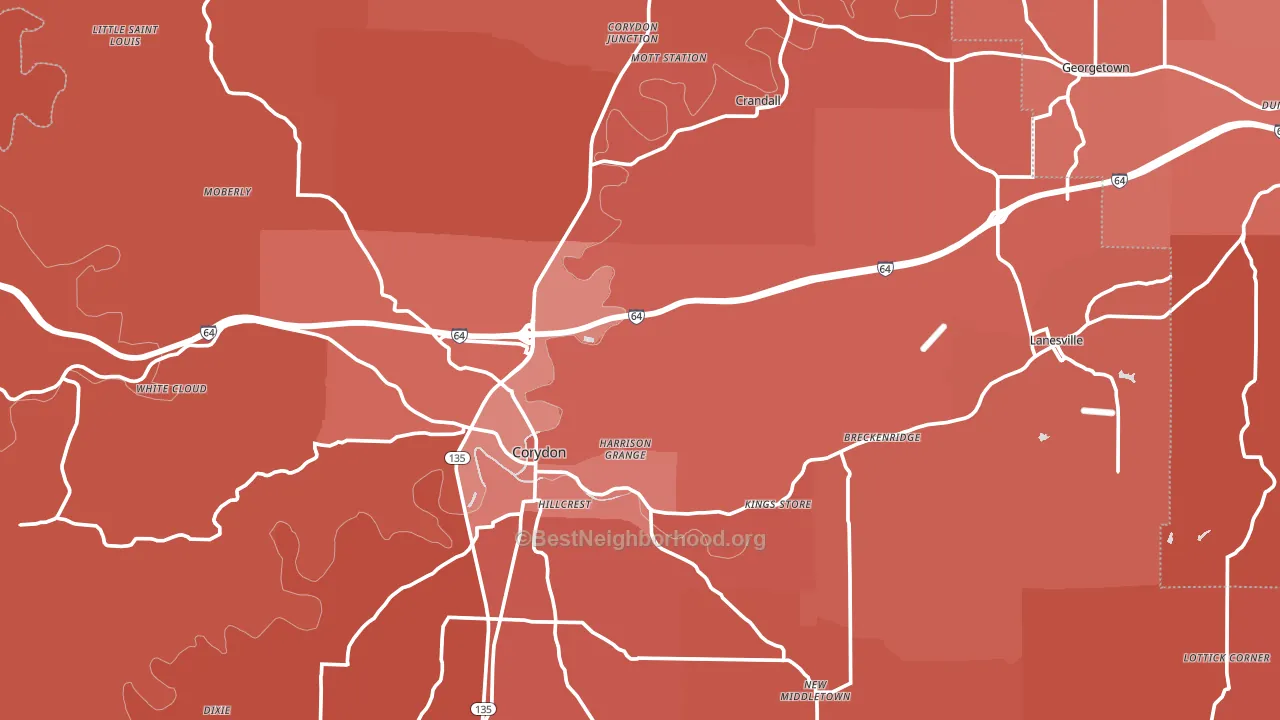
Harrison County leans heavily Republican by roughly 50 points: about 25% of voters vote Democratic and 75% Republican.
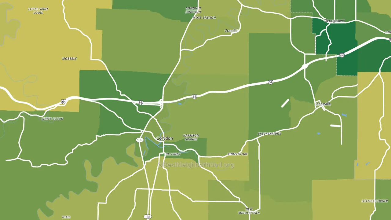
About 72% of adults in Harrison County typically vote, above the U.S. average of about 62%. Among adults in Harrison County, ~18% vote Democratic, ~54% Republican, and ~28% don't vote. The map below shows estimated turnout by block group.
How Harrison County compares
Among counties within 50 miles, Harrison County leans more Republican than 11 of 21 neighbors.
Harrison County runs about 31 points more Republican than Indiana as a whole.
Politics vary noticeably by city within Harrison County. The southwest side is the most Republican-leaning (R+58) and the west side is the least Republican-leaning (R+44), a spread of about 14 points.
Why Harrison County leans the way it does
Density, race composition, education, and family structure all sit close to their national averages in Harrison County. The lean here lands roughly where demographic data alone would predict.
Paved land cover and Republican lean
Places with little paved surface tend to lean Republican; Harrison County, IN sits in the bottom quarter nationally on this measure. Paved ground does not change how people vote; it mostly reflects how urban and built-up a place is.
Why turnout in Harrison County looks the way it does
Homeowners vote more often than renters. About 84% of households in Harrison County own their home, about 9 points above the U.S. average of 75%. Learn more about the findings and methodology on the political spectrum map.
Nearby Counties
- Floyd County, IN R+18
- Crawford County, IN R+52
- Meade County, KY R+49
- Clark County, IN R+23
- Jefferson County, KY D+20
- Washington County, IN R+57
- Bullitt County, KY R+48
- Orange County, IN R+54
- Hardin County, KY R+27
- Oldham County, KY R+23
Counties with Similar Populations
- Okeechobee County, FL R+46
- Hendry County, FL R+26
- Avoyelles Parish, LA R+37
- Waldo County, ME R+7
- Mecosta County, MI R+26
- Snyder County, PA R+50
- Howell County, MO R+62
- Latah County, ID R+4
- Murray County, GA R+68
- Sequoyah County, OK R+58
Sources and methodology
Precinct-level voting records used to fit the model come from Indiana Secretary of State, Elections, distributed by the Voting and Election Science Team. Demographic inputs come from the U.S. Census Bureau (ACS 5-year estimates and the 2020 Decennial Census). Health and environmental inputs come from the CDC (PLACES and the Environmental Justice Index). Land cover comes from the USGS and EPA. Election-day and lead-up weather come from PRISM 4km daily grids and the NOAA Global Historical Climatology Network. Mail-voting and election-administration patterns come from the MIT Election Lab's Survey of the Performance of American Elections. Block-group crime detail comes from CrimeGrade. Internet data and modeling support provided by ISPreports.org.
Modeling and analysis by the BestNeighborhood data science team. Full methodology and findings: political spectrum map.
Methodology reviewed by the BestNeighborhood data team. Last updated May 2026.