Howell County is a Republican stronghold. About 19% of voters here vote Democratic and 81% Republican.
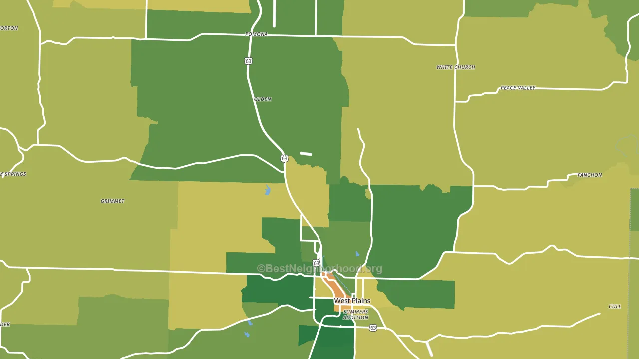
About 74% of adults in Howell County typically vote, above the U.S. average of about 62%. Among adults in Howell County, ~14% vote Democratic, ~60% Republican, and ~26% don't vote. The map below shows estimated turnout by block group.
How Howell County compares
Among counties within 50 miles, Howell County leans more Republican than 1 of 10 neighbors.
Howell County runs about 44 points more Republican than Missouri as a whole.
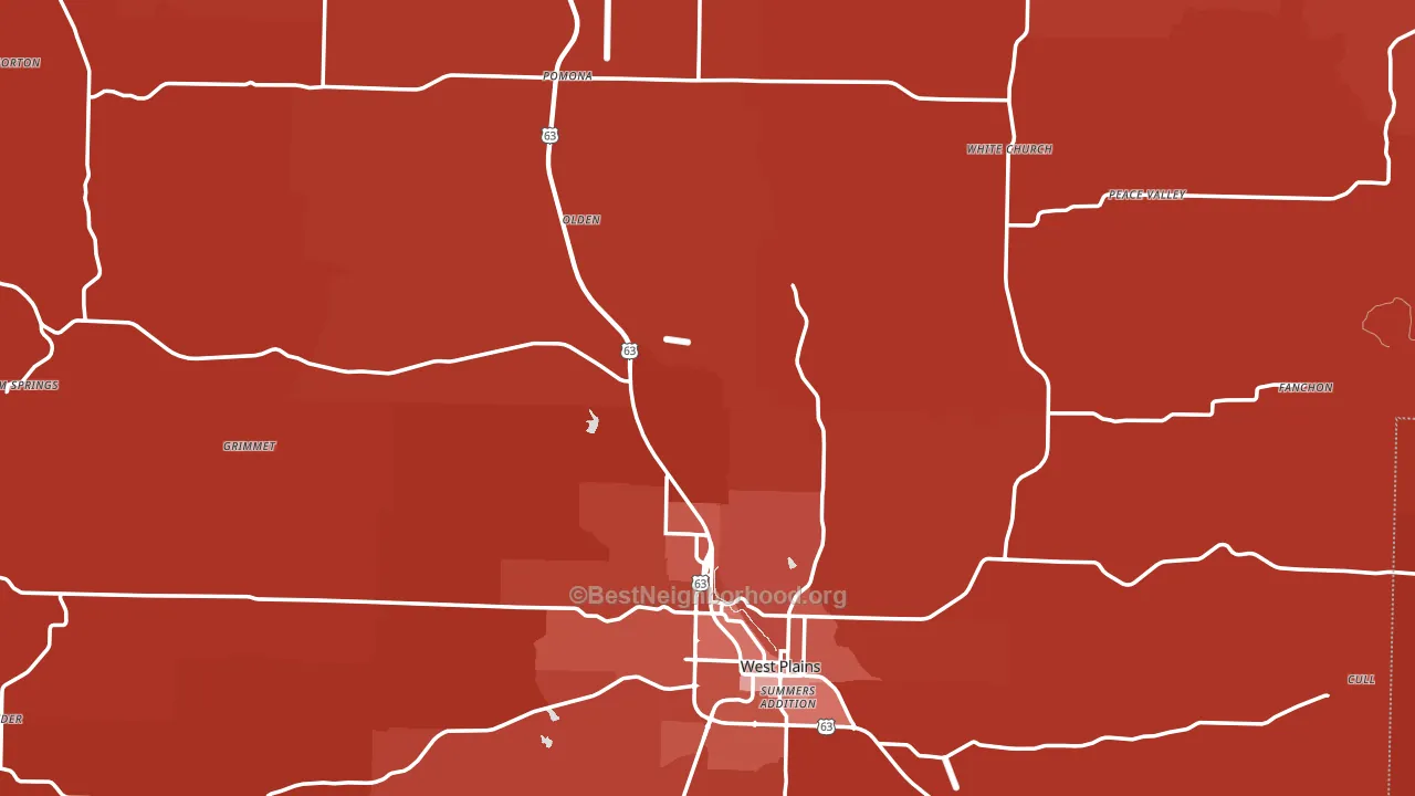
Politics vary noticeably by city within Howell County. The southwest side is the most Republican-leaning (R+72) and the east side is the least Republican-leaning (R+58), a spread of about 13 points.
Why Howell County leans the way it does
This analysis examined 14,881 data points per county to find what predicts political lean and turnout. The items below are a few correlations that stood out for Howell County, not a ranked or complete list of what matters most.
Areas with a high white share and below-average college attainment vote Republican. In Howell County, about 91% of residents are non-Hispanic white, about 19 points above the U.S. average of 72%; about 18% of adults hold a bachelor's degree, about 10 points below the U.S. average of 28%.
Cancer-screening access and voter turnout
Places with low colon-cancer-screening access tend to turn out at a lower rate; Howell County, MO sits in the bottom quarter nationally on this measure. Cancer screening does not drive turnout; it reflects income, insurance, and healthcare access.
Why turnout in Howell County looks the way it does
Turnout in Howell County sits close to the national pattern. Routine healthcare access, homeownership, education, and food security all land near their national averages here. Learn more about the findings and methodology on the political spectrum map.
Nearby Counties
- Oregon County, MO R+69
- Fulton County, AR R+64
- Shannon County, MO R+68
- Ozark County, MO R+67
- Texas County, MO R+67
- Wright County, MO R+69
- Douglas County, MO R+70
- Baxter County, AR R+51
- Izard County, AR R+65
- Sharp County, AR R+62
Counties with Similar Populations
- Snyder County, PA R+50
- Mecosta County, MI R+26
- Avoyelles Parish, LA R+37
- Harrison County, IN R+50
- Okeechobee County, FL R+46
- Hendry County, FL R+26
- Waldo County, ME R+7
- Murray County, GA R+68
- Latah County, ID R+4
- Mower County, MN R+13
Sources and methodology
Precinct-level voting records used to fit the model come from Missouri Secretary of State, Elections, distributed by the Voting and Election Science Team. Demographic inputs come from the U.S. Census Bureau (ACS 5-year estimates and the 2020 Decennial Census). Health and environmental inputs come from the CDC (PLACES and the Environmental Justice Index). Land cover comes from the USGS and EPA. Election-day and lead-up weather come from PRISM 4km daily grids and the NOAA Global Historical Climatology Network. Mail-voting and election-administration patterns come from the MIT Election Lab's Survey of the Performance of American Elections. Block-group crime detail comes from CrimeGrade. Internet data and modeling support provided by ISPreports.org.
Modeling and analysis by the BestNeighborhood data science team. Full methodology and findings: political spectrum map.
Methodology reviewed by the BestNeighborhood data team. Last updated May 2026.