Jefferson County leans Democratic by roughly 20 points: about 60% of voters vote Democratic and 40% Republican.
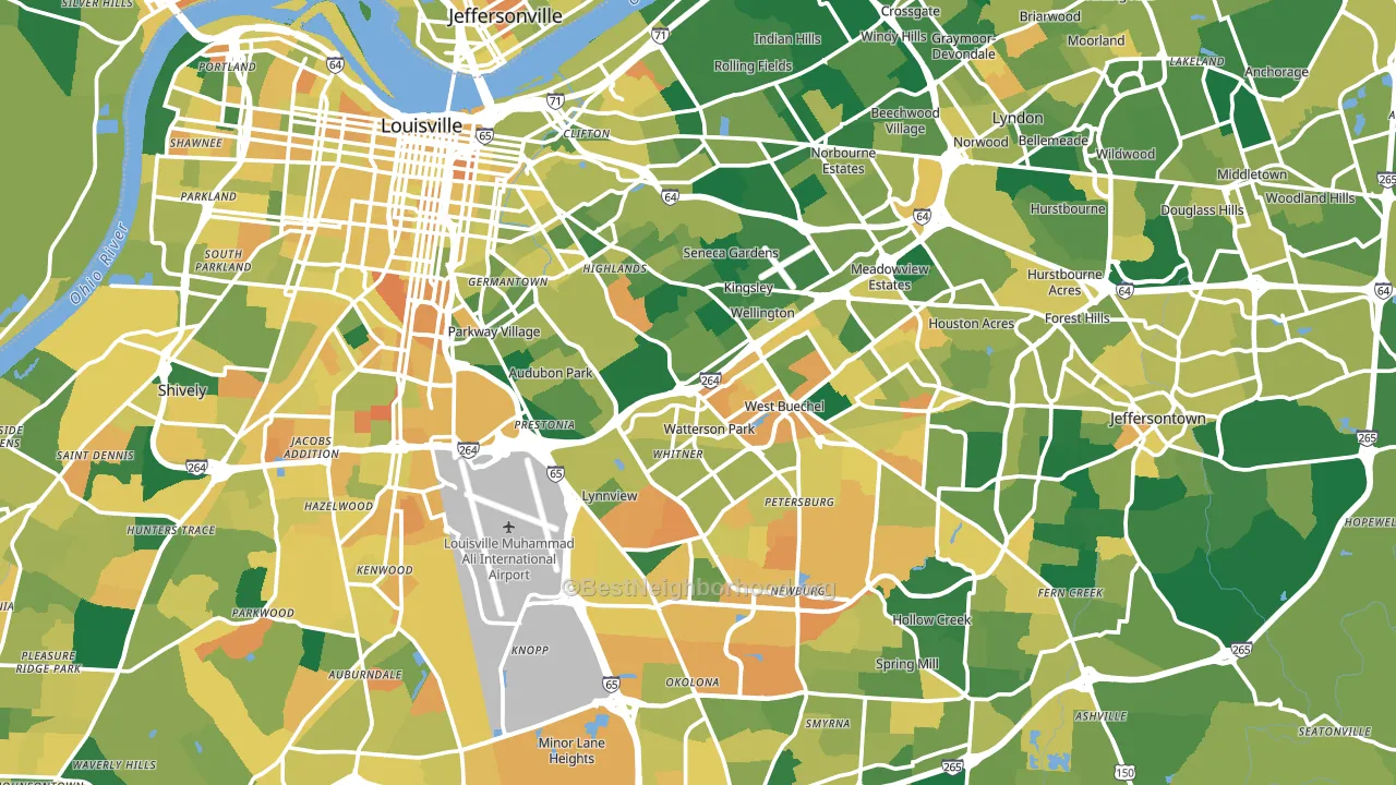
About 66% of adults in Jefferson County typically vote, near the U.S. average of about 62%. Among adults in Jefferson County, ~40% vote Democratic, ~26% Republican, and ~34% don't vote. The map below shows estimated turnout by block group.
How Jefferson County compares
Among counties within 50 miles, Jefferson County is the most Democratic-leaning.
Jefferson County runs about 51 points more Democratic than Kentucky as a whole. Kentucky leans Republican overall, while Jefferson County is one of the few Democratic-leaning pockets.
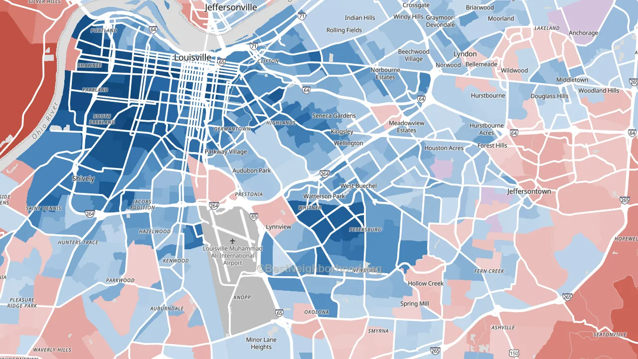
Politics vary noticeably by city within Jefferson County. The northwest side is the most Democratic-leaning (D+71) and the southeast side is the least Democratic-leaning (Even), a spread of about 70 points.
Why Jefferson County leans the way it does
This analysis examined 14,881 data points per county to find what predicts political lean and turnout. The items below are a few correlations that stood out for Jefferson County, not a ranked or complete list of what matters most.
Dense areas vote Democratic. About 90% of residents in Jefferson County live in densely developed areas, about 54 points above the U.S. average of 36%. High college attainment predicts Democratic voting, and Jefferson County sits in the top quarter (about 36%, above 87% of counties). Jefferson County runs against the grain of Kentucky, a Democratic-leaning pocket in a Republican-leaning state.
Population density and Democratic lean
Places with high population density tend to lean Democratic; Jefferson County, KY sits in the top tenth nationally on this measure.
Why turnout in Jefferson County looks the way it does
Turnout in Jefferson County sits close to the national pattern. Routine healthcare access, homeownership, education, and food security all land near their national averages here. Learn more about the findings and methodology on the political spectrum map.
Nearby Counties
- Clark County, IN R+23
- Bullitt County, KY R+48
- Floyd County, IN R+18
- Oldham County, KY R+23
- Spencer County, KY R+56
- Harrison County, IN R+50
- Shelby County, KY R+32
- Nelson County, KY R+46
- Meade County, KY R+49
- Henry County, KY R+51
Counties with Similar Populations
- San Joaquin County, CA D+4
- Oklahoma County, OK D+6
- Suffolk County, MA D+53
- Cobb County, GA D+20
- San Mateo County, CA D+48
- DeKalb County, GA D+63
- Lee County, FL R+19
- Monroe County, NY D+25
- Essex County, MA D+18
- Multnomah County, OR D+52
Sources and methodology
Precinct-level voting records used to fit the model come from Kentucky State Board of Elections, distributed by the Voting and Election Science Team. Demographic inputs come from the U.S. Census Bureau (ACS 5-year estimates and the 2020 Decennial Census). Health and environmental inputs come from the CDC (PLACES and the Environmental Justice Index). Land cover comes from the USGS and EPA. Election-day and lead-up weather come from PRISM 4km daily grids and the NOAA Global Historical Climatology Network. Mail-voting and election-administration patterns come from the MIT Election Lab's Survey of the Performance of American Elections. Block-group crime detail comes from CrimeGrade. Internet data and modeling support provided by ISPreports.org.
Modeling and analysis by the BestNeighborhood data science team. Full methodology and findings: political spectrum map.
Methodology reviewed by the BestNeighborhood data team. Last updated May 2026.