Houston is a Republican stronghold. About 14% of voters here vote Democratic and 86% Republican.
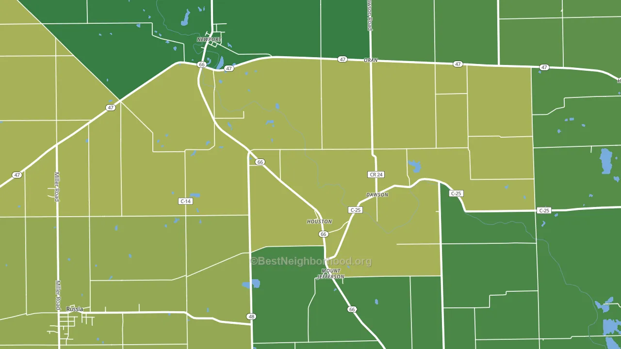
About 74% of adults in Houston typically vote, above the U.S. average of about 62%. Among adults in Houston, ~10% vote Democratic, ~64% Republican, and ~26% don't vote. The map below shows estimated turnout by block group.
How Houston compares
Among cities within 25 miles, Houston leans more Republican than 82 of 103 neighbors.
Houston runs about 62 points more Republican than Ohio as a whole.
Why Houston leans the way it does
This analysis examined 14,881 data points per city to find what predicts political lean and turnout. The items below are a few correlations that stood out for Houston, not a ranked or complete list of what matters most.
Car-dependent areas vote Republican. About 86% of residents in Houston drive to work alone, about 12 points above the U.S. average of 74%. Low college attainment predicts Republican voting, and Houston sits in the bottom quarter (about 14%, below 80% of cities). A high family-household share predicts Republican voting, and about 77% of households in Houston are family households, above 82% of cities.
Walkability and Republican lean
Places with a low walkability score tend to lean Republican; Houston, OH sits in the bottom quarter nationally on this measure. A walkable street grid does not change how people vote; it mostly reflects how urban a place is.
Why turnout in Houston looks the way it does
Turnout in Houston sits close to the national pattern. Learn more about the findings and methodology on the political spectrum map.
Nearby Cities
- Mount Jefferson, OH R+70
- Russia, OH R+72
- Fort Loramie, OH R+70
- Willowdell, OH R+77
- Filburns Island, OH R+77
- Lockington, OH R+71
- Yorkshire, OH R+79
- Versailles, OH R+70
- Lehmkuhl Landing, OH R+74
- Webster, OH R+69
Cities with Similar Populations
- Long Point, TX R+65
- San Lorenzo Park, CA D+47
- Elk Run Heights, IA R+25
- Elmore City, OK R+66
- Kell, IL R+66
- Ringling, OK R+72
- Sidney Center, NY R+37
- Prairie Du Rocher, IL R+57
- Fountain Run, KY R+71
- Shartlesville, PA R+50
Sources and methodology
Precinct-level voting records used to fit the model come from Ohio Secretary of State, Elections, distributed by the Voting and Election Science Team. Demographic inputs come from the U.S. Census Bureau (ACS 5-year estimates and the 2020 Decennial Census). Health and environmental inputs come from the CDC (PLACES and the Environmental Justice Index). Land cover comes from the USGS and EPA. Election-day and lead-up weather come from PRISM 4km daily grids and the NOAA Global Historical Climatology Network. Mail-voting and election-administration patterns come from the MIT Election Lab's Survey of the Performance of American Elections. Block-group crime detail comes from CrimeGrade. Internet data and modeling support provided by ISPreports.org.
Modeling and analysis by the BestNeighborhood data science team. Full methodology and findings: political spectrum map.
Methodology reviewed by the BestNeighborhood data team. Last updated May 2026.