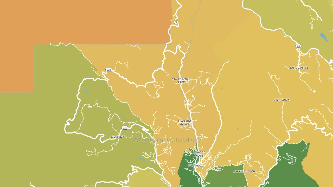
San Lorenzo Park leans heavily Democratic by roughly 48 points: about 74% of voters vote Democratic and 26% Republican.
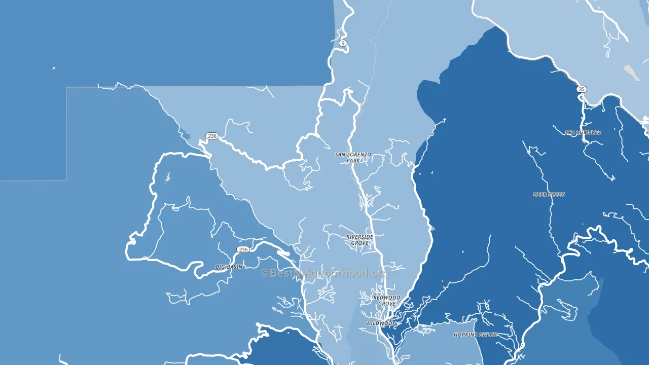
About 52% of adults in San Lorenzo Park typically vote, below the U.S. average of about 62%. Among adults in San Lorenzo Park, ~38% vote Democratic, ~14% Republican, and ~48% don't vote. The map below shows estimated turnout by block group.
How San Lorenzo Park compares
Among cities within 25 miles, San Lorenzo Park leans more Democratic than 34 of 52 neighbors.
San Lorenzo Park runs about 27 points more Democratic than California as a whole.
Why San Lorenzo Park leans the way it does
This analysis examined 14,881 data points per city to find what predicts political lean and turnout. The items below are a few correlations that stood out for San Lorenzo Park, not a ranked or complete list of what matters most.
Areas with high college attainment vote Democratic. About 35% of adults in San Lorenzo Park hold a bachelor's degree, about 7 points above the U.S. average of 28%. A high never-married share predicts Democratic voting, and about 34% of adults in San Lorenzo Park have never been married, above 86% of cities.
Park access and Democratic lean
Places with heavy park coverage tend to lean Democratic; San Lorenzo Park, CA sits in the top quarter nationally on this measure. Park access does not change how people vote; it tends to track denser, higher-income areas.
Why turnout in San Lorenzo Park looks the way it does
Crowded housing lines up with lower turnout. About 12% of homes in San Lorenzo Park have more than one occupant per room, above 98% of cities. Strong routine healthcare access lines up with higher turnout, and San Lorenzo Park sits in the top quarter on routine-care measures. Learn more about the findings and methodology on the political spectrum map.
Nearby Cities
- Forest Springs, CA D+41
- Boulder Creek, CA D+37
- Brookdale, CA D+36
- Lompico, CA D+30
- Ben Lomond, CA D+31
- Swanton, CA D+54
- Davenport, CA D+52
- La Honda, CA D+54
- Saratoga, CA D+29
- Monte Sereno, CA D+34
Cities with Similar Populations
- Kell, IL R+66
- Houston, OH R+73
- Long Point, TX R+65
- Elk Run Heights, IA R+25
- Elmore City, OK R+66
- Lilydale, MN D+27
- Shartlesville, PA R+50
- Edwards, MO R+64
- Millsboro, OH R+47
- Dameron, MD R+12
Sources and methodology
Precinct-level voting records used to fit the model come from California Secretary of State, Elections, distributed by the Voting and Election Science Team. Demographic inputs come from the U.S. Census Bureau (ACS 5-year estimates and the 2020 Decennial Census). Health and environmental inputs come from the CDC (PLACES and the Environmental Justice Index). Land cover comes from the USGS and EPA. Election-day and lead-up weather come from PRISM 4km daily grids and the NOAA Global Historical Climatology Network. Mail-voting and election-administration patterns come from the MIT Election Lab's Survey of the Performance of American Elections. Block-group crime detail comes from CrimeGrade. Internet data and modeling support provided by ISPreports.org.
Modeling and analysis by the BestNeighborhood data science team. Full methodology and findings: political spectrum map.
Methodology reviewed by the BestNeighborhood data team. Last updated May 2026.