Hyde Park is a Democratic stronghold. About 92% of voters here vote Democratic and 8% Republican.
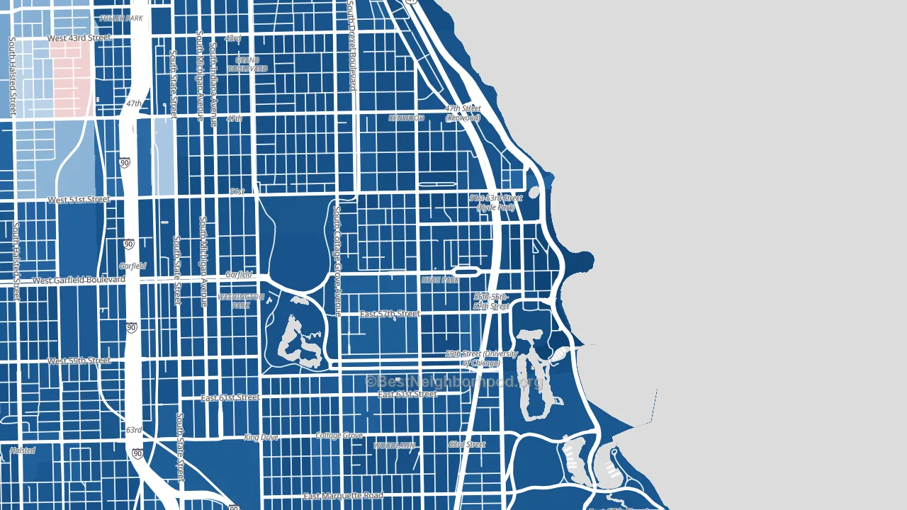
About 53% of adults in Hyde Park typically vote, below the U.S. average of about 62%. Among adults in Hyde Park, ~49% vote Democratic, ~4% Republican, and ~47% don't vote. The map below shows estimated turnout by block group.
How Hyde Park compares
Among neighborhoods within 5 miles, Hyde Park leans more Democratic than 28 of 36 neighbors.
Hyde Park runs about 72 points more Democratic than Illinois as a whole.
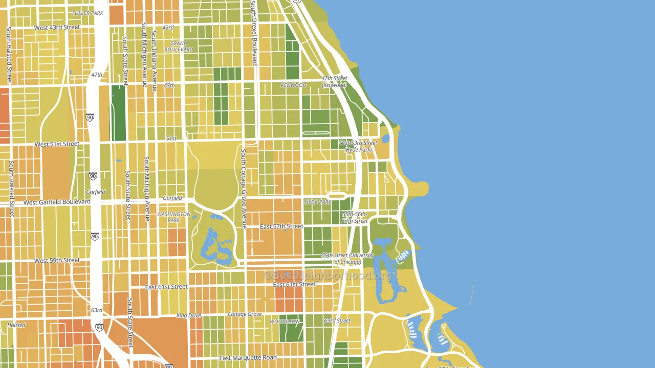
Politics vary noticeably by block within Hyde Park. The southeast side is the most Democratic-leaning (D+89) and the southwest side is the least Democratic-leaning (D+59), a spread of about 30 points.
Why Hyde Park leans the way it does
This analysis examined 14,881 data points per neighborhood to find what predicts political lean and turnout. The items below are a few correlations that stood out for Hyde Park, not a ranked or complete list of what matters most.
Areas with high college attainment vote Democratic. About 80% of adults in Hyde Park hold a bachelor's degree, about 51 points above the U.S. average of 28%. A high never-married share predicts Democratic voting, and about 57% of adults in Hyde Park have never been married, above 91% of neighborhoods.
Population density and Democratic lean
Places with high population density tend to lean Democratic; Hyde Park, Chicago, IL sits in the top tenth nationally on this measure.
Why turnout in Hyde Park looks the way it does
Renters vote less often than owners. About 61% of households in Hyde Park rent, about 36 points above the U.S. average of 25%. Learn more about the findings and methodology on the political spectrum map.
Nearby Neighborhoods
Neighborhoods with Similar Populations
- Poly High District, Long Beach, CA D+38
- West Farms, Bronx, NY D+44
- Oakwood, Staten Island, NY R+41
- Suitland-Silver Hill, Suitland, MD D+86
- Broadmoor-Sherwood, Baton Rouge, LA D+22
- Albany Park, Chicago, IL D+51
- Elmwood, Philadelphia, PA D+76
- Little Haiti, Miami, FL D+54
- Brice-Tussing, Columbus, OH D+46
- Little Lake City, Santa Fe Springs, CA D+24
Sources and methodology
Precinct-level voting records used to fit the model come from Illinois State Board of Elections, distributed by the Voting and Election Science Team. Demographic inputs come from the U.S. Census Bureau (ACS 5-year estimates and the 2020 Decennial Census). Health and environmental inputs come from the CDC (PLACES and the Environmental Justice Index). Land cover comes from the USGS and EPA. Election-day and lead-up weather come from PRISM 4km daily grids and the NOAA Global Historical Climatology Network. Mail-voting and election-administration patterns come from the MIT Election Lab's Survey of the Performance of American Elections. Block-group crime detail comes from CrimeGrade. Internet data and modeling support provided by ISPreports.org.
Modeling and analysis by the BestNeighborhood data science team. Full methodology and findings: political spectrum map.
Methodology reviewed by the BestNeighborhood data team. Last updated May 2026.