Indian Lake East leans heavily Democratic by roughly 36 points: about 68% of voters vote Democratic and 32% Republican.
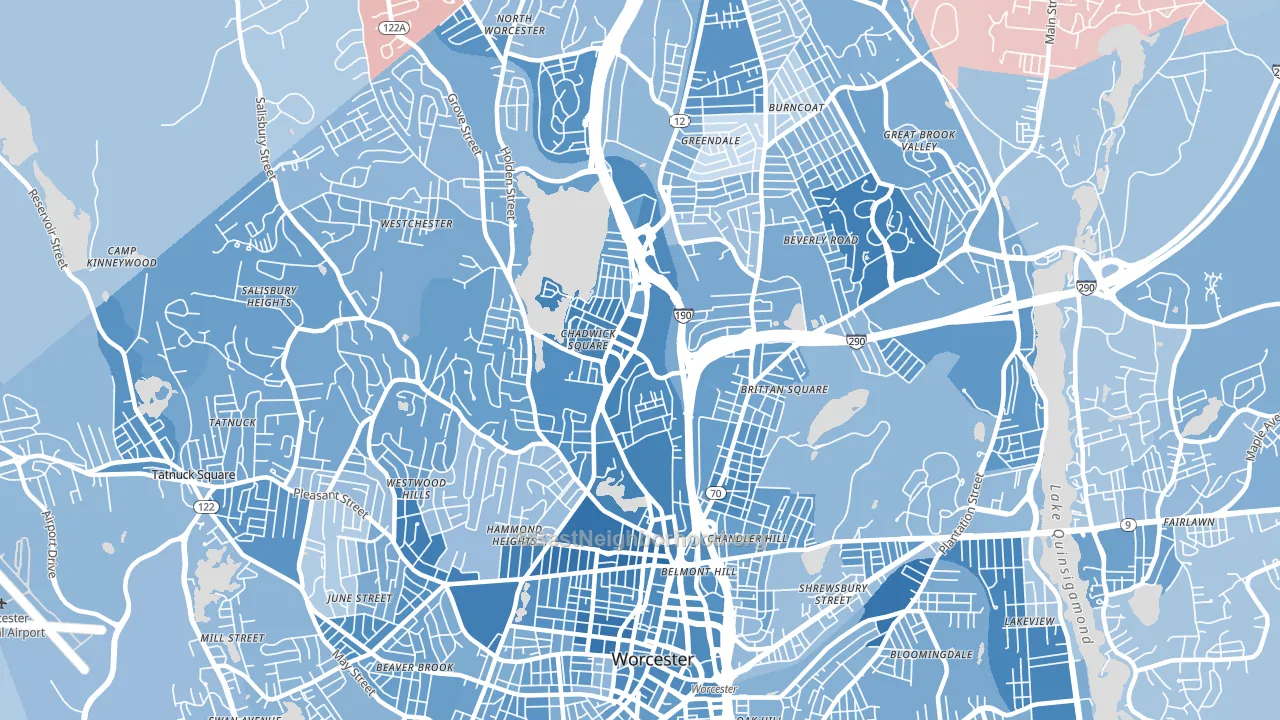
About 55% of adults in Indian Lake East typically vote, below the U.S. average of about 62%. Among adults in Indian Lake East, ~37% vote Democratic, ~18% Republican, and ~45% don't vote. The map below shows estimated turnout by block group.
How Indian Lake East compares
Among neighborhoods within 5 miles, Indian Lake East leans more Democratic than 19 of 25 neighbors.
Indian Lake East runs about 11 points more Democratic than Massachusetts as a whole.
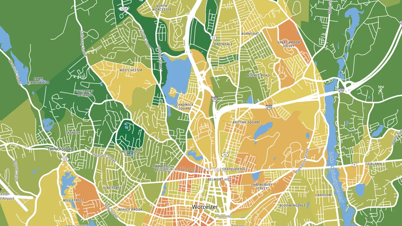
Politics vary noticeably by block within Indian Lake East. The north side is the most Democratic-leaning (D+43) and the northeast side is the least Democratic-leaning (D+27), a spread of about 16 points.
Why Indian Lake East leans the way it does
This analysis examined 14,881 data points per neighborhood to find what predicts political lean and turnout. The items below are a few correlations that stood out for Indian Lake East, not a ranked or complete list of what matters most.
Areas with many never-married adults vote Democratic. About 47% of adults in Indian Lake East have never been married, about 18 points above the U.S. average of 29%.
Paved land cover and Democratic lean
Places with extensive paved surfaces tend to lean Democratic; Indian Lake East, Worcester, MA sits above the national average on this measure. Paved ground does not change how people vote; it mostly reflects how urban and built-up a place is.
Why turnout in Indian Lake East looks the way it does
Renters vote less often than owners. About 65% of households in Indian Lake East rent, about 40 points above the U.S. average of 25%. Learn more about the findings and methodology on the political spectrum map.
Nearby Neighborhoods
- Bell Hill, Worcester, MA D+36
- North Lincoln Street, Worcester, MA D+38
- Forest Grove, Worcester, MA D+30
- Salisbury Street, Worcester, MA D+35
- Institute Park, Worcester, MA D+50
- Central Business District, Worcester, MA D+42
- Newton Square, Worcester, MA D+31
- Main Middle, Worcester, MA D+31
- Indian Hill, Worcester, MA D+27
- Great Brook Valley, Worcester, MA D+31
Neighborhoods with Similar Populations
- Carson Heights, Indianapolis, IN D+13
- Hayhurst, Portland, OR D+68
- Century Village West, Boca Raton, FL D+13
- Woods of Shavano, San Antonio, TX D+9
- Kirkmere, Youngstown, OH D+7
- South Oceanside, Oceanside, CA D+19
- Broadmoor, New Orleans, LA D+68
- Pearl Highlands, Pearl City, HI D+16
- Meadow Village, San Antonio, TX D+24
- Audubon Place, Tuscaloosa, AL D+14
Sources and methodology
Precinct-level voting records used to fit the model come from Massachusetts Secretary of the Commonwealth, Elections, distributed by the Voting and Election Science Team. Demographic inputs come from the U.S. Census Bureau (ACS 5-year estimates and the 2020 Decennial Census). Health and environmental inputs come from the CDC (PLACES and the Environmental Justice Index). Land cover comes from the USGS and EPA. Election-day and lead-up weather come from PRISM 4km daily grids and the NOAA Global Historical Climatology Network. Mail-voting and election-administration patterns come from the MIT Election Lab's Survey of the Performance of American Elections. Block-group crime detail comes from CrimeGrade. Internet data and modeling support provided by ISPreports.org.
Modeling and analysis by the BestNeighborhood data science team. Full methodology and findings: political spectrum map.
Methodology reviewed by the BestNeighborhood data team. Last updated May 2026.