Main Middle leans heavily Democratic by roughly 30 points: about 65% of voters vote Democratic and 35% Republican.
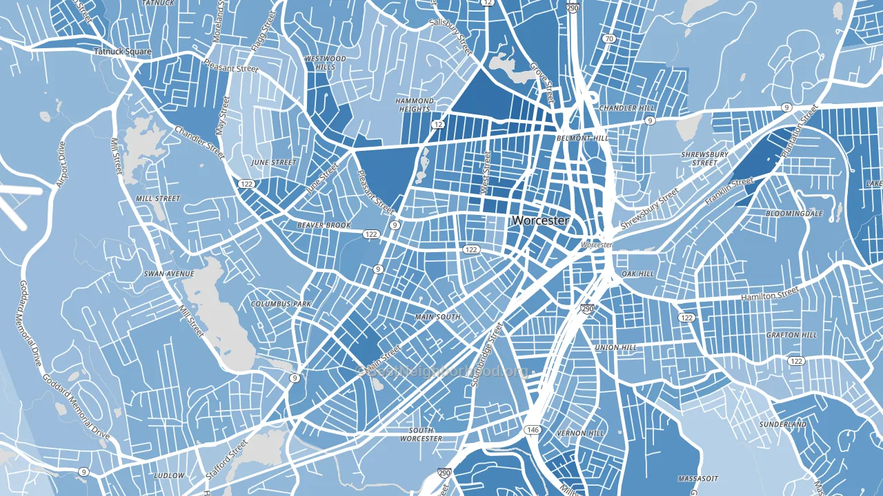
About 33% of adults in Main Middle typically vote, below the U.S. average of about 62%. Among adults in Main Middle, ~22% vote Democratic, ~12% Republican, and ~66% don't vote. The map below shows estimated turnout by block group.
How Main Middle compares
Among neighborhoods within 5 miles, Main Middle leans more Democratic than 13 of 25 neighbors.
Main Middle runs about 6 points more Democratic than Massachusetts as a whole.
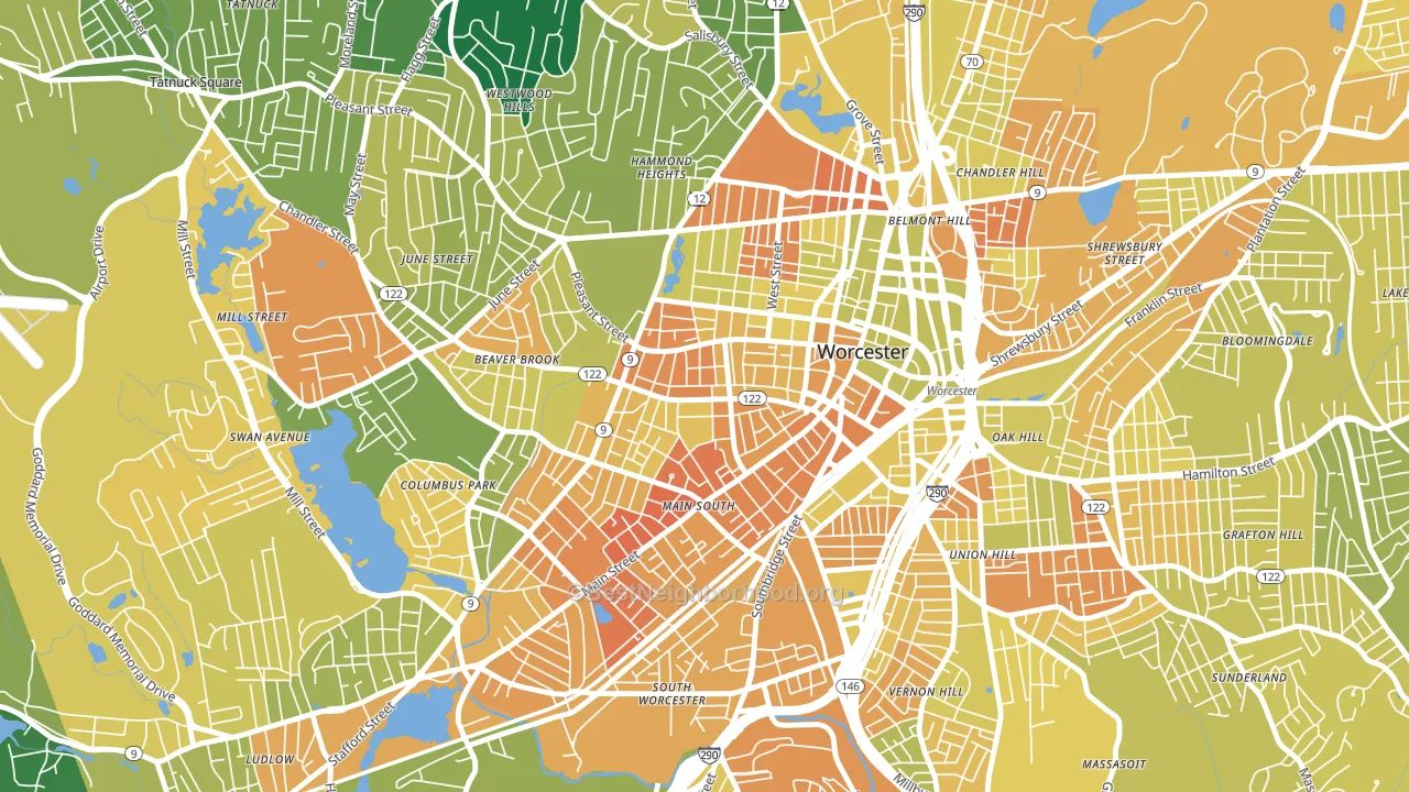
Politics vary noticeably by block within Main Middle. The east side is the most Democratic-leaning (D+35) and the northwest side is the least Democratic-leaning (D+24), a spread of about 12 points.
Why Main Middle leans the way it does
This analysis examined 14,881 data points per neighborhood to find what predicts political lean and turnout. The items below are a few correlations that stood out for Main Middle, not a ranked or complete list of what matters most.
Dense areas vote Democratic. More than 99% of residents in Main Middle live in densely developed areas, about 64 points above the U.S. average of 36%. A high never-married share predicts Democratic voting, and about 52% of adults in Main Middle have never been married, above 85% of neighborhoods.
Paved land cover and Democratic lean
Places with extensive paved surfaces tend to lean Democratic; Main Middle, Worcester, MA sits in the top tenth nationally on this measure. Paved ground does not change how people vote; it mostly reflects how urban and built-up a place is.
Why turnout in Main Middle looks the way it does
Areas with limited routine healthcare access turn out at lower rates. Main Middle is in the bottom quarter nationally for routine-care measures such as insurance coverage, preventive screenings, and dental visits. The dental-visit rate here is about 48%, about 24 points below the Massachusetts average of 72%. Renters vote less often than owners, and about 89% of households in Main Middle rent, compared to around 71% in nearby neighborhoods. High food insecurity lines up with lower turnout, and about 41% of adults in Main Middle report food insecurity, above 94% of neighborhoods. Learn more about the findings and methodology on the political spectrum map.
Nearby Neighborhoods
- University Park, Worcester, MA D+36
- Institute Park, Worcester, MA D+50
- Central Business District, Worcester, MA D+42
- Green Island, Worcester, MA D+33
- Newton Square, Worcester, MA D+31
- South Worcester, Worcester, MA D+26
- Columbus Park, Worcester, MA D+29
- Salisbury Street, Worcester, MA D+35
- Vernon Hill, Worcester, MA D+30
- Bell Hill, Worcester, MA D+36
Neighborhoods with Similar Populations
- Civic Center Little Tokyo, Los Angeles, CA D+48
- Old Louisville, Louisville, KY D+66
- Green Mountain, Lakewood, CO D+20
- Verdugo Viejo, Glendale, CA D+15
- Portola Springs, Irvine, CA D+15
- Northside, Syracuse, NY D+27
- Prince's Bay, Staten Island, NY R+56
- Highland Park, San Antonio, TX D+34
- Bay Ho, San Diego, CA D+27
- Oakridge, Bakersfield, CA D+11
Sources and methodology
Precinct-level voting records used to fit the model come from Massachusetts Secretary of the Commonwealth, Elections, distributed by the Voting and Election Science Team. Demographic inputs come from the U.S. Census Bureau (ACS 5-year estimates and the 2020 Decennial Census). Health and environmental inputs come from the CDC (PLACES and the Environmental Justice Index). Land cover comes from the USGS and EPA. Election-day and lead-up weather come from PRISM 4km daily grids and the NOAA Global Historical Climatology Network. Mail-voting and election-administration patterns come from the MIT Election Lab's Survey of the Performance of American Elections. Block-group crime detail comes from CrimeGrade. Internet data and modeling support provided by ISPreports.org.
Modeling and analysis by the BestNeighborhood data science team. Full methodology and findings: political spectrum map.
Methodology reviewed by the BestNeighborhood data team. Last updated May 2026.