Newton Square leans heavily Democratic by roughly 30 points: about 65% of voters vote Democratic and 35% Republican.
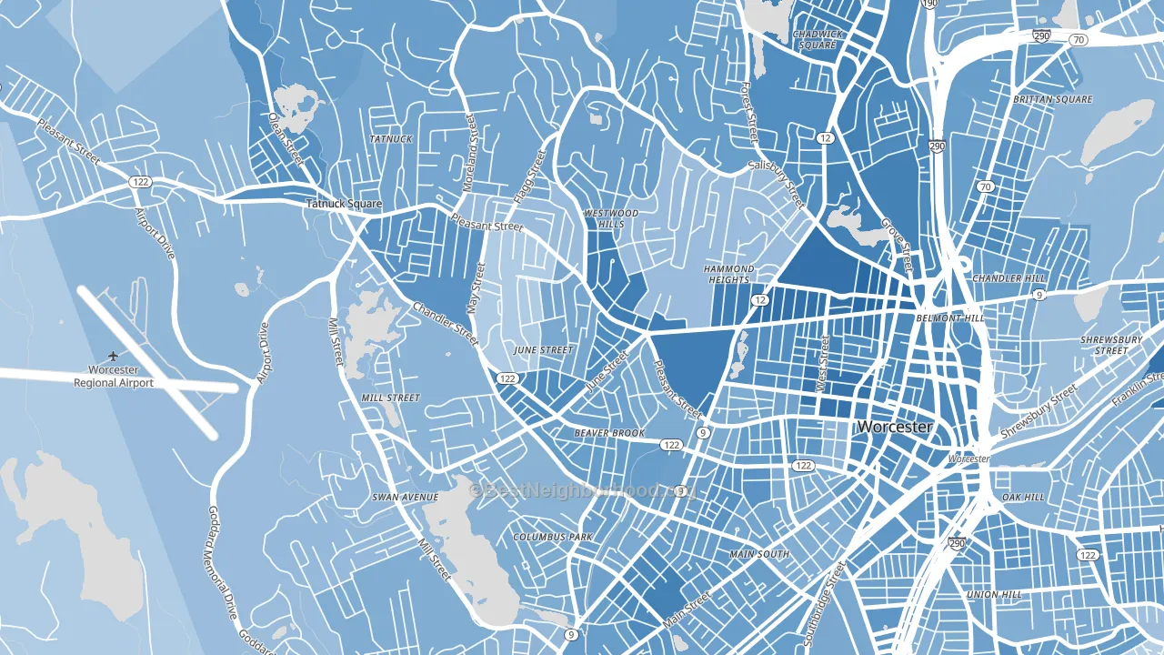
About 62% of adults in Newton Square typically vote, near the U.S. average of about 62%. Among adults in Newton Square, ~41% vote Democratic, ~22% Republican, and ~37% don't vote. The map below shows estimated turnout by block group.
How Newton Square compares
Among neighborhoods within 5 miles, Newton Square leans more Democratic than 12 of 25 neighbors.
Newton Square runs about 6 points more Democratic than Massachusetts as a whole.
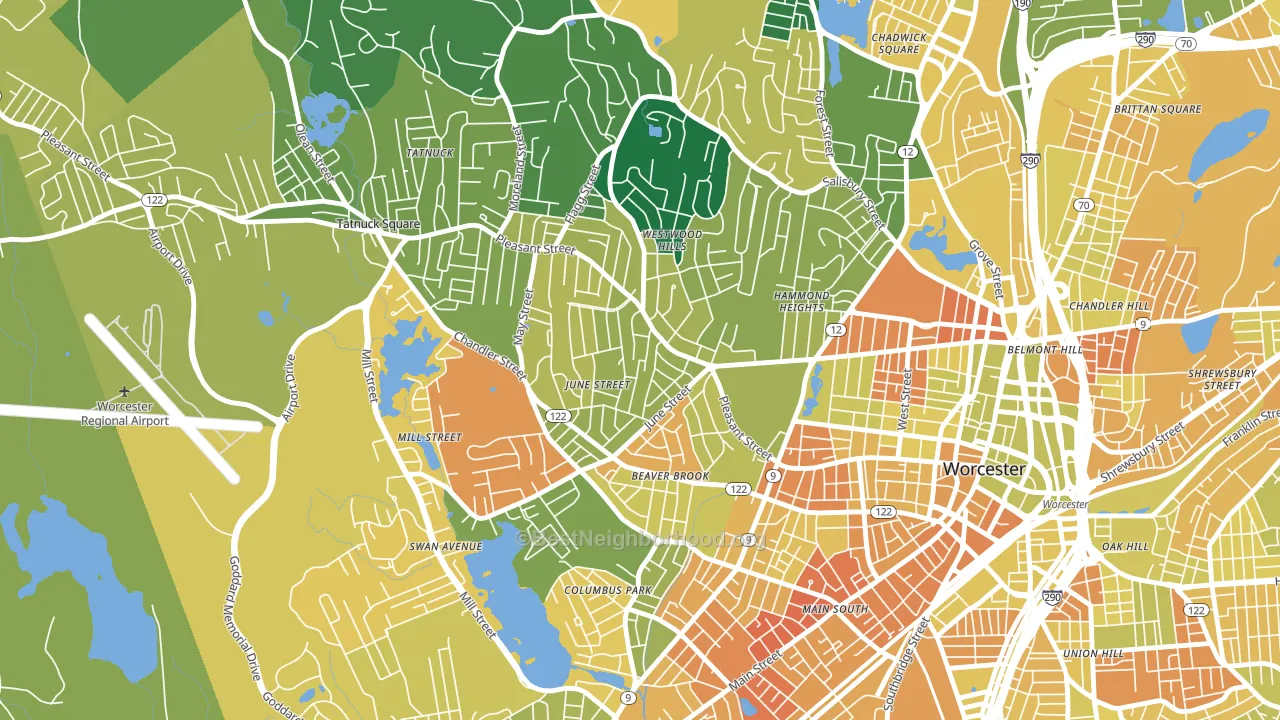
Politics vary noticeably by block within Newton Square. The east side is the most Democratic-leaning (D+41) and the west side is the least Democratic-leaning (D+27), a spread of about 13 points.
Why Newton Square leans the way it does
Density, race composition, education, and family structure all sit close to their national averages in Newton Square. The lean here lands roughly where demographic data alone would predict.
Walkability and Democratic lean
Places with a highly walkable street grid tend to lean Democratic; Newton Square, Worcester, MA sits in the top quarter nationally on this measure. A walkable street grid does not change how people vote; it mostly reflects how urban a place is.
Why turnout in Newton Square looks the way it does
Areas with strong routine healthcare access turn out at higher rates. Newton Square is in the top quarter nationally for routine-care measures such as insurance coverage, preventive screenings, and dental visits. The dental-visit rate here is about 72%, about 12 points above the U.S. average of 60%. Learn more about the findings and methodology on the political spectrum map.
Nearby Neighborhoods
- Salisbury Street, Worcester, MA D+35
- Tatnuck, Worcester, MA D+32
- Main Middle, Worcester, MA D+31
- Columbus Park, Worcester, MA D+29
- Institute Park, Worcester, MA D+50
- University Park, Worcester, MA D+36
- Central Business District, Worcester, MA D+42
- Forest Grove, Worcester, MA D+30
- Indian Lake East, Worcester, MA D+36
- South Worcester, Worcester, MA D+26
Neighborhoods with Similar Populations
- Woodbine, Sacramento, CA D+37
- Wellshire, Denver, CO D+49
- Forest Lakes, Monument, CO R+25
- Troutman Park, Fort Collins, CO D+32
- Flying Horse, Colorado Springs, CO R+26
- Twin Rivers Beach, Providence, RI D+12
- Frye Circle, Andover, MA D+42
- East Village, San Antonio, TX D+22
- Creekstone, Kennewick, WA R+28
- Soulard, St. Louis, MO D+64
Sources and methodology
Precinct-level voting records used to fit the model come from Massachusetts Secretary of the Commonwealth, Elections, distributed by the Voting and Election Science Team. Demographic inputs come from the U.S. Census Bureau (ACS 5-year estimates and the 2020 Decennial Census). Health and environmental inputs come from the CDC (PLACES and the Environmental Justice Index). Land cover comes from the USGS and EPA. Election-day and lead-up weather come from PRISM 4km daily grids and the NOAA Global Historical Climatology Network. Mail-voting and election-administration patterns come from the MIT Election Lab's Survey of the Performance of American Elections. Block-group crime detail comes from CrimeGrade. Internet data and modeling support provided by ISPreports.org.
Modeling and analysis by the BestNeighborhood data science team. Full methodology and findings: political spectrum map.
Methodology reviewed by the BestNeighborhood data team. Last updated May 2026.