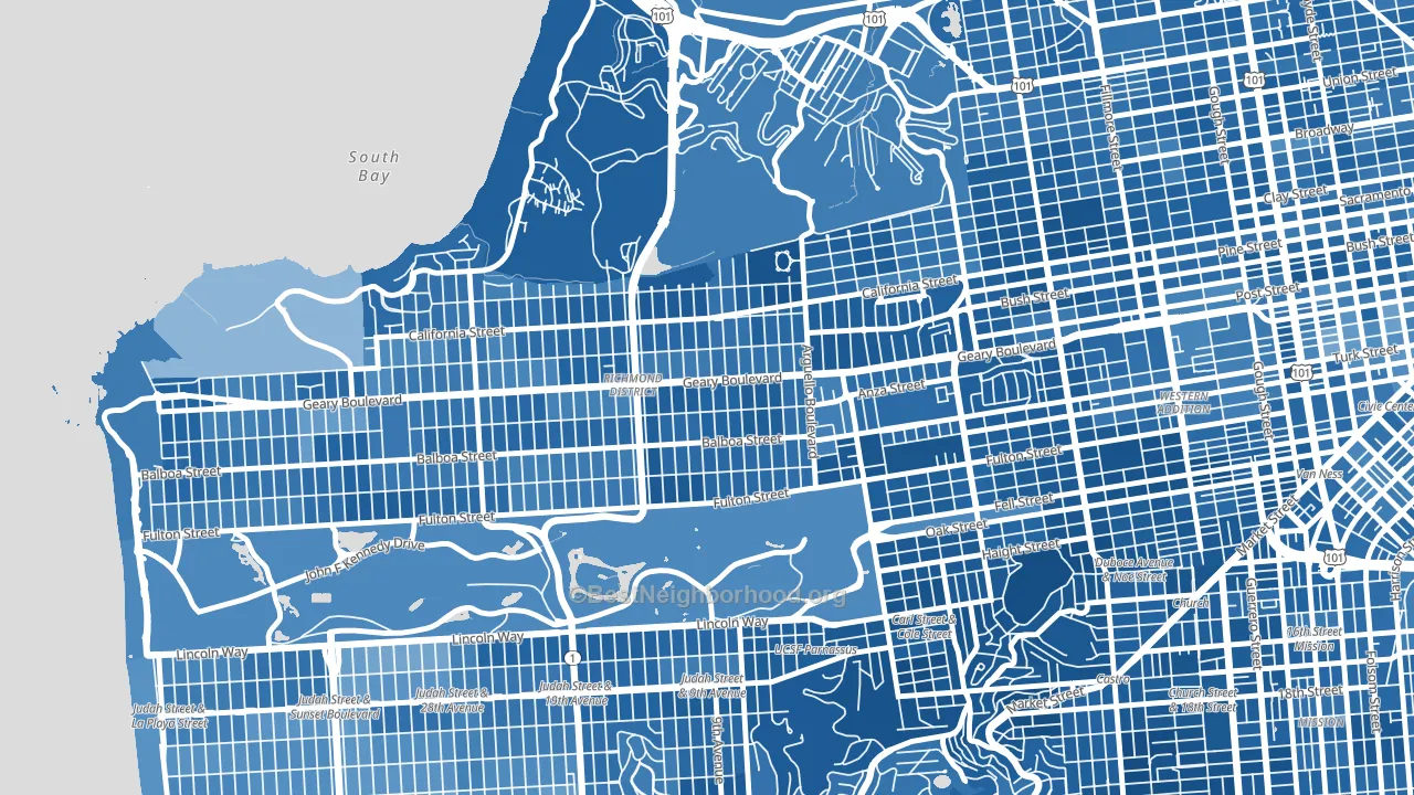
Inner Richmond is a Democratic stronghold. About 84% of voters here vote Democratic and 16% Republican.
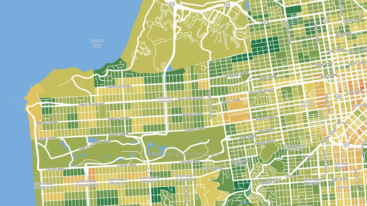
About 67% of adults in Inner Richmond typically vote, near the U.S. average of about 62%. Among adults in Inner Richmond, ~56% vote Democratic, ~11% Republican, and ~33% don't vote. The map below shows estimated turnout by block group.
How Inner Richmond compares
Among neighborhoods within 5 miles, Inner Richmond leans more Democratic than 24 of 40 neighbors.
Inner Richmond runs about 48 points more Democratic than California as a whole.
Why Inner Richmond leans the way it does
This analysis examined 14,881 data points per neighborhood to find what predicts political lean and turnout. The items below are a few correlations that stood out for Inner Richmond, not a ranked or complete list of what matters most.
Areas with high college attainment vote Democratic. About 71% of adults in Inner Richmond hold a bachelor's degree, about 43 points above the U.S. average of 28%.
Walkability and Democratic lean
Places with a highly walkable street grid tend to lean Democratic; Inner Richmond, San Francisco, CA sits in the top tenth nationally on this measure. A walkable street grid does not change how people vote; it mostly reflects how urban a place is.
Why turnout in Inner Richmond looks the way it does
Areas with strong routine healthcare access turn out at higher rates. Inner Richmond is in the top quarter nationally for routine-care measures such as insurance coverage, preventive screenings, and dental visits. The dental-visit rate here is about 71%, about 11 points above the U.S. average of 60%. Learn more about the findings and methodology on the political spectrum map.
Nearby Neighborhoods
- Presidio Heights, San Francisco, CA D+72
- Seacliff, San Francisco, CA D+59
- Haight-Ashbury, San Francisco, CA D+82
- Inner Sunset, San Francisco, CA D+72
- Cole Valley, San Francisco, CA D+82
- Outer Richmond, San Francisco, CA D+57
- Western Addition, San Francisco, CA D+73
- Pacific Heights, San Francisco, CA D+69
- Duboce Triangle, San Francisco, CA D+83
- Cow Hollow, San Francisco, CA D+64
Neighborhoods with Similar Populations
- Westland, Galloway, OH Even
- Silver Lake, Los Angeles, CA D+66
- Walnut Valley, Diamond Bar, CA D+9
- North Torrance, Torrance, CA D+20
- Central City, Los Angeles, CA D+45
- Financial District, Manhattan, NY D+58
- Frankford, Philadelphia, PA D+56
- TCU-West Cliff, Fort Worth, TX D+6
- Hyde Park, Los Angeles, CA D+70
- Playa Vista, Los Angeles, CA D+46
Sources and methodology
Precinct-level voting records used to fit the model come from California Secretary of State, Elections, distributed by the Voting and Election Science Team. Demographic inputs come from the U.S. Census Bureau (ACS 5-year estimates and the 2020 Decennial Census). Health and environmental inputs come from the CDC (PLACES and the Environmental Justice Index). Land cover comes from the USGS and EPA. Election-day and lead-up weather come from PRISM 4km daily grids and the NOAA Global Historical Climatology Network. Mail-voting and election-administration patterns come from the MIT Election Lab's Survey of the Performance of American Elections. Block-group crime detail comes from CrimeGrade. Internet data and modeling support provided by ISPreports.org.
Modeling and analysis by the BestNeighborhood data science team. Full methodology and findings: political spectrum map.
Methodology reviewed by the BestNeighborhood data team. Last updated May 2026.