Ireland Corners leans heavily Democratic by roughly 32 points: about 66% of voters vote Democratic and 34% Republican.
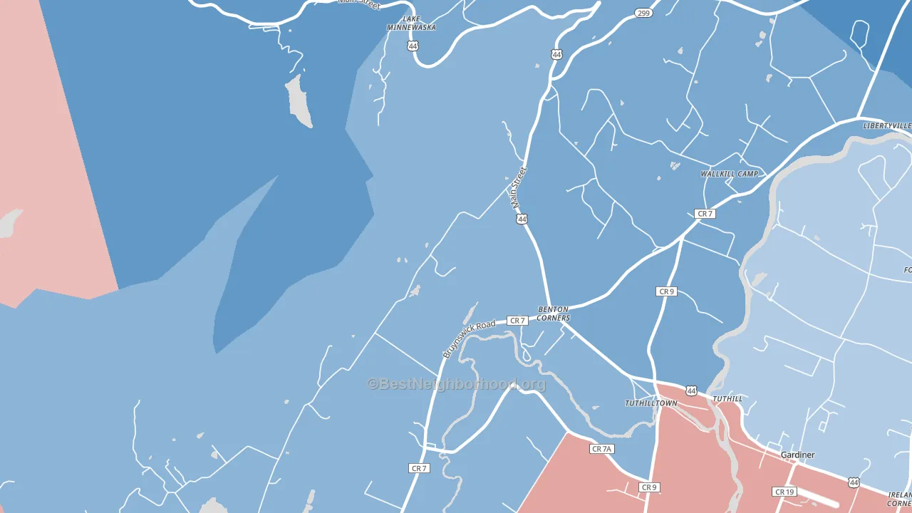
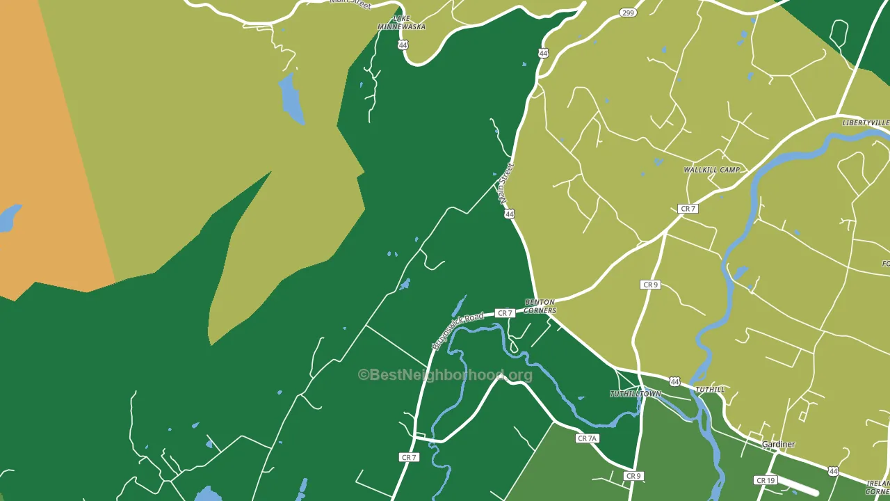
About 97% of adults in Ireland Corners typically vote, above the U.S. average of about 62%. Among adults in Ireland Corners, ~64% vote Democratic, ~33% Republican, and ~3% don't vote. The map below shows estimated turnout by block group.
How Ireland Corners compares
Among cities within 25 miles, Ireland Corners leans more Democratic than 114 of 131 neighbors.
Ireland Corners runs about 19 points more Democratic than New York as a whole.
Why Ireland Corners leans the way it does
This analysis examined 14,881 data points per city to find what predicts political lean and turnout. The items below are a few correlations that stood out for Ireland Corners, not a ranked or complete list of what matters most.
Areas with high college attainment vote Democratic. About 58% of adults in Ireland Corners hold a bachelor's degree, about 29 points above the U.S. average of 28%. A high never-married share predicts Democratic voting, and about 31% of adults in Ireland Corners have never been married, above 77% of cities.
Homeownership and voter turnout
Places with homeowner-heavy households tend to turn out at a higher rate; Ireland Corners, NY sits in the top quarter nationally on this measure.
Why turnout in Ireland Corners looks the way it does
Areas with high high-school completion turn out at higher rates. About 98% of adults in Ireland Corners have completed high school, about 7 points above the New York average of 91%. Homeowners vote more often than renters, and about 90% of households in Ireland Corners own their home, about 15 points above the U.S. average of 75%. Learn more about the findings and methodology on the political spectrum map.
Nearby Cities
- Gardiner, NY D+13
- Rutsonville, NY R+11
- Granite, NY D+32
- Modena, NY R+11
- New Paltz, NY D+51
- Wallkill, NY R+20
- Accord, NY D+16
- Lake Osiris Colony, NY R+26
- High Falls, NY D+34
Cities with Similar Populations
- Yenome, SC R+29
- South Plymouth, NY R+48
- Mahon, IN R+49
- Round Valley, CA D+8
- Bogard, MO R+71
- Madley, PA R+73
- Kenney, TX R+68
- Bonner, MT R+22
- Valley Center, MI R+55
- Leigh, TX R+14
Sources and methodology
Precinct-level voting records used to fit the model come from New York State Board of Elections, distributed by the Voting and Election Science Team. Demographic inputs come from the U.S. Census Bureau (ACS 5-year estimates and the 2020 Decennial Census). Health and environmental inputs come from the CDC (PLACES and the Environmental Justice Index). Land cover comes from the USGS and EPA. Election-day and lead-up weather come from PRISM 4km daily grids and the NOAA Global Historical Climatology Network. Mail-voting and election-administration patterns come from the MIT Election Lab's Survey of the Performance of American Elections. Block-group crime detail comes from CrimeGrade. Internet data and modeling support provided by ISPreports.org.
Modeling and analysis by the BestNeighborhood data science team. Full methodology and findings: political spectrum map.
Methodology reviewed by the BestNeighborhood data team. Last updated May 2026.