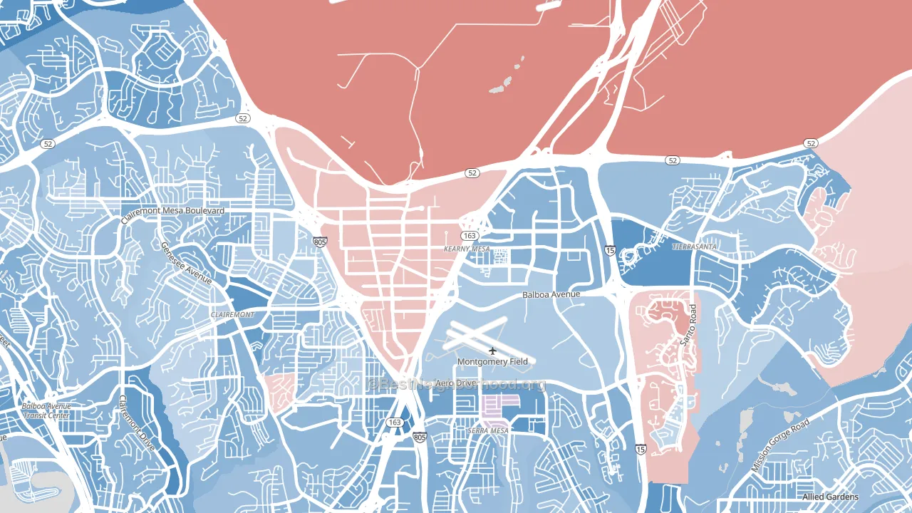
Kearny Mesa leans Democratic by roughly 24 points: about 62% of voters vote Democratic and 38% Republican.
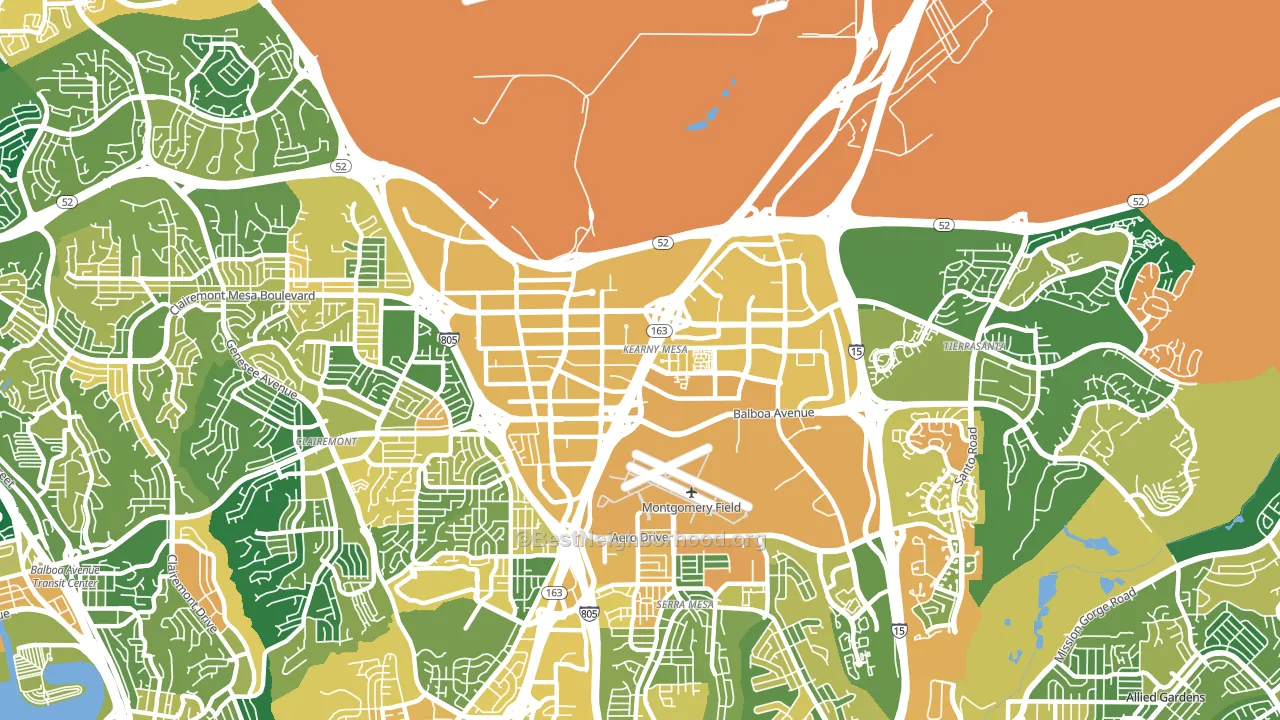
About 45% of adults in Kearny Mesa typically vote, below the U.S. average of about 62%. Among adults in Kearny Mesa, ~28% vote Democratic, ~17% Republican, and ~55% don't vote. The map below shows estimated turnout by block group.
How Kearny Mesa compares
Among neighborhoods within 5 miles, Kearny Mesa leans more Democratic than 4 of 16 neighbors.
Kearny Mesa runs about 5 points more Democratic than California as a whole.
Politics vary noticeably by block within Kearny Mesa. The east side is the most Democratic-leaning (D+34) and the west side is the least Democratic-leaning (D+10), a spread of about 24 points.
Why Kearny Mesa leans the way it does
This analysis examined 14,881 data points per neighborhood to find what predicts political lean and turnout. The items below are a few correlations that stood out for Kearny Mesa, not a ranked or complete list of what matters most.
Areas with high college attainment vote Democratic. About 56% of adults in Kearny Mesa hold a bachelor's degree, about 28 points above the U.S. average of 28%.
Paved land cover and Democratic lean
Places with extensive paved surfaces tend to lean Democratic; Kearny Mesa, San Diego, CA sits in the top tenth nationally on this measure. Paved ground does not change how people vote; it mostly reflects how urban and built-up a place is.
Why turnout in Kearny Mesa looks the way it does
Turnout in Kearny Mesa sits close to the national pattern. Routine healthcare access, homeownership, education, and food security all land near their national averages here. Learn more about the findings and methodology on the political spectrum map.
Nearby Neighborhoods
- Clairemont Mesa, San Diego, CA D+24
- Serra Mesa, San Diego, CA D+30
- Bird Land, San Diego, CA D+32
- Tierrasanta, San Diego, CA D+20
- North Clairemont, San Diego, CA D+25
- Linda Vista, San Diego, CA D+28
- Grantville, San Diego, CA D+36
- Allied Gardens, San Diego, CA D+25
- Mission Valley East, San Diego, CA D+33
- Bay Park, San Diego, CA D+30
Neighborhoods with Similar Populations
- Surrey Lane, Bergenfield, NJ R+22
- College Hill, Easton, PA D+57
- Bailey, East Lansing, MI D+57
- Armatage, Minneapolis, MN D+65
- First Ward, Binghamton, NY D+29
- Gashland, Kansas City, MO R+4
- Preston Park, Roanoke, VA Even
- Northwest Arvada, Arvada, CO D+16
- VCU, Richmond, VA D+71
- North Oak Park, Sacramento, CA D+70
Sources and methodology
Precinct-level voting records used to fit the model come from California Secretary of State, Elections, distributed by the Voting and Election Science Team. Demographic inputs come from the U.S. Census Bureau (ACS 5-year estimates and the 2020 Decennial Census). Health and environmental inputs come from the CDC (PLACES and the Environmental Justice Index). Land cover comes from the USGS and EPA. Election-day and lead-up weather come from PRISM 4km daily grids and the NOAA Global Historical Climatology Network. Mail-voting and election-administration patterns come from the MIT Election Lab's Survey of the Performance of American Elections. Block-group crime detail comes from CrimeGrade. Internet data and modeling support provided by ISPreports.org.
Modeling and analysis by the BestNeighborhood data science team. Full methodology and findings: political spectrum map.
Methodology reviewed by the BestNeighborhood data team. Last updated May 2026.