Lane County leans Democratic by roughly 20 points: about 60% of voters vote Democratic and 40% Republican.
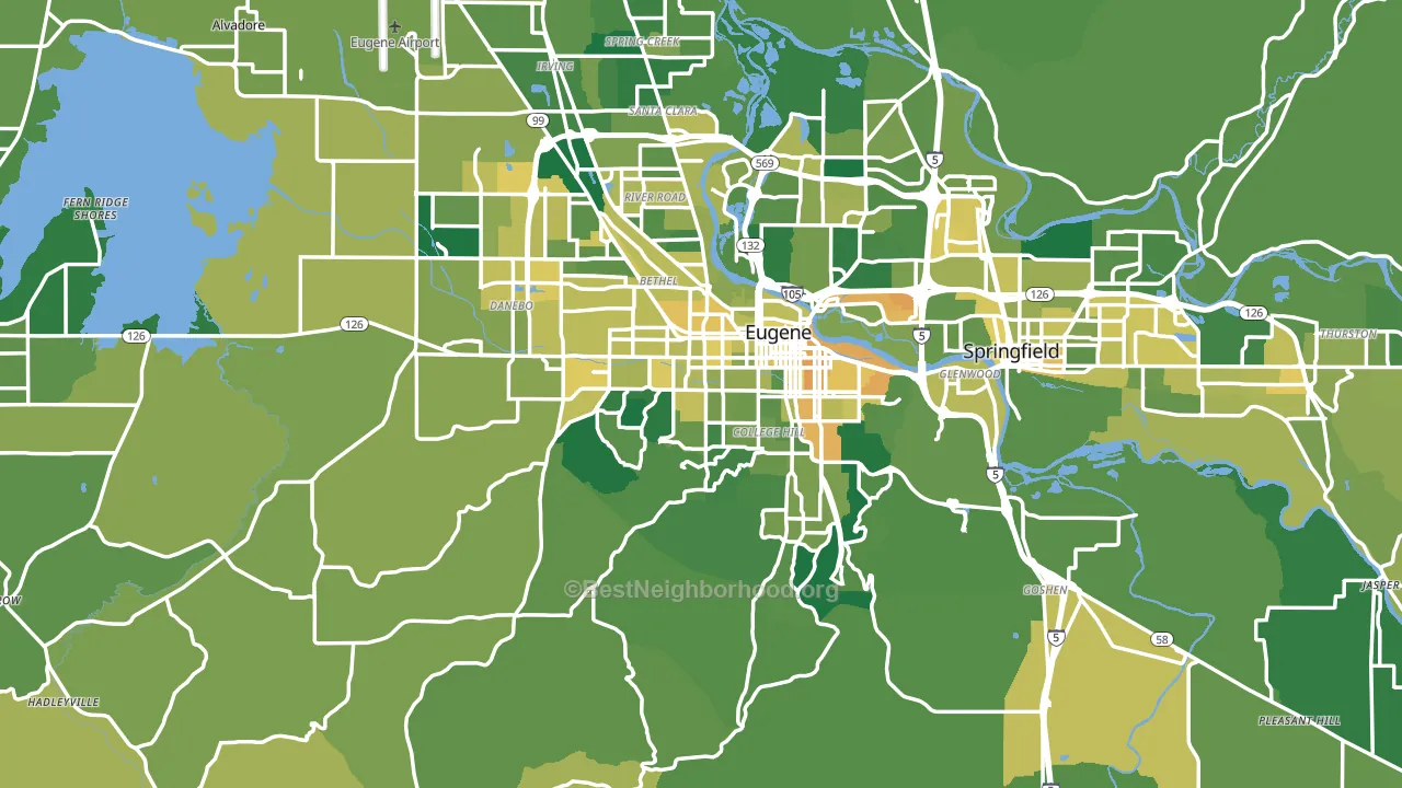
About 73% of adults in Lane County typically vote, above the U.S. average of about 62%. Among adults in Lane County, ~44% vote Democratic, ~29% Republican, and ~27% don't vote. The map below shows estimated turnout by block group.
How Lane County compares
Lane County sits in a sparsely populated area with few comparable counties nearby.
Lane County runs about 7 points more Democratic than Oregon as a whole.
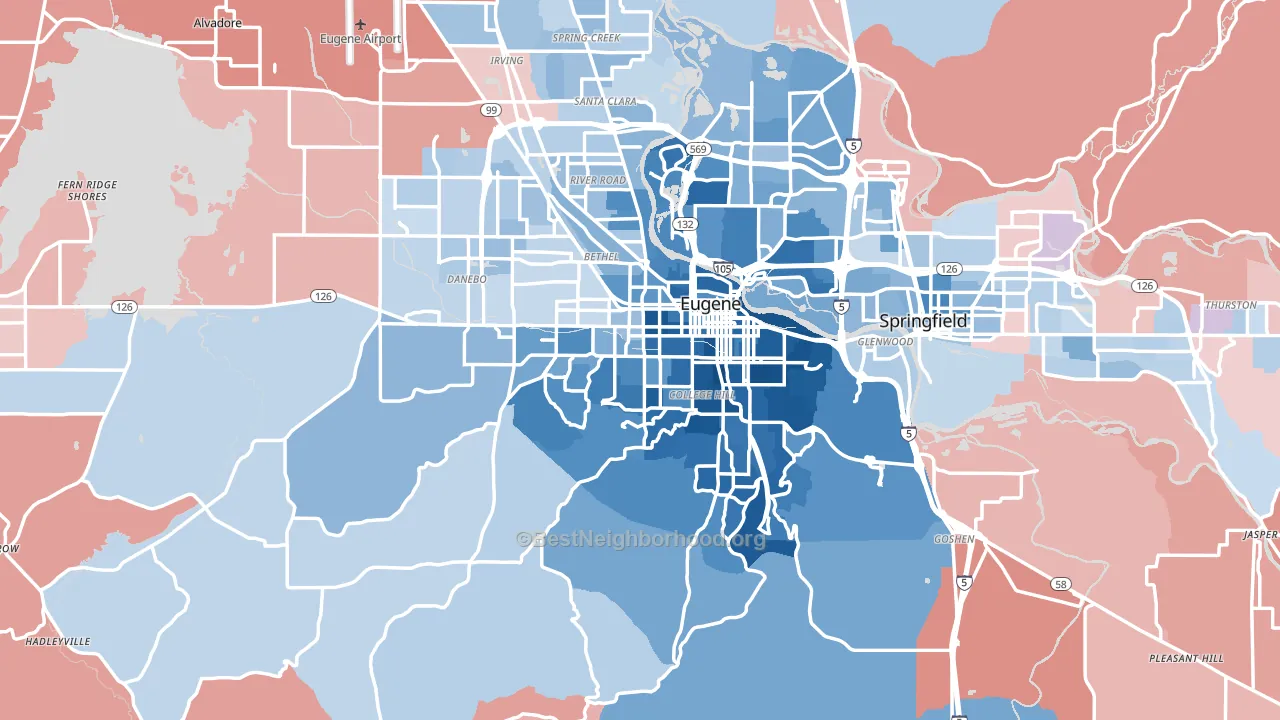
Politics vary noticeably by city within Lane County. The north side runs the most Democratic (D+33) and the southeast side runs the most Republican (R+16), a spread of about 49 points.
Why Lane County leans the way it does
This analysis examined 14,881 data points per county to find what predicts political lean and turnout. The items below are a few correlations that stood out for Lane County, not a ranked or complete list of what matters most.
Dense areas vote Democratic. About 72% of residents in Lane County live in densely developed areas, about 35 points above the U.S. average of 36%. High college attainment predicts Democratic voting, and Lane County sits in the top quarter (about 34%, above 85% of counties). A high never-married share predicts Democratic voting, and about 35% of adults in Lane County have never been married, above 84% of counties.
Population density and Democratic lean
Places with high population density tend to lean Democratic; Lane County, OR sits in the top tenth nationally on this measure.
Why turnout in Lane County looks the way it does
Turnout in Lane County sits close to the national pattern. Routine healthcare access, homeownership, education, and food security all land near their national averages here. Learn more about the findings and methodology on the political spectrum map.
Nearby Counties
- Linn County, OR R+25
- Benton County, OR D+42
- Douglas County, OR R+29
- Polk County, OR R+4
- Lincoln County, OR D+13
- Marion County, OR D+3
- Coos County, OR R+10
- Yamhill County, OR R+5
- Deschutes County, OR D+5
- Clackamas County, OR D+13
Counties with Similar Populations
- Forsyth County, NC D+18
- Lake County, FL R+25
- Orleans Parish, LA D+63
- Allen County, IN R+5
- Mercer County, NJ D+38
- Madison County, AL R+5
- Osceola County, FL Even
- Marion County, FL R+28
- Collier County, FL R+20
- Butler County, OH R+20
Sources and methodology
Precinct-level voting records used to fit the model come from Oregon Secretary of State, Elections Division, distributed by the Voting and Election Science Team. Demographic inputs come from the U.S. Census Bureau (ACS 5-year estimates and the 2020 Decennial Census). Health and environmental inputs come from the CDC (PLACES and the Environmental Justice Index). Land cover comes from the USGS and EPA. Election-day and lead-up weather come from PRISM 4km daily grids and the NOAA Global Historical Climatology Network. Mail-voting and election-administration patterns come from the MIT Election Lab's Survey of the Performance of American Elections. Block-group crime detail comes from CrimeGrade. Internet data and modeling support provided by ISPreports.org.
Modeling and analysis by the BestNeighborhood data science team. Full methodology and findings: political spectrum map.
Methodology reviewed by the BestNeighborhood data team. Last updated May 2026.