Live Oak Springs leans Republican by roughly 28 points: about 36% of voters vote Democratic and 64% Republican.
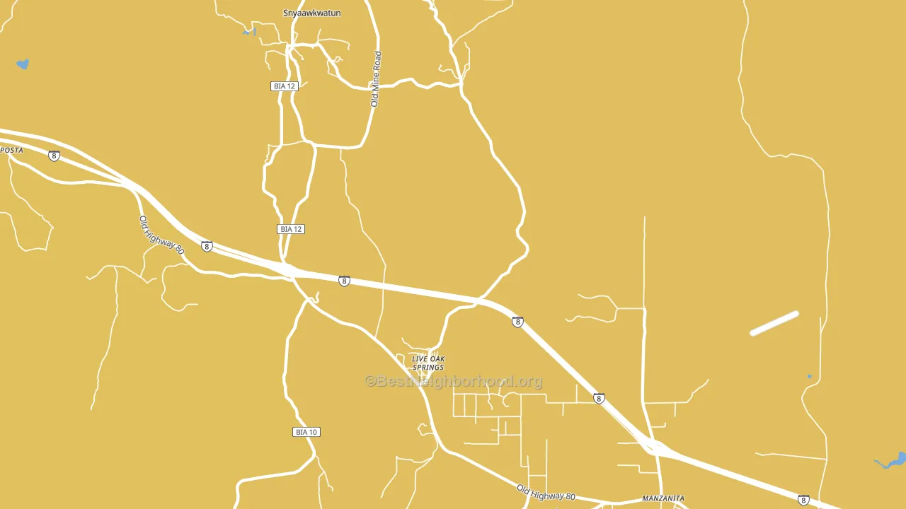
About 39% of adults in Live Oak Springs typically vote, below the U.S. average of about 62%. Among adults in Live Oak Springs, ~14% vote Democratic, ~25% Republican, and ~61% don't vote. The map below shows estimated turnout by block group.
How Live Oak Springs compares
Among cities within 25 miles, Live Oak Springs leans more Republican than 4 of 18 neighbors.
Live Oak Springs runs about 47 points more Republican than California as a whole. California leans Democratic overall, while Live Oak Springs is one of the few Republican-leaning pockets.
Why Live Oak Springs leans the way it does
This analysis examined 14,881 data points per city to find what predicts political lean and turnout. The items below are a few correlations that stood out for Live Oak Springs, not a ranked or complete list of what matters most.
Live Oak Springs votes against the grain of California. California leans Democratic overall, while Live Oak Springs runs about 47 points more Republican. Rural areas vote Republican, and Live Oak Springs sits in the bottom quarter on density (about 2%, below 96% of cities).
Paved land cover and Republican lean
Places with little paved surface tend to lean Republican; Live Oak Springs, CA sits in the bottom tenth nationally on this measure. Paved ground does not change how people vote; it mostly reflects how urban and built-up a place is.
Why turnout in Live Oak Springs looks the way it does
Areas with high food insecurity turn out at lower rates. About 24% of adults in Live Oak Springs report food insecurity, about 7 points above the U.S. average of 16%. Learn more about the findings and methodology on the political spectrum map.
Nearby Cities
- Boulevard, CA R+27
- Tierra del Sol, CA R+27
- Barrett, CA R+27
- Bankhead Springs, CA R+31
- Boulder Oaks, CA R+29
- Campo, CA R+31
- Jacumba, CA R+31
- Boulder Park, CA R+35
- Cameron Corners, CA R+31
- Pine Valley, CA R+35
Cities with Similar Populations
- Alexander, IA R+56
- Pie Town, NM R+44
- Rexville, NY R+63
- London, OR R+24
- Crest Park, CA R+19
- Whiteside, MO R+62
- Tiptop, VA R+71
- Dinsmore, TX R+47
- Niota, IL R+46
- Hagarstown, IL R+70
Sources and methodology
Precinct-level voting records used to fit the model come from California Secretary of State, Elections, distributed by the Voting and Election Science Team. Demographic inputs come from the U.S. Census Bureau (ACS 5-year estimates and the 2020 Decennial Census). Health and environmental inputs come from the CDC (PLACES and the Environmental Justice Index). Land cover comes from the USGS and EPA. Election-day and lead-up weather come from PRISM 4km daily grids and the NOAA Global Historical Climatology Network. Mail-voting and election-administration patterns come from the MIT Election Lab's Survey of the Performance of American Elections. Block-group crime detail comes from CrimeGrade. Internet data and modeling support provided by ISPreports.org.
Modeling and analysis by the BestNeighborhood data science team. Full methodology and findings: political spectrum map.
Methodology reviewed by the BestNeighborhood data team. Last updated May 2026.