Mayflower leans slightly Democratic by roughly 12 points: about 56% of voters vote Democratic and 44% Republican.
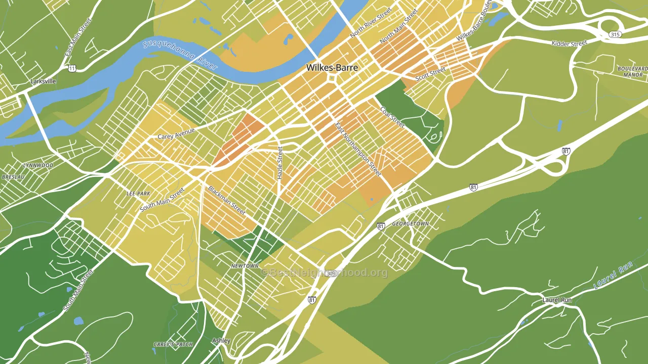
About 53% of adults in Mayflower typically vote, below the U.S. average of about 62%. Among adults in Mayflower, ~30% vote Democratic, ~23% Republican, and ~47% don't vote. The map below shows estimated turnout by block group.
How Mayflower compares
Among neighborhoods within 5 miles, Mayflower leans more Democratic than 1 of 3 neighbors.
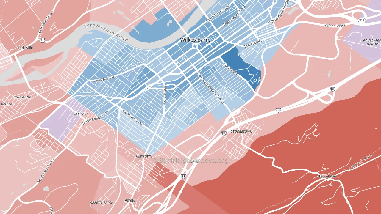
Mayflower runs about 14 points more Democratic than Pennsylvania as a whole. Pennsylvania is roughly evenly split, and Mayflower sits clearly on the Democratic side.
Politics vary noticeably by block within Mayflower. The northwest side runs the most Democratic (D+31) and the southeast side runs the most Republican (R+5), a spread of about 37 points.
Why Mayflower leans the way it does
This analysis examined 14,881 data points per neighborhood to find what predicts political lean and turnout. The items below are a few correlations that stood out for Mayflower, not a ranked or complete list of what matters most.
Mayflower votes against the grain of Pennsylvania. Pennsylvania is roughly evenly split, while Mayflower runs about 14 points more Democratic.
Population density and Democratic lean
Places with high population density tend to lean Democratic; Mayflower, Wilkes-Barre, PA sits in the top quarter nationally on this measure.
Why turnout in Mayflower looks the way it does
Turnout in Mayflower sits close to the national pattern. Routine healthcare access, homeownership, education, and food security all land near their national averages here. Learn more about the findings and methodology on the political spectrum map.
Nearby Neighborhoods
- Rolling Mill Hill, Wilkes-Barre, PA D+13
- North End, Wilkes-Barre, PA D+16
- Parsons, Wilkes-Barre, PA R+9
- South Side, Scranton, PA D+16
- West Side, Scranton, PA D+8
- Downtown, Scranton, PA D+28
- The Hill Section, Scranton, PA D+23
- Petersburg, Scranton, PA D+20
- Providence, Scranton, PA D+10
- Green Ridge, Scranton, PA D+17
Neighborhoods with Similar Populations
- Sauganash, Chicago, IL D+26
- Verdugo Woodlands, Glendale, CA D+19
- Hillcrest, Little Rock, AR D+43
- Madison Park, Santa Ana, CA D+31
- Seven Oaks, Wesley Chapel, FL R+9
- Sunset Hills, Lawrence, KS D+56
- Viola, Monsey, NY R+70
- Hodgin, Albuquerque, NM D+30
- Gresham-North Gresham, Gresham, OR D+16
- South Delridge, Seattle, WA D+52
Sources and methodology
Precinct-level voting records used to fit the model come from Pennsylvania Department of State, Bureau of Elections, distributed by the Voting and Election Science Team. Demographic inputs come from the U.S. Census Bureau (ACS 5-year estimates and the 2020 Decennial Census). Health and environmental inputs come from the CDC (PLACES and the Environmental Justice Index). Land cover comes from the USGS and EPA. Election-day and lead-up weather come from PRISM 4km daily grids and the NOAA Global Historical Climatology Network. Mail-voting and election-administration patterns come from the MIT Election Lab's Survey of the Performance of American Elections. Block-group crime detail comes from CrimeGrade. Internet data and modeling support provided by ISPreports.org.
Modeling and analysis by the BestNeighborhood data science team. Full methodology and findings: political spectrum map.
Methodology reviewed by the BestNeighborhood data team. Last updated May 2026.