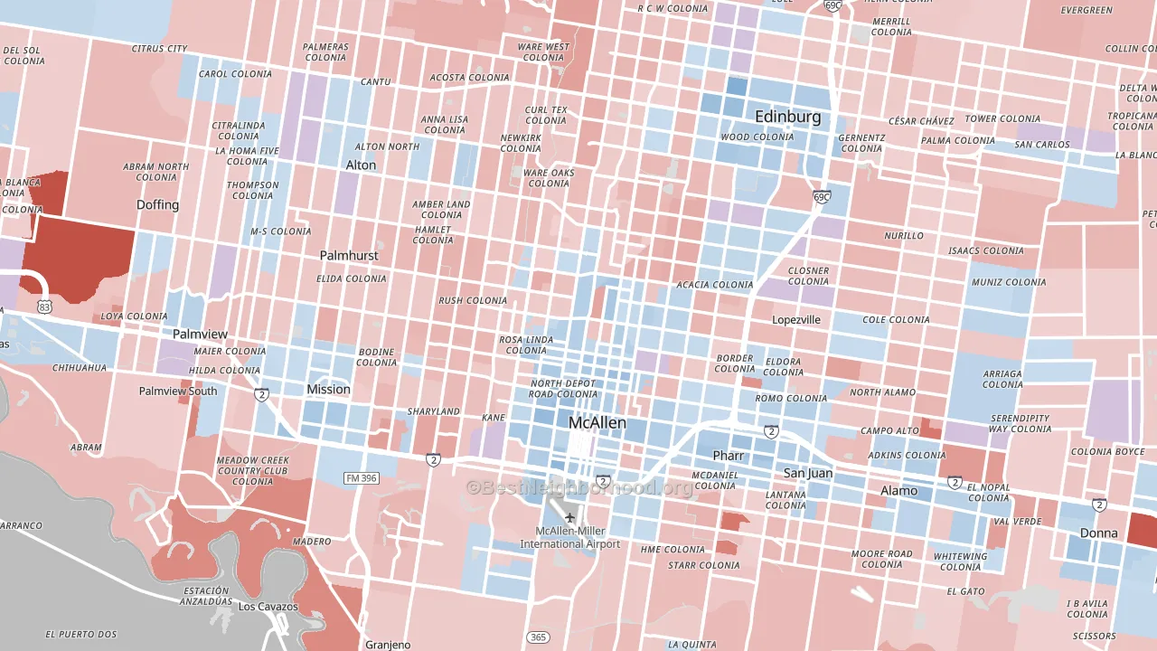
McAllen is a true toss-up. About 49% of voters here vote Democratic and 51% Republican.
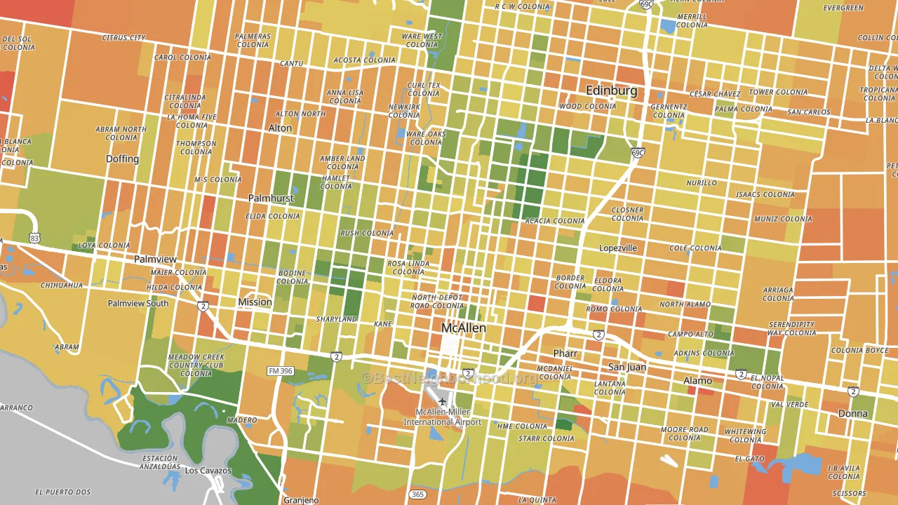
About 43% of adults in the McAllen area typically vote, below the U.S. average of about 62%. Among adults in the McAllen area, ~21% vote Democratic, ~22% Republican, and ~57% don't vote. The map below shows estimated turnout by block group.
How McAllen compares
Among cities within 25 miles, McAllen sits roughly in the middle of the political spectrum, with 11 neighbors leaning further in the place's direction and 33 leaning the other way.
McAllen runs about 12 points more Democratic than Texas as a whole.
Why McAllen leans the way it does
Density, race composition, education, and family structure all sit close to their national averages in the McAllen area. The lean here lands roughly where demographic data alone would predict.
Preventive-care access and voter turnout
Places with limited routine preventive-care access tend to turn out at a lower rate; McAllen, TX sits in the bottom tenth nationally on this measure. Dental visits do not drive turnout; the rate reflects income, insurance, and healthcare access, which line up with who votes.
Why turnout in McAllen looks the way it does
Areas with limited routine healthcare access turn out at lower rates. McAllen is in the bottom quarter nationally for routine-care measures such as insurance coverage, preventive screenings, and dental visits. The dental-visit rate here is about 43%, about 11 points below the Texas average of 54%. Renters vote less often than owners, and about 31% of households in the McAllen area rent, above 85% of cities. Low high-school completion lines up with lower turnout, and about 69% of adults in the McAllen area have completed high school, below 98% of cities. Learn more about the findings and methodology on the political spectrum map.
Nearby Cities
- Palmhurst, TX R+9
- Lopezville, TX Even
- Pharr, TX Even
- Alton, TX R+3
- San Juan, TX Even
- Edinburg, TX Even
- Mission, TX R+4
- Madero, TX R+16
- Granjeno, TX R+12
- Alamo, TX R+3
Cities with Similar Populations
- Baton Rouge, LA R+6
- El Paso, TX D+14
- Worcester, MA D+12
- Allentown, PA Even
- Oxnard, CA D+16
- Albany, NY D+14
- Knoxville, TN R+32
- Sarasota, FL R+16
- Bakersfield, CA R+12
- Columbia, SC D+6
Sources and methodology
Precinct-level voting records used to fit the model come from Texas Secretary of State, Elections Division, distributed by the Voting and Election Science Team. Demographic inputs come from the U.S. Census Bureau (ACS 5-year estimates and the 2020 Decennial Census). Health and environmental inputs come from the CDC (PLACES and the Environmental Justice Index). Land cover comes from the USGS and EPA. Election-day and lead-up weather come from PRISM 4km daily grids and the NOAA Global Historical Climatology Network. Mail-voting and election-administration patterns come from the MIT Election Lab's Survey of the Performance of American Elections. Block-group crime detail comes from CrimeGrade. Internet data and modeling support provided by ISPreports.org.
Modeling and analysis by the BestNeighborhood data science team. Full methodology and findings: political spectrum map.
Methodology reviewed by the BestNeighborhood data team. Last updated May 2026.