Monroe County leans Democratic by roughly 30 points: about 65% of voters vote Democratic and 35% Republican.
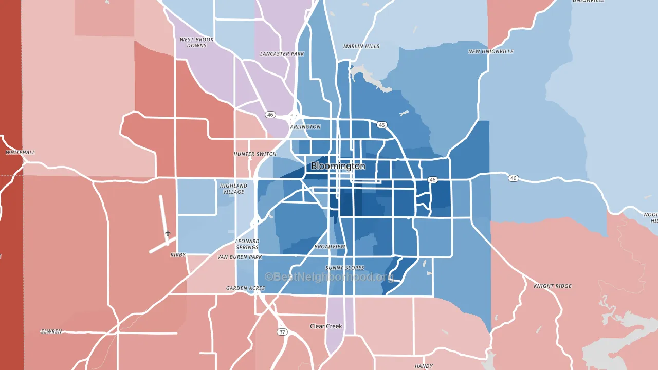
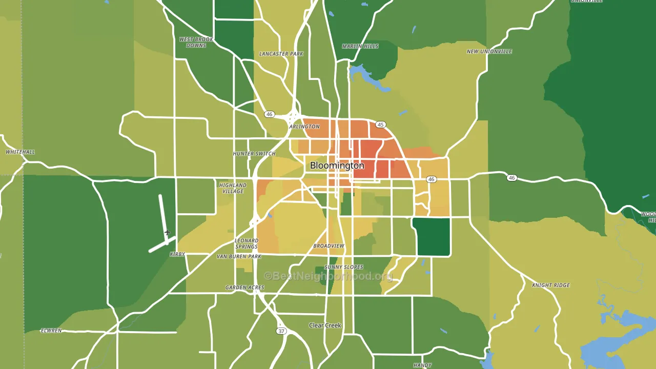
About 62% of adults in Monroe County typically vote, near the U.S. average of about 62%. Among adults in Monroe County, ~40% vote Democratic, ~22% Republican, and ~38% don't vote. The map below shows estimated turnout by block group.
How Monroe County compares
Among counties within 50 miles, Monroe County leans more Democratic than 19 of 20 neighbors.
Monroe County runs about 48 points more Democratic than Indiana as a whole. Indiana leans Republican overall, while Monroe County is one of the few Democratic-leaning pockets.
Politics vary noticeably by city within Monroe County. The east side runs the most Democratic (D+63) and the northwest side runs the most Republican (R+15), a spread of about 78 points.
Why Monroe County leans the way it does
This analysis examined 14,881 data points per county to find what predicts political lean and turnout. The items below are a few correlations that stood out for Monroe County, not a ranked or complete list of what matters most.
Areas with high college attainment vote Democratic. About 52% of adults in Monroe County hold a bachelor's degree, about 24 points above the U.S. average of 28%. Dense areas vote Democratic, and Monroe County sits in the top fifth on density (about 66%, above 89% of counties). Monroe County runs against the grain of Indiana, a Democratic-leaning pocket in a Republican-leaning state.
Population density and Democratic lean
Places with high population density tend to lean Democratic; Monroe County, IN sits in the top tenth nationally on this measure.
Why turnout in Monroe County looks the way it does
Renters vote less often than owners. About 47% of households in Monroe County rent, about 22 points above the U.S. average of 25%. Learn more about the findings and methodology on the political spectrum map.
Nearby Counties
- Owen County, IN R+57
- Brown County, IN R+43
- Lawrence County, IN R+51
- Morgan County, IN R+51
- Greene County, IN R+55
- Bartholomew County, IN R+30
- Johnson County, IN R+35
- Jackson County, IN R+51
- Putnam County, IN R+46
- Martin County, IN R+59
Counties with Similar Populations
- Spotsylvania County, VA R+8
- Randall County, TX R+46
- Wright County, MN R+28
- Napa County, CA D+32
- Marathon County, WI R+17
- Livingston Parish, LA R+66
- Hampton City, VA D+41
- Florence County, SC Even
- Washington County, WI R+28
- Brunswick County, NC R+29
Sources and methodology
Precinct-level voting records used to fit the model come from Indiana Secretary of State, Elections, distributed by the Voting and Election Science Team. Demographic inputs come from the U.S. Census Bureau (ACS 5-year estimates and the 2020 Decennial Census). Health and environmental inputs come from the CDC (PLACES and the Environmental Justice Index). Land cover comes from the USGS and EPA. Election-day and lead-up weather come from PRISM 4km daily grids and the NOAA Global Historical Climatology Network. Mail-voting and election-administration patterns come from the MIT Election Lab's Survey of the Performance of American Elections. Block-group crime detail comes from CrimeGrade. Internet data and modeling support provided by ISPreports.org.
Modeling and analysis by the BestNeighborhood data science team. Full methodology and findings: political spectrum map.
Methodology reviewed by the BestNeighborhood data team. Last updated May 2026.